
Trash Icecream
Employer: All Turtles
Role: Sr. Design Director
Year: 2022
Context
The Situation
Trash Ice Cream had everything a brand needs to break through: a provocative name, a genuinely great product, and a founder with real personality. What it didn't have was a visual identity that matched its ambition. The existing logo was a first attempt, built with an online tool. The concept, an inverted "A" shaped like an ice cream cone, had a kernel of something, but it wasn't executable at scale.
The bigger opportunity was the business goal behind the brand. Trash wasn't just trying to look better. They wanted to open a new location and build toward franchising. That changes what a brand has to do. It can't just express personality; it has to be a system that scales, that works on a cup, a wall, a menu, a social feed, and eventually a store operated by someone who's never met the founders.
That was the real brief: build a brand platform, not just a visual identity.
The Hard Call
Early in the engagement, the client came in with a strong point of view: they wanted the brand rooted in 80s and 90s nostalgia. The references were good, bold, irreverent, and culturally loaded. And honestly, the instinct made sense. That era has real aesthetic power.
But we pushed back. Not because nostalgia is wrong, but because that specific direction was pulling toward an audience that didn't match where Trash needed to go. A franchise brand targeting growth needs to connect with people in their 20s and 30s, the customers who would make a new location viable, drive social engagement, and become regulars. Heavy retro nostalgia skews older. It also dates faster than a brand built for longevity should.
The conversation took time. It was collaborative, not confrontational; we worked through the references together, explored the origins of the nostalgia instinct, and found a way to honor its spirit (bold, unapologetic, culturally aware) without being anchored to a specific decade. The final brand feels timeless in its irreverence rather than nostalgic for a particular era. That distinction matters for a franchise.
The Team
Christina King - Design Lead
Alejandro Rodriguez - Design Lead
William Tamagi - Engineering Lead
Forrest Bryant - Content Lead
Peter Kemme - Motion Design
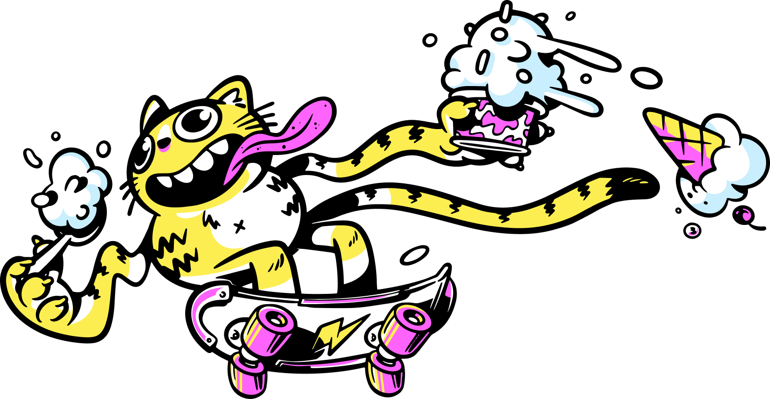
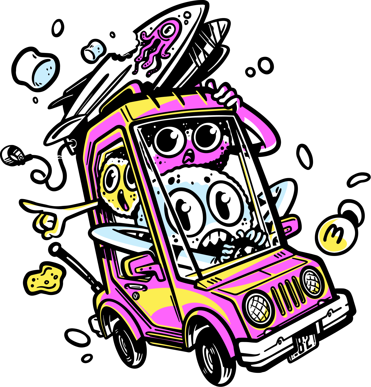
Carlos Rocafort - Illustration
Gloria Lu - Design Operations
Clio Atencio - Design Director
Services Provided
- Brand Strategy
- Visual Identity
- UX & UI Design
- Copywriting
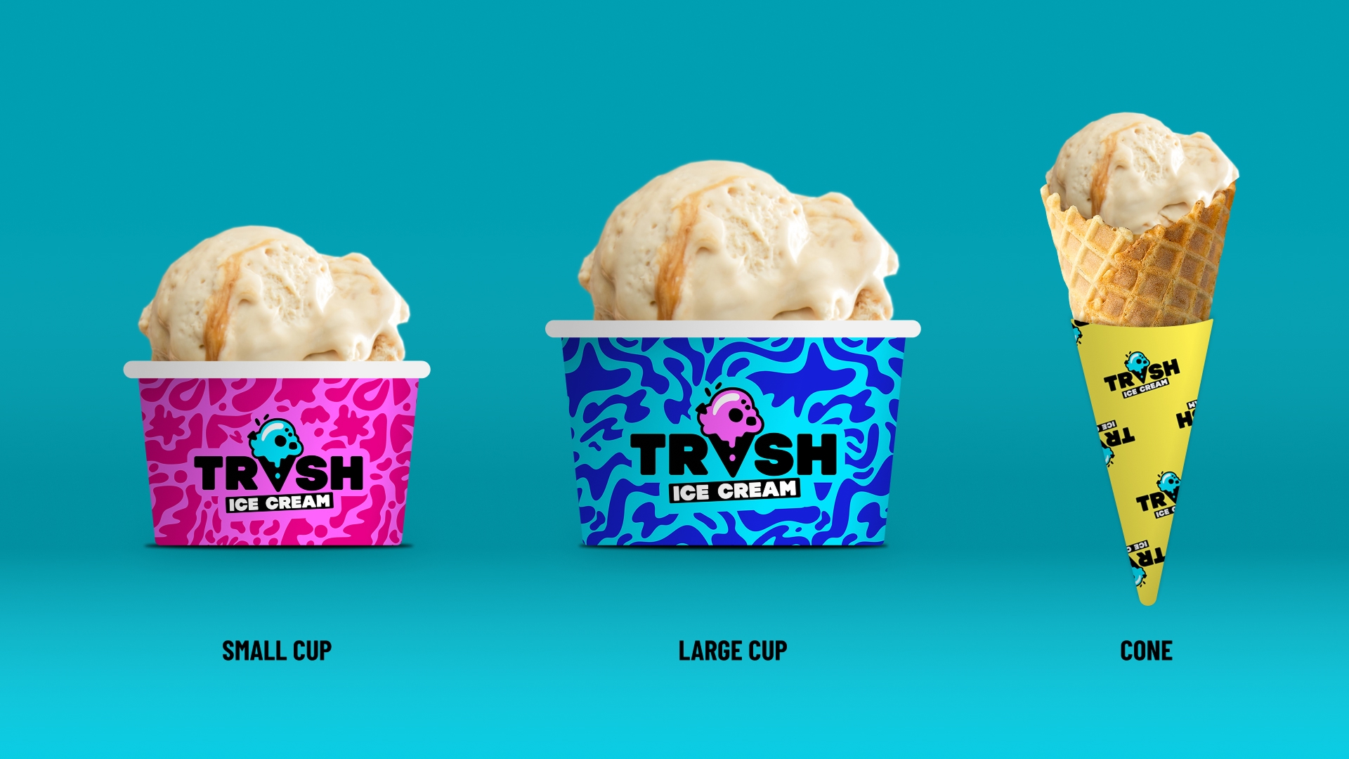
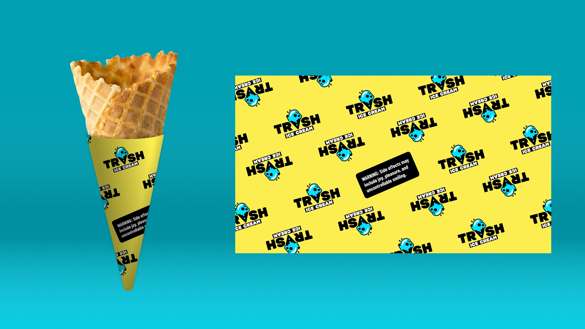
- Packaging
- Illustration
- Motion Design
- Advertising
- Social Media
- Environmental Design
My Role
As Senior Director of Design at All Turtles, I led the creative strategy and direction across the full engagement, from brand positioning and identity through environmental design, packaging, digital, and social. This was a deeply collaborative process with the client, with strategic decisions made together and execution owned by our team.
Impact
- 9x increase in social media engagement following rebrand launch
- 4x increase in sales, driven primarily by the store redesign and improved customer flow
- Brand system successfully scaled to multiple locations
- Positioned the business for franchising with a modular store format and comprehensive brand guidelines
The Process
Discovery & Strategic Foundation
We started with immersive conversations and working sessions with the founders to understand what Trash actually stood for beneath the surface, not just aesthetically, but in terms of values, audience, and long-term vision.
What emerged was a brand built around a specific kind of joy: unself-conscious indulgence. Permission to go overboard. The pleasure of not being precious about things. That's what "Trash" means when it's working, not lowbrow, but liberating.
Mission
To highlight the fun and whimsy of everyday life and encourage full indulgence in its pleasures.
Brand Values
Bold
Edgy
Playful
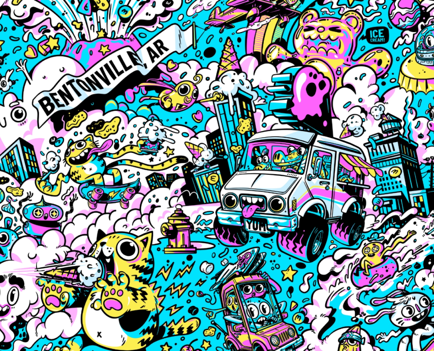
Trash Ice Cream is a bold, indulgent brand that disrupts the ice cream market with high-quality, unconventional flavors and toppings. Its brand design—featuring striking typography, a vibrant color palette, and an expressive ice cream mark—captures the playful, over-the-top experience and adventurous spirit of enjoying Trash.
Brand Identity & Narrative Development
Old Logo:
The original mark had an idea inside it that was worth keeping, the ice cream cone hidden in the letterform, but the execution wasn't ready to carry a brand at scale. We ran an extensive logo exploration: dozens of directions across three rounds of increasing fidelity, each one stress-tested against real applications.

New Logo & Visual System:
The final mark struck a balance we kept coming back to as our filter throughout: playful without being childish, bold without being aggressive. It clicked with the client immediately, not because it was the safest option, but because it was the most confident one.

The Visual System
The full visual system was built to do a lot of work simultaneously: express personality loudly on social media, communicate clearly on packaging, and hold up in a physical environment at franchise scale.
That required real discipline. A brand that's all personality and no system falls apart the moment someone else tries to execute it. So alongside the expressive elements, the typography, the color palette, the illustrations, the motion, we built usage rules that made the brand reproducible without becoming generic.
Key elements:
- A dynamic, expressive typography system with clear hierarchy rules
- A vibrant color palette with defined primaries and application logic
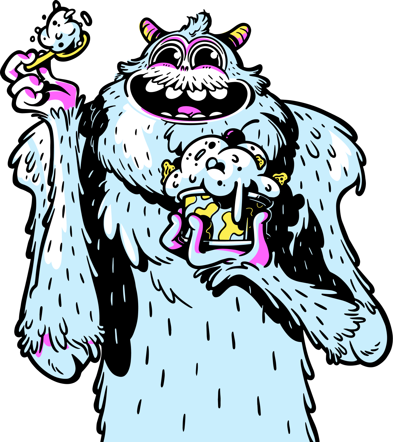
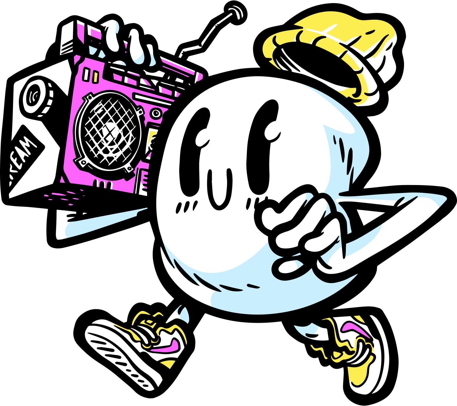
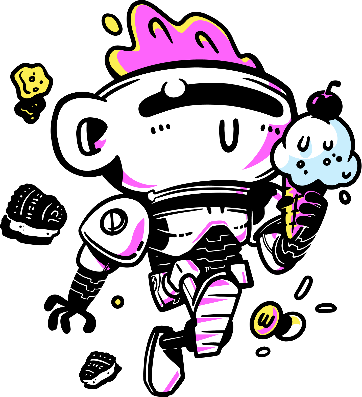
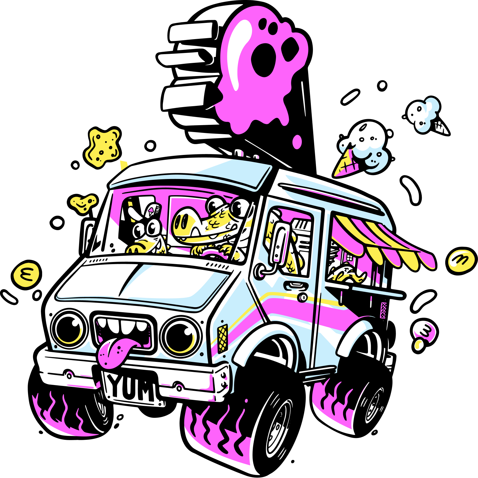
- Custom character illustrations that could flex across cups, social, and environmental issues
- Motion guidelines for digital and in-store use
- A tone of voice framework built around the "get trashed" brand idea, irreverent but never mean
Brand Guidelines


Ilustrations
Digital Presence
The website and social presence had to do one specific thing: make Trash feel like a place worth going out of your way for. In a crowded food and beverage market, especially one dominated by Instagram-native brands, the bar for digital craft is high.
We designed the website to mirror the in-store experience, unexpected, energetic, and a little overwhelming in the best way. The design system lite that underpins it (colors, buttons, inputs, navigation) is tight enough to be consistent and loose enough to feel alive.
The social strategy leaned into the brand's natural territory: bold visuals, product-forward content, and a voice that didn't take itself seriously. The 9x increase in engagement wasn't a fluke; it was what happens when a brand finally sounds like itself.
Design System Lite


Marketing Website
Social Media Presence
Packaging & Marketing
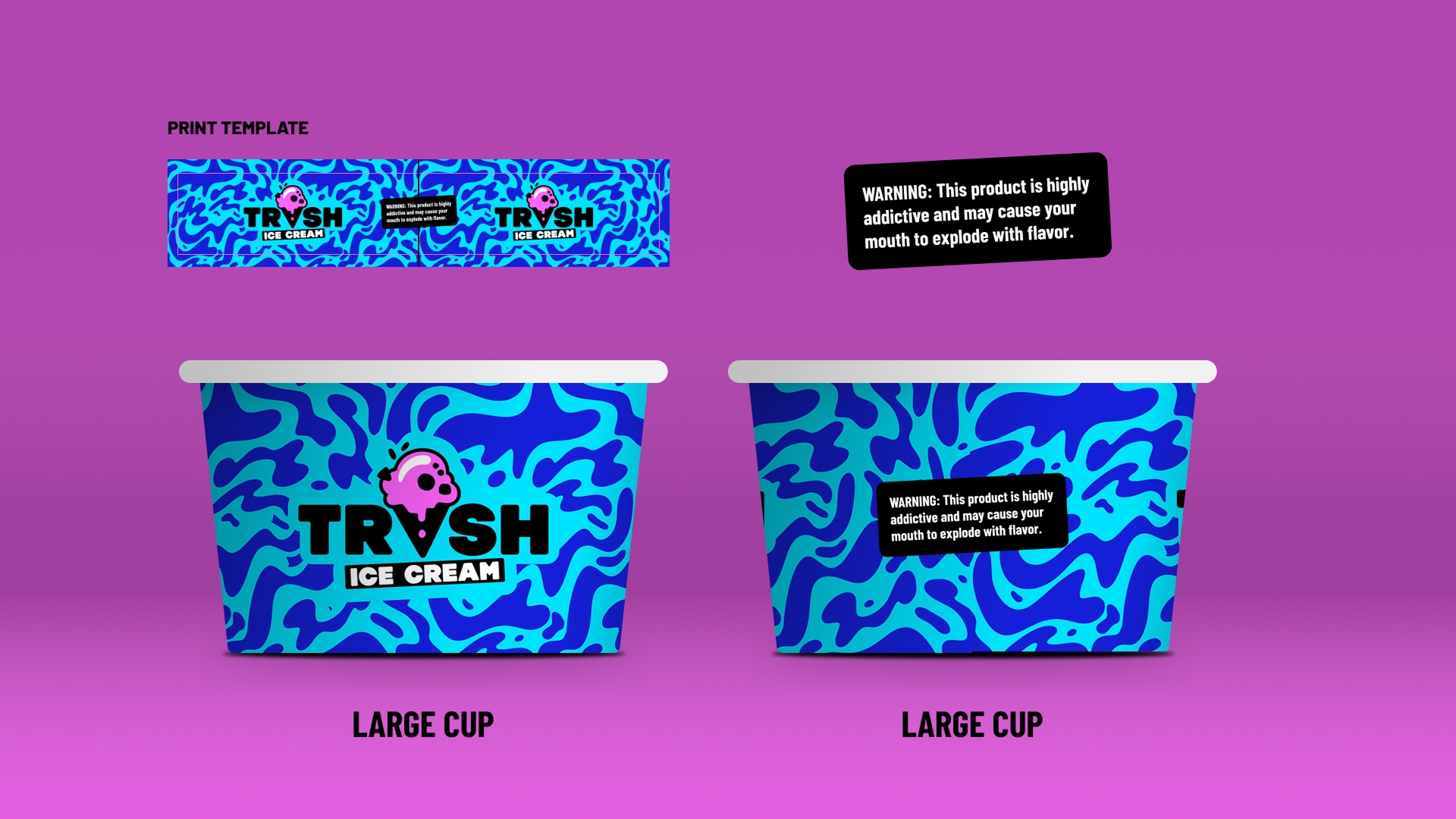
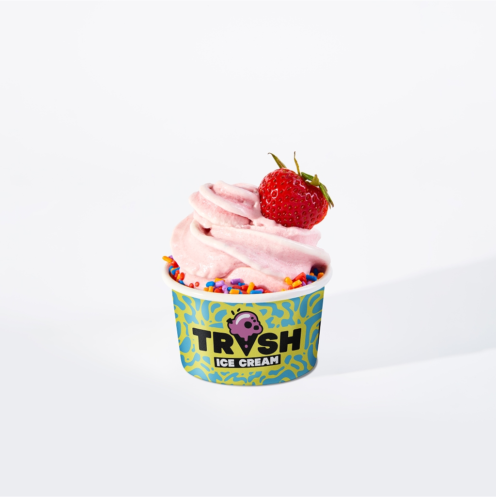
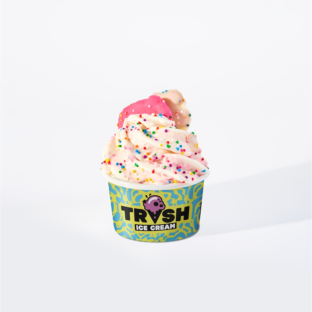
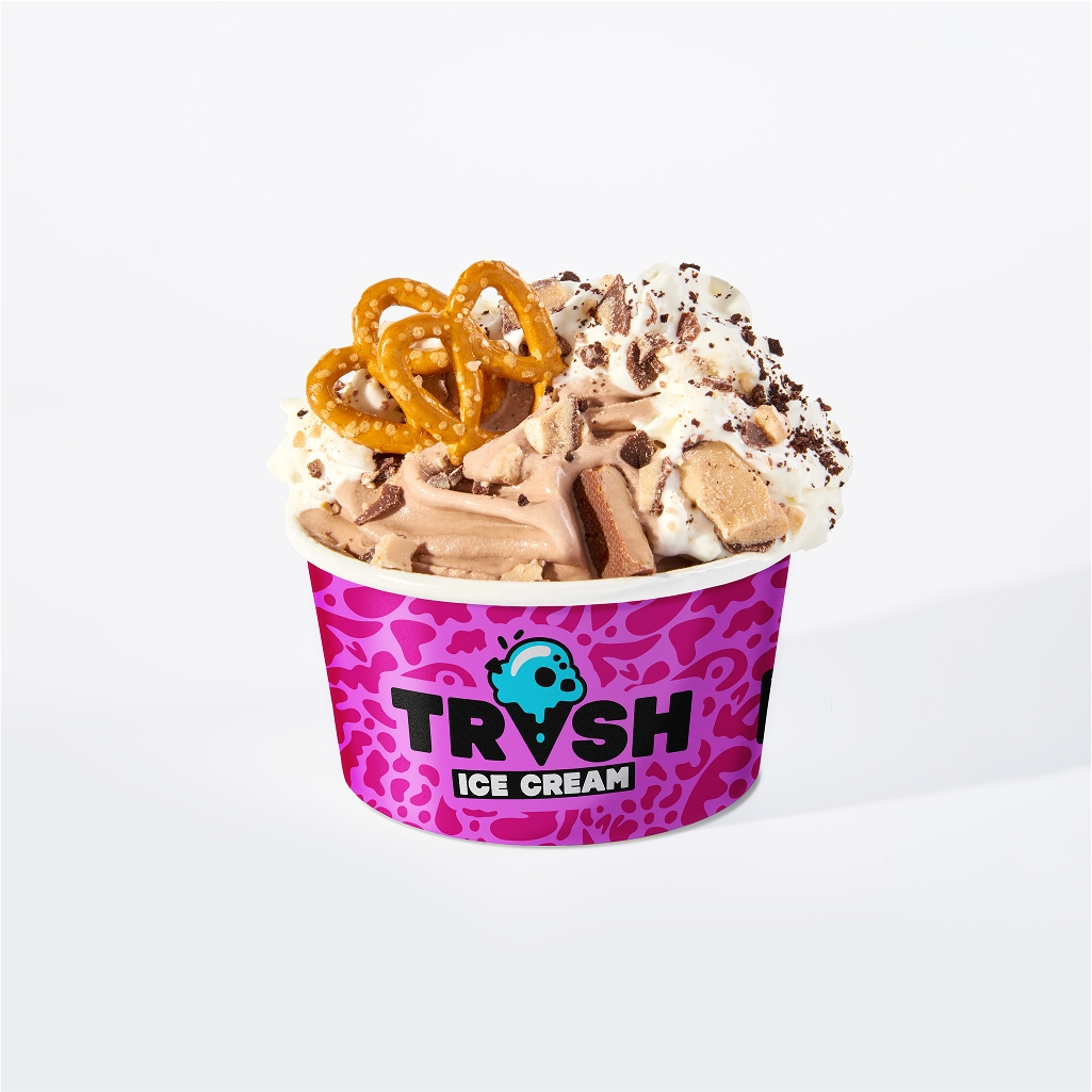
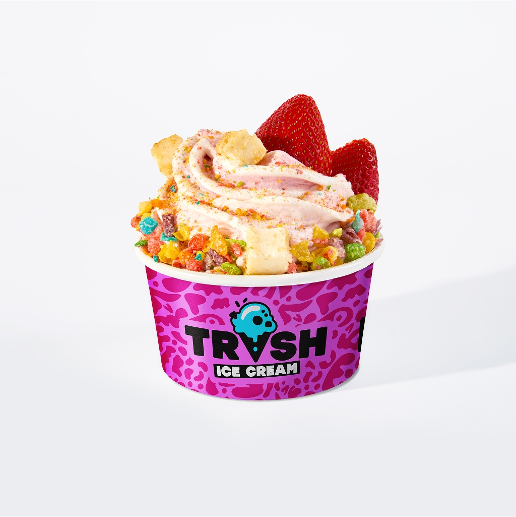
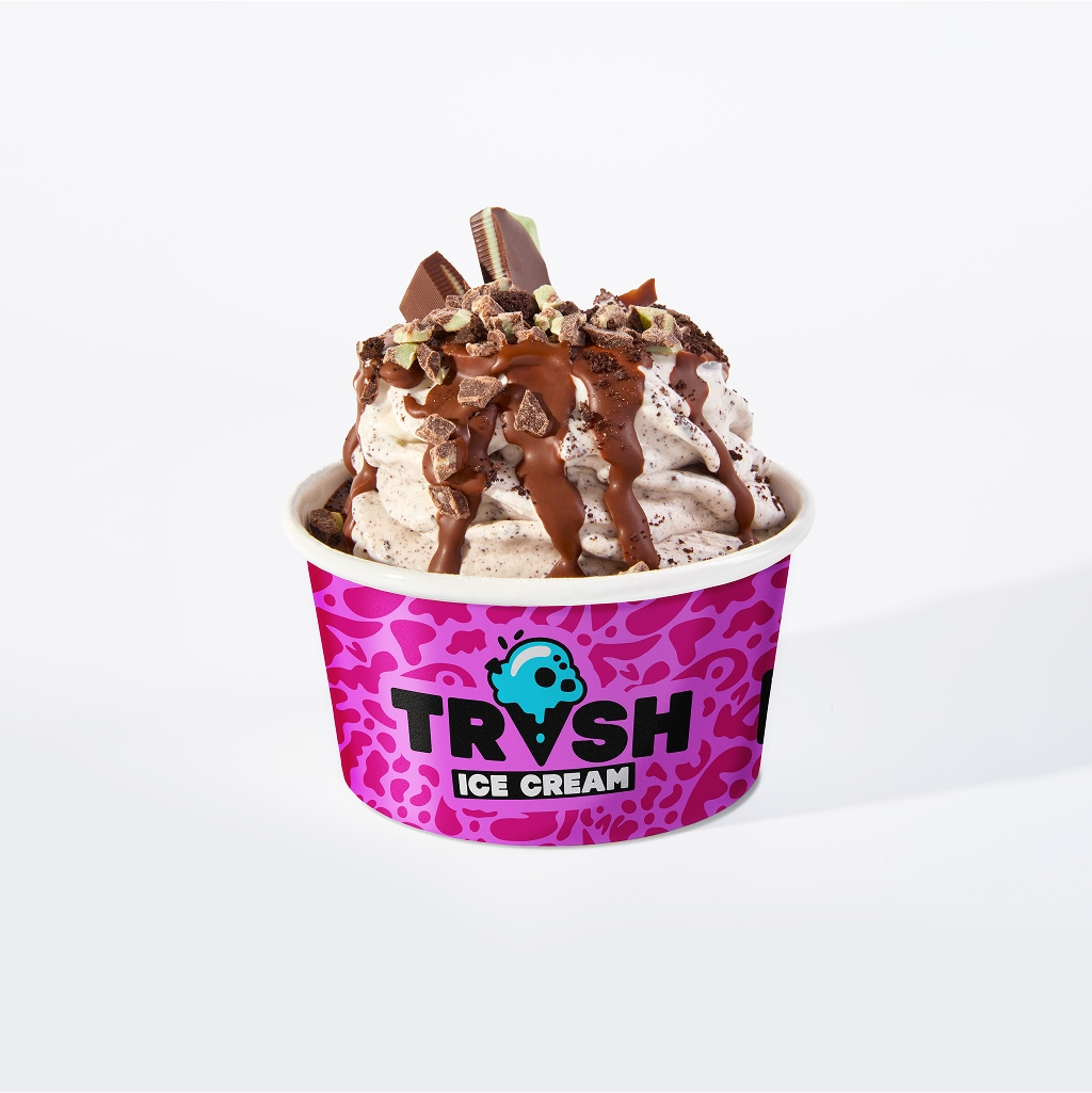
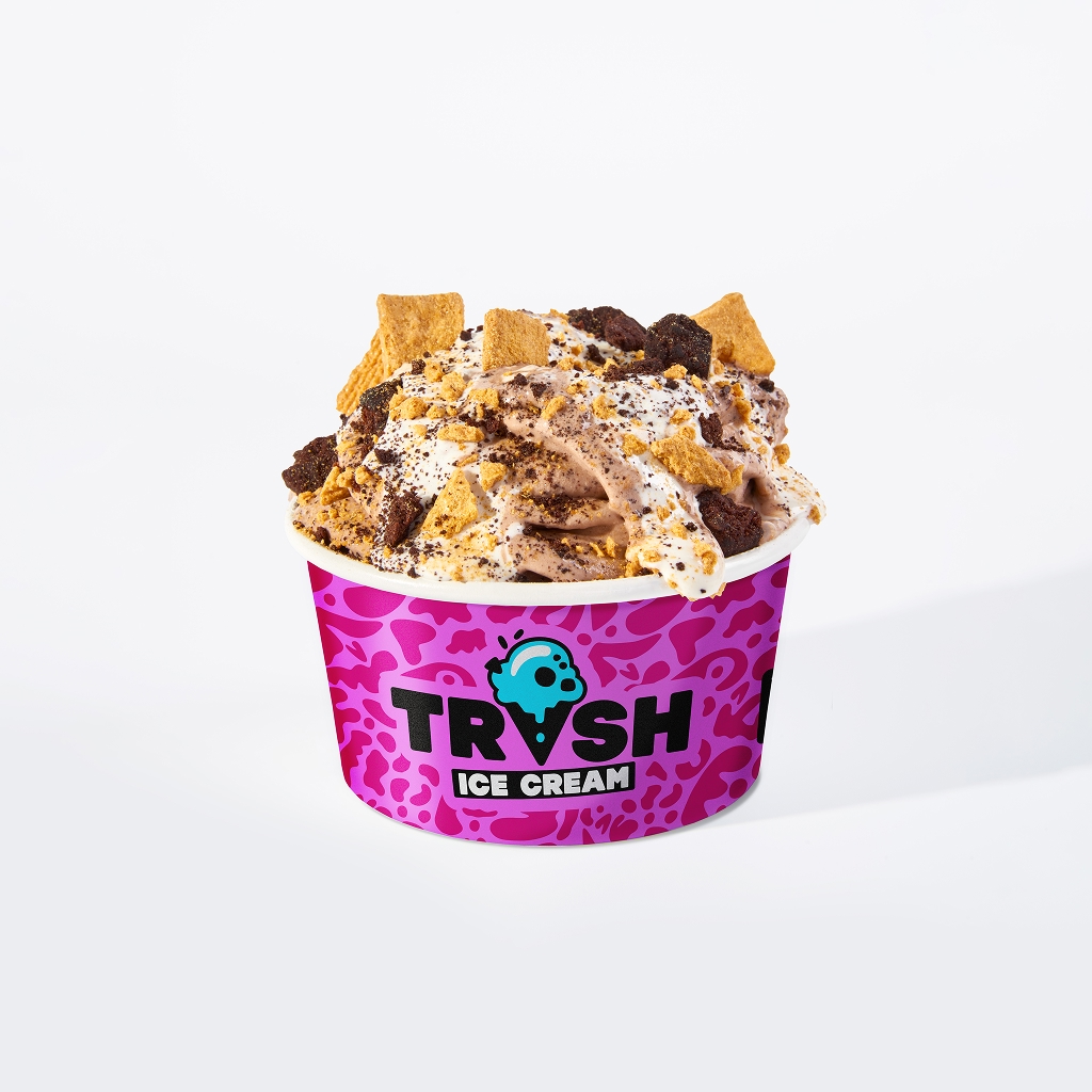
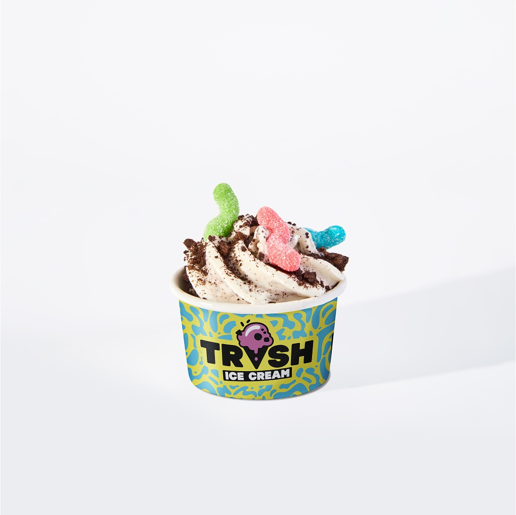
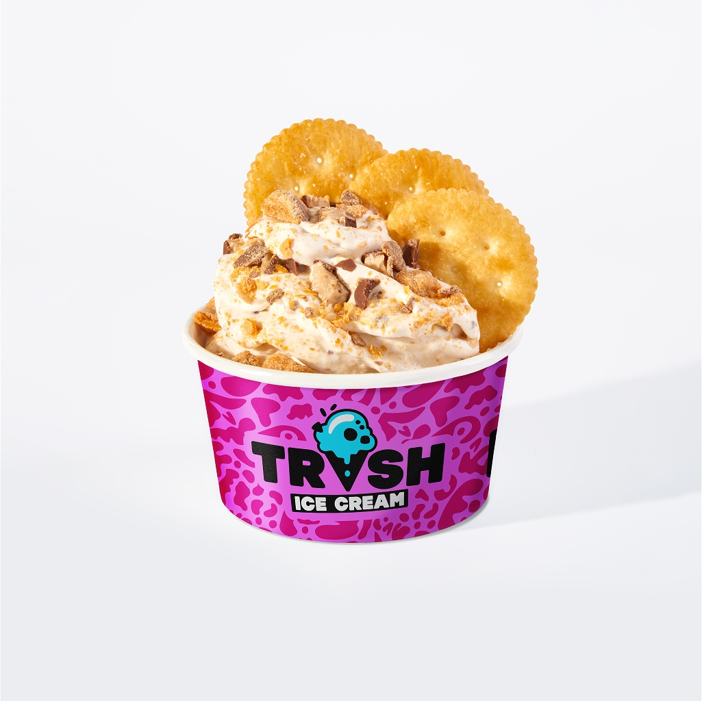
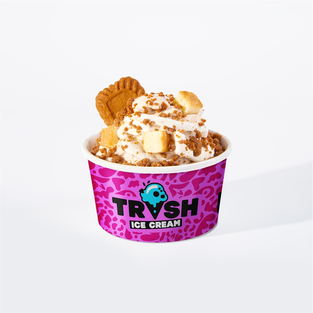
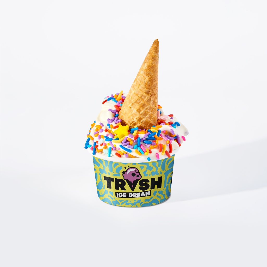
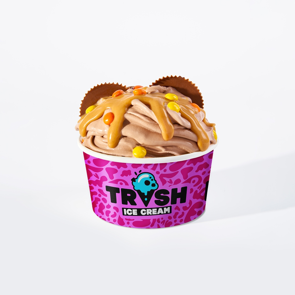
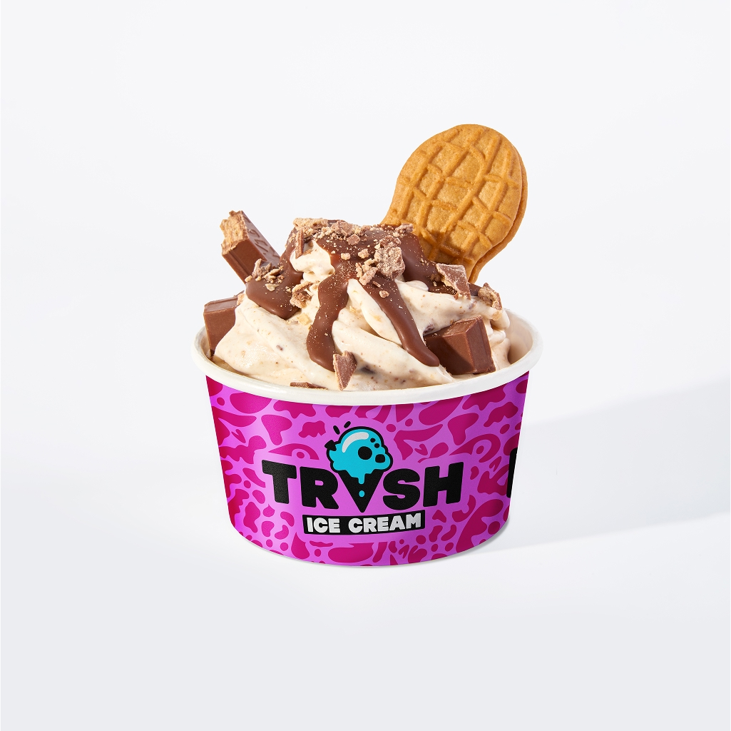
Packaging for an ice cream brand is a moment of truth; the cup is in the customer's hand, in their photo, in their story. We treated it accordingly.
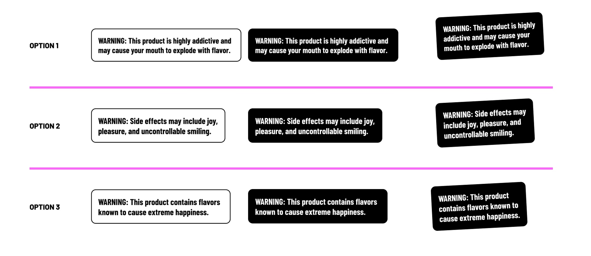
The parental advisory sticker concept for the cups was a direct expression of the brand idea: Trash is unapologetically indulgent, and the packaging should lean into that with a wink. The flavor names, Sprinkle Fest, Circus, Karma Cha, Dirt Worm, were developed with the same spirit: memorable, specific, slightly absurd in the best way.
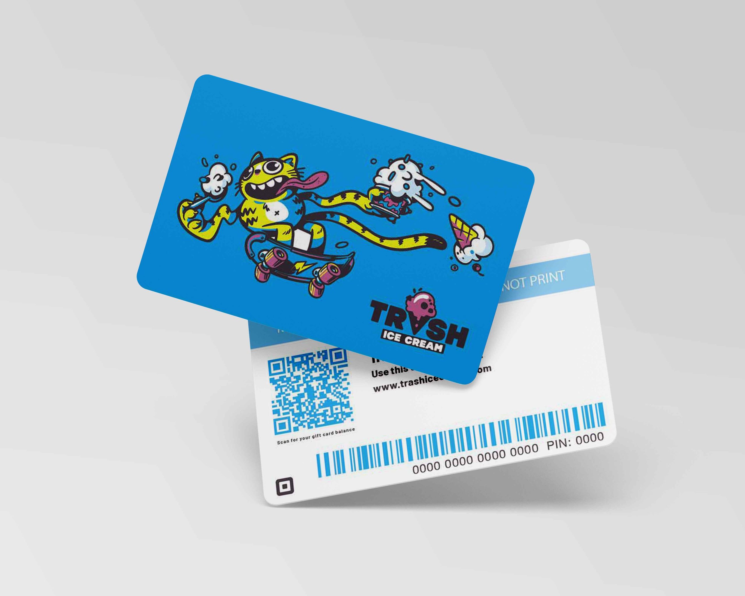
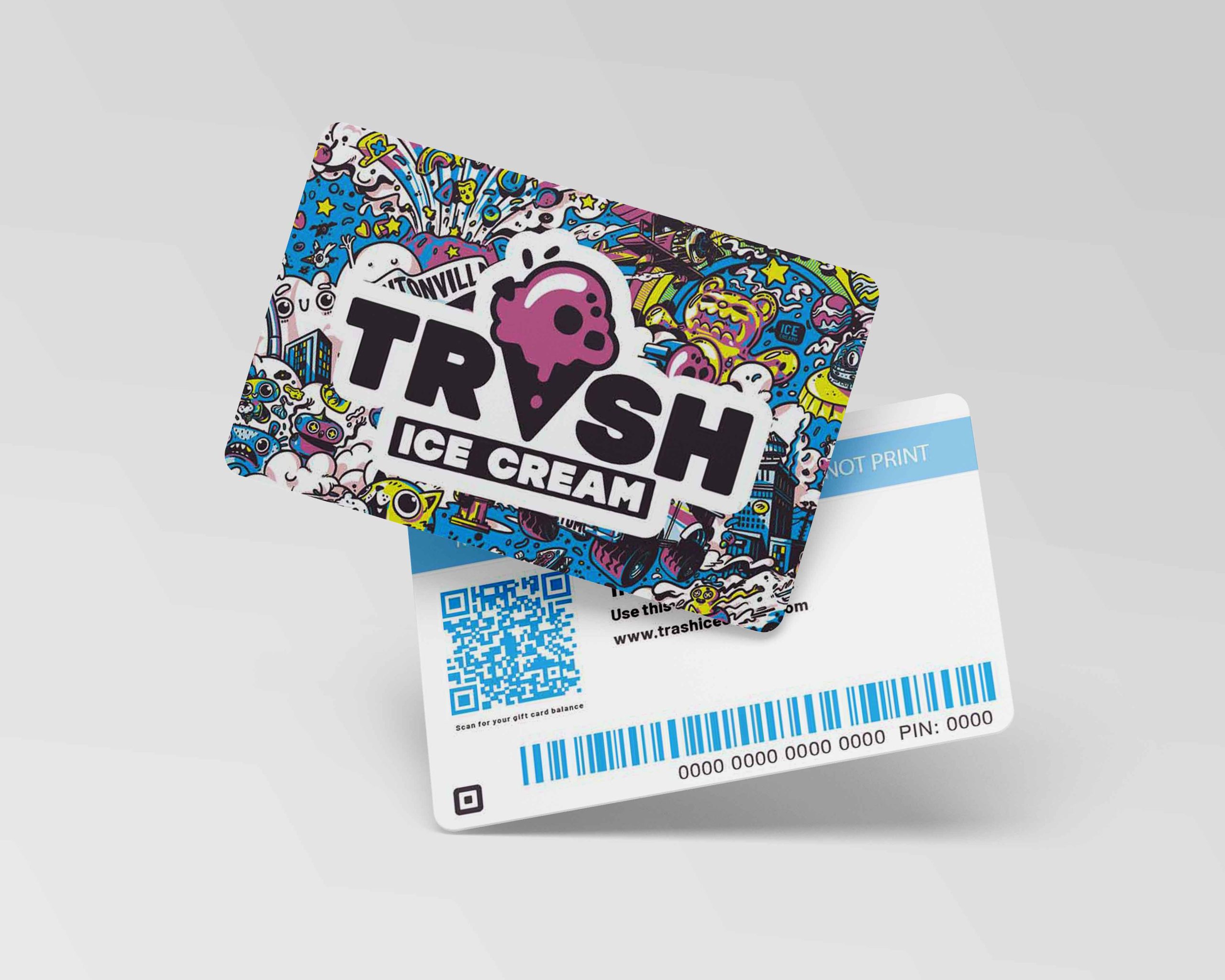
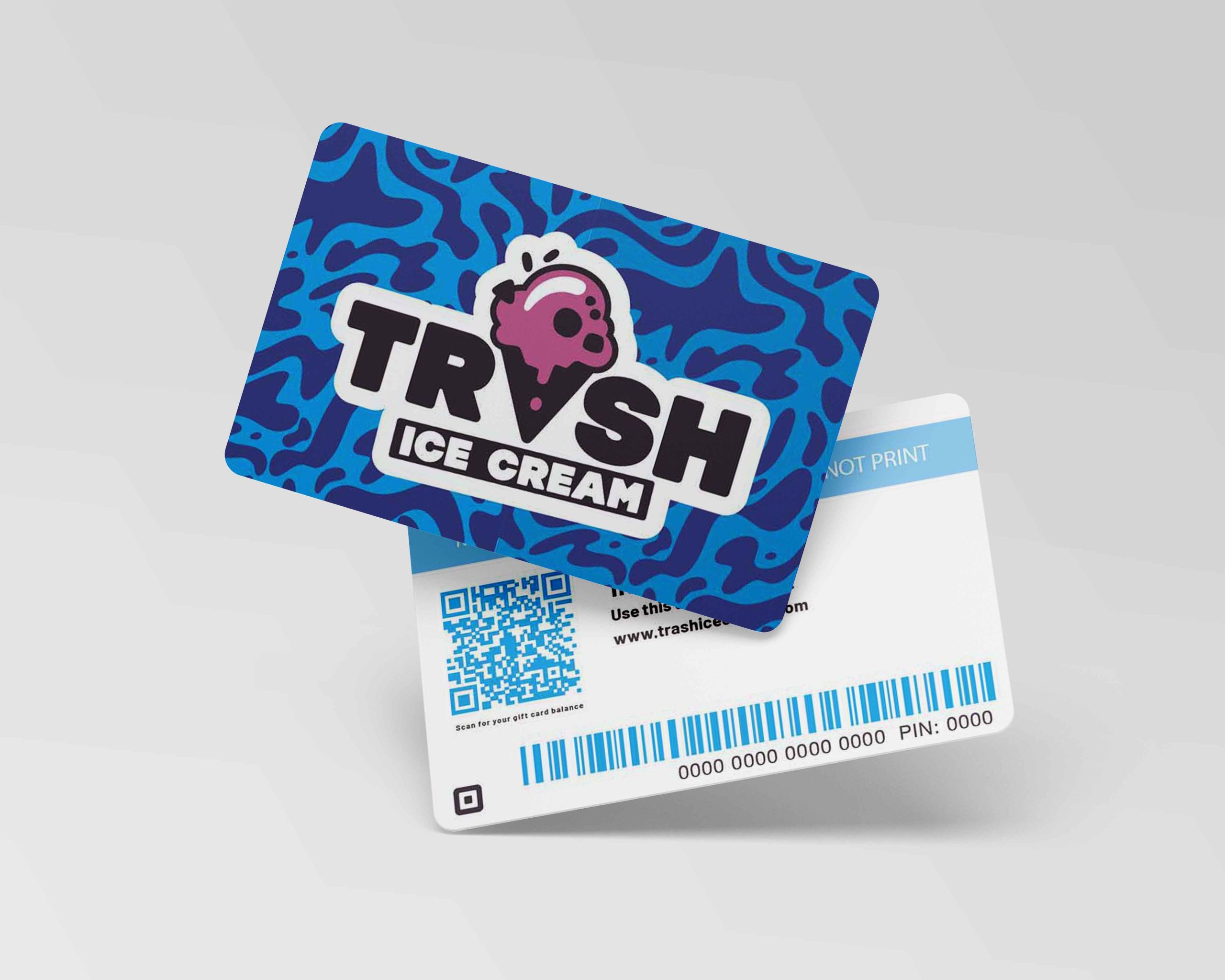
Gift cards, stickers, and merch were designed as extensions of the same system, each one a small ambassador for the brand in the world.
Cones and Cups
Gift Cards
Product Imagery
Environmental Design
This is where the 4x sales increase actually came from, and it's the part of the project most portfolios would skip over because it's harder to show.
Working alongside Trash's interior designer, we rethought the customer journey inside the store: how people enter, how they read the menu, where they queue, and how orders flow. The goal was to reduce wait times and increase throughput, not just make the walls look good.
The environmental design decisions were made with the franchise model in mind: modular, reproducible, and brand-expressive without requiring custom fabrication for every new location. The menu system, exterior branding, interior graphics, and wayfinding all work together as a scalable kit.
When the store runs better, more customers get served, and more of them leave happy. That's what drove the sales increase, design as an operational tool, not just a visual one.
Exterior & interior branding


What I'd Do Differently
I'd push harder on defining the audience earlier. The nostalgia conversation was the right one to have, but having it earlier, in the first discovery session rather than partway through the identity exploration, would have saved time and given the creative work a clearer brief from the start. The collaborative dynamic with this client was genuinely strong, and I think they were ready for that conversation sooner than we gave them credit for.
Selected Works


heraclio@designstgy.com