
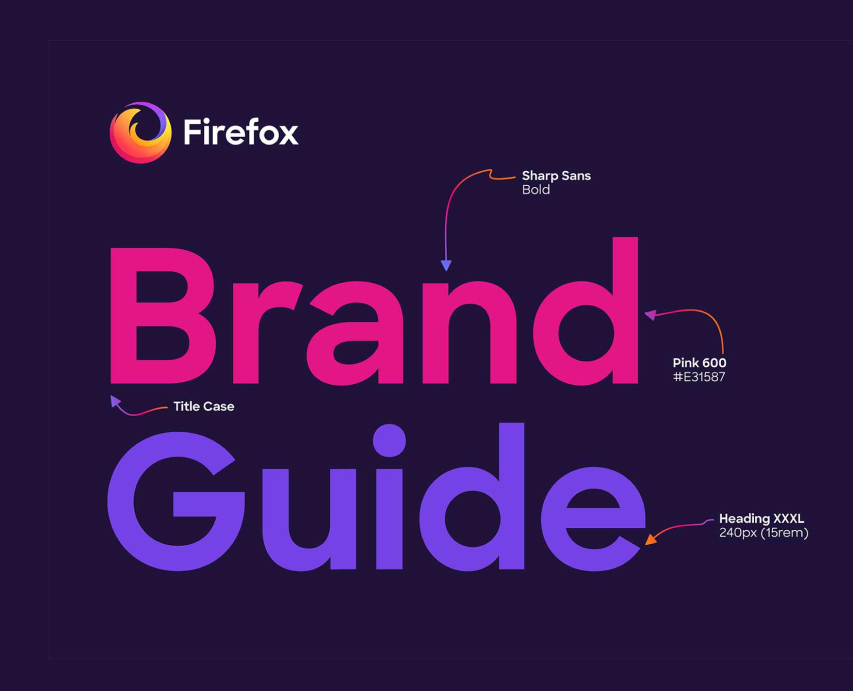
Firefox Browser
Employer: Mozilla - Firefox
Role: Head of Brand Design
Year: 2019
Context
Why
Firefox's download page had a conversion problem, but not the one anyone expected.
The page was generating downloads. What it wasn't generating was installs. Users were clicking the button without enough understanding of what they were downloading or why it was worth switching. The result was a high volume of low-intent prospects dropping off before completing installation.
The real problem was content and clarity. The page had a single, ambiguous CTA with no surrounding context, no reasons to switch, no product differentiation, and no education for the undecided user. It worked for people who already wanted Firefox. It failed everyone else.
This was also the first page to implement Firefox's refreshed visual identity, making it both a conversion project and a brand flagship.
The Insight
The page was optimized for people who had already made the decision. We needed to redesign it for people who hadn't, without slowing down the ones who had.
That meant two parallel user journeys: a frictionless fast path for high-intent visitors, and an informative, persuasive experience for browsers still deciding. The content architecture had to serve both without compromising either.
Impact
- 10% YoY increase in installs; attributed directly to this page, driven by higher-quality prospect conversion rather than increased download volume
- Qualitative research confirmed increased user confidence and intent prior to download
- Established the visual and content framework adopted across subsequent Firefox marketing surfaces
- First successful implementation of Firefox's refreshed visual identity at scale
What We Knew
The research that shaped that direction surfaced a consistent pattern. User research with 29 non-Firefox users, including Chrome and Brave users, surfaced a consistent pattern: people found the page visually appealing but couldn't articulate why they should switch. They couldn't distinguish core browser features from peripheral information. And there was no clear answer to the question every undecided user was silently asking: why Firefox, why now?
What was working: strong color, easy download flow, privacy messaging.
What wasn't: no compelling reason to switch, a confusing hero image, insufficient product education, and SEO gaps that limited reach to users already searching for Firefox by name.
My Responsibilities
As Head of Brand Design, I led the creative and content strategy for the redesign, directing the team through research synthesis, content architecture, visual design, and the first full-scale expression of Firefox's refreshed visual identity.
What I Did Differently
I'd push harder, earlier, to reframe the success metric. For too long, the team measured page health by download volume alone. Installs that require real intent are a more honest number. If we'd established that framing at the start, I think we would have moved faster and with less organizational friction. The data was always there. We just weren't asking the right question.
The Team
- Jennifer Rouse - UX Design
- Mark Weaver - Brand Design
- James Dybvig - Motion Design
- Rob Antley - Copy Writer
Old Design

Process
Research
Research & Insights
Our process started with a deep dive into engagement metrics and user behavior. By auditing SEO performance and studying competitor strategies, we identified the gaps in our current journey. These insights allowed us to form a solid hypothesis for a more compelling, distinctive experience that prioritized both user needs and brand identity.
User Testing
To ensure a user-centric redesign, we conducted qualitative testing with 29 non-Firefox users (including Chrome and Brave users) to compare our landing page against competitors. These insights identified high-resonance elements and friction points, allowing us to refine the experience to better communicate Firefox’s unique value to new users.
What's Working
👍 Bright colors are appealing
👍 Easy to download
👍 Message focusing on privacy
What's is not Working
👎 Lack of information
👎 Hero image is confusing
👎 No clear reason to switch
👎 Users were confused about what is a feature of the browser and what is not
Areas for improvement
- The page primarily catered to users already inclined to download Firefox, lacking persuasive information for undecided users.
- Did not provide enough differentiation for users on the fence, no strong reasons to switch.
- Lacked essential keywords and phrases that users search for when looking for a new browser (SEO optimization needed).
- Content breadth did not match competitor pages.
- The hero image was unclear and led to confusion.
- Users struggled to distinguish between core browser features and other information presented on the page.
User Experience
Our wireframing focused on two core user paths: a high-speed funnel for high-intent visitors and an informative journey for those comparing browsers. By balancing friction-free downloads with transparent product education, we built a foundation that was both intuitive and conversion-optimized.

Design Direction
The visual design had a constraint most redesigns don't: this page would be the first public expression of Firefox's refreshed brand identity. That raised the stakes considerably. We weren't just redesigning a page; we were setting a precedent for how the new brand would feel in the wild.
The early temptation was to go bold. Firefox's brand personality is opinionated and energetic, and the design team naturally wanted to express that. I pushed back on that instinct. A download page isn't a campaign; it's a decision moment. Users arrive with a specific task. Spectacle gets in the way of that.
The direction I set was warm, clear, and confident. The brand energy would come through color and typography, not complexity. Every visual layer had to earn its place by either reducing confusion or building trust, not simply expressing personality.
The hero was the hardest call. We went through several directions before landing on one that communicated what Firefox is rather than how it feels. That distinction, product clarity over brand mood, guided most of the visual decisions on the page.
What We Built
A restructured page that answered the undecided user's questions before asking them to act, with clearer product education, stronger differentiation messaging, and a visual design that was the first implementation of Firefox's new brand direction.
The hero was rebuilt to communicate what Firefox is and why it matters, not just that it exists. Feature communication was reorganized to help users clearly distinguish core browser capabilities from supporting content. SEO was integrated into the content strategy from the start, not retrofitted at the end.


Selected Works


heraclio@designstgy.com