
Carrot Fertility
Employer: All Turtles
Type: Series D
Industry: SAAS
Role: Sr. Design Director
Year: 2023
Context
The Situation
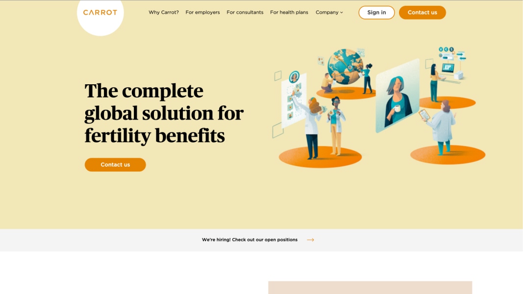
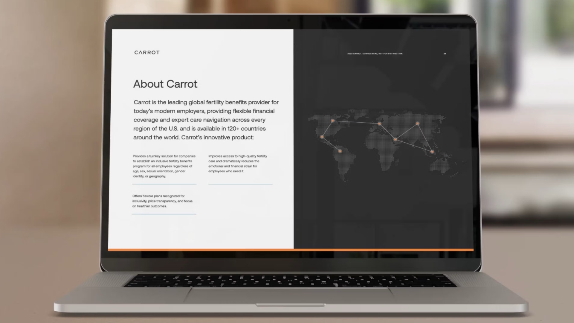
Carrot Fertility had already won. They were the B2B leader in employer-sponsored fertility benefits, a category they'd helped create. But the brand had grown up during a scrappier phase of the business, and it was starting to show. Soft colors, stock imagery, warm but vague messaging. It communicated care, but not confidence. For a company now selling to enterprise HR leaders and health plans, that gap was becoming a liability.
My team at All Turtles served as an embedded design partner, not an outside agency that shows up for a rebrand and leaves, but a team integrated into their day-to-day across brand, product, marketing, and events. Over the course of the engagement, we rebuilt the visual language of the company from the ground up. Carrot has since reached Series D and remains the category leader in B2B fertility benefits.
The Scope
This was one of the most expansive engagements I've led. Over the course of the partnership, we delivered:
- A full brand refresh, visual identity, color system, typography, photography direction, patterns, data visualization
- A unified design system adopted across marketing and product teams
- A redesigned marketing website
- Carrot Sprints, a 0→1 AI-powered metabolic health product, from concept through beta launch
- Two distinct bodies of work, running in parallel, under the same creative direction.
- Day-to-day embedded design team to support marketing and product needs.
The Team
- Josh Parenti — Product Design Lead
- Christina King — Visual Design Lead
- Dala Botha — Brand Design
- David Perez — Content lead
- Gloria Lu — Design Operations
- Clio Atencio — Sr. Design Director
My Role
As Sr. Design Director, I led creative direction across both workstreams, brand and product, managing a distributed multidisciplinary team while staying close enough to the work to ensure quality and consistency. I owned the strategic framing of the visual identity, oversaw the design system, directed the product design process for Sprints, and managed budgets, hiring, and cross-functional relationships with Carrot's internal teams.
Impact
The rebrand gave Carrot a visual language that could sit in a boardroom deck and still feel human, authoritative enough to close enterprise deals, grounded enough not to lose the people those deals are ultimately about. The shift from warm-and-vague to data-driven wasn't cosmetic. It was a repositioning of how the company presented its evidence to the market.
The unified design system resolved a fragmentation problem that had slowed both marketing and product teams. With a shared visual foundation in place, execution got faster, and the brand held together across surfaces that had previously felt disconnected.
Carrot reached Series D. They remain the category leader in B2B fertility benefits, the position the brand was rebuilt to hold.
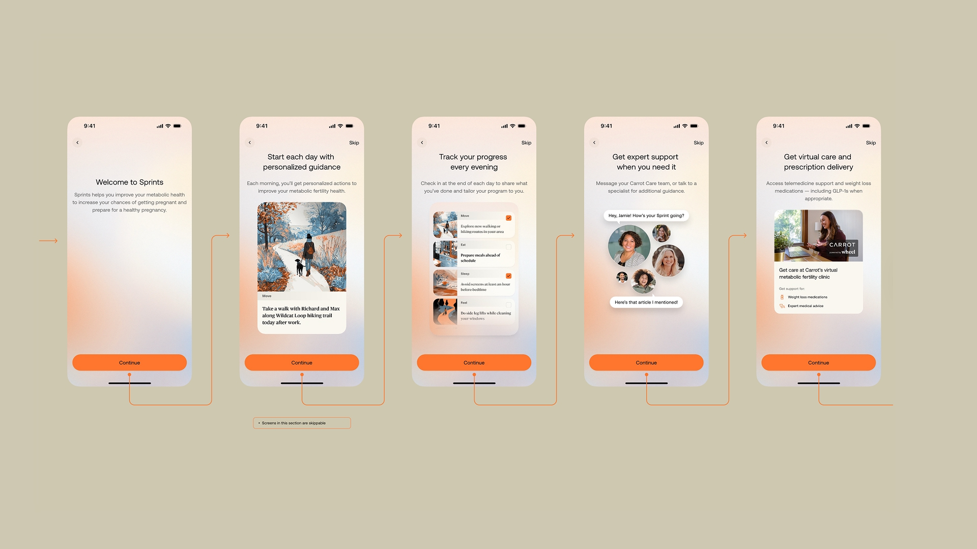
- Launched Carrot Sprints in beta, a 0→1 AI-powered metabolic health product designed for individuals trying to conceive
The Brand Rebrand
The Strategic Gap
Carrot's competitive research revealed something that should have been obvious in hindsight but wasn't: the entire fertility benefits market looked the same. Soft pastels, hopeful stock photography, rounded everything. It communicated warmth, but in a B2B context, warmth without authority doesn't close enterprise deals.
Carrot was already winning on outcomes. They had the clinical data, the global network, the track record. The brand just wasn't saying so. It was speaking the language of reassurance when it should have been speaking the language of results.
The strategic direction Carrot brought to us: mature the brand. The visual answer we developed: make data the hero.
Old vs. New
The old brand communicated: we care about you. The new brand communicates: we get results, and we care about you.
That's not a subtle difference at enterprise scale. HR leaders and health plan executives are buying outcomes, not feelings. The rebrand gave Carrot a visual language that could sit in a boardroom deck and still feel human.
Old Branding
Brand Architecture
To strengthen and scale its identity, Carrot established a structured brand architecture. This framework ensures consistent positioning across all touchpoints, safeguarding brand equity while enabling more efficient resource allocation. It provides a clear, unified foundation that highlights Carrot’s competitive advantages.
- Brand Promise: Pursue your possible
- Mission: Fertility care for all.
- Vision: The leading global fertility platform, changing lives through precision care.
- Target Audiences: Employers, HealthPlans, Consultants, and Partners.
- Positioning Statement: Carrot provides lifelong fertility and family-forming care globally, impacting lives and producing industry-leading outcomes through precision care delivered by our deeply personalized engagement platform.
Visual Identity
Research showed a competitive gap for a data-driven, authoritative brand in a market full of soft colors, illustrations, and stock photos. We filled this gap by developing a distinctive, adaptable identity that secures Carrot’s position as a market leader and provides a scalable framework for future expansion.
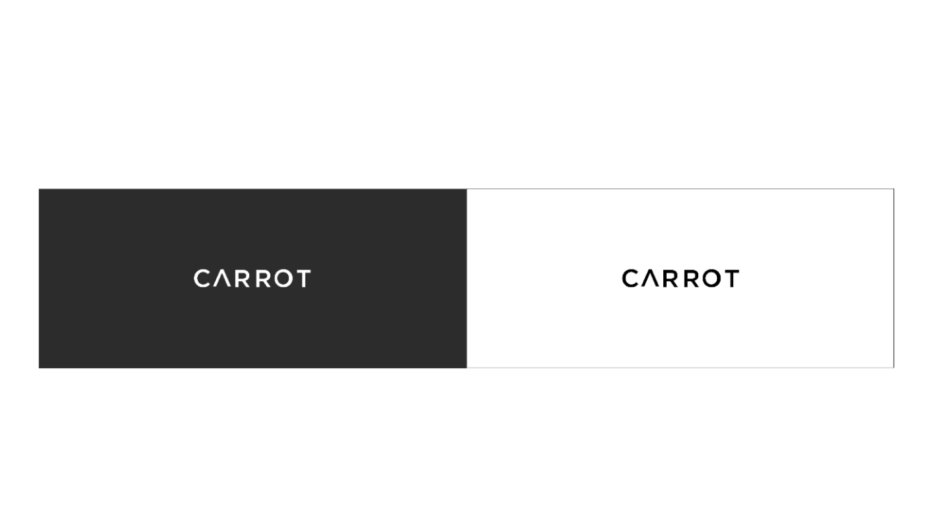
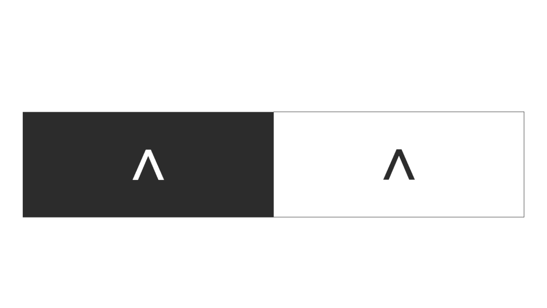
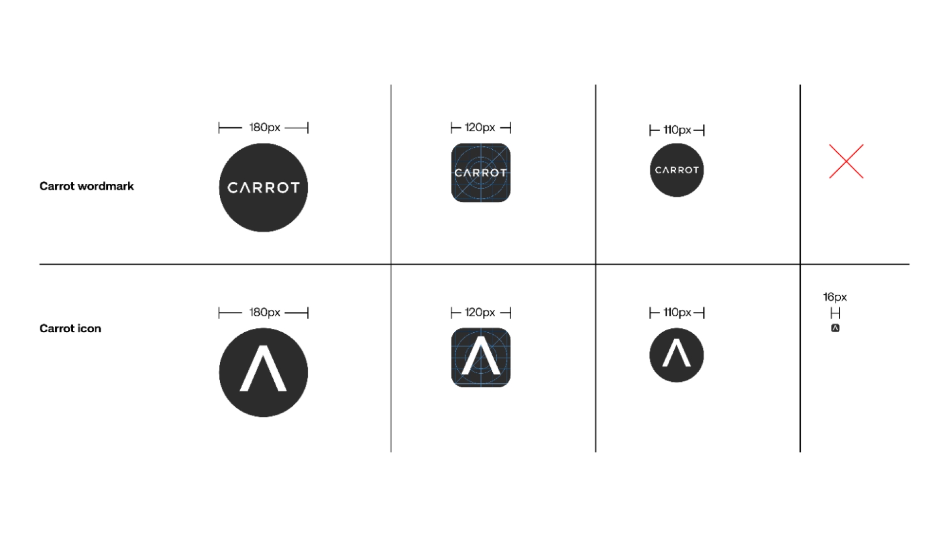
Original and untouch Logo:
The only asset that Carrot wanted to keep untouched was the logo, and was designed before my time at All Turtles.

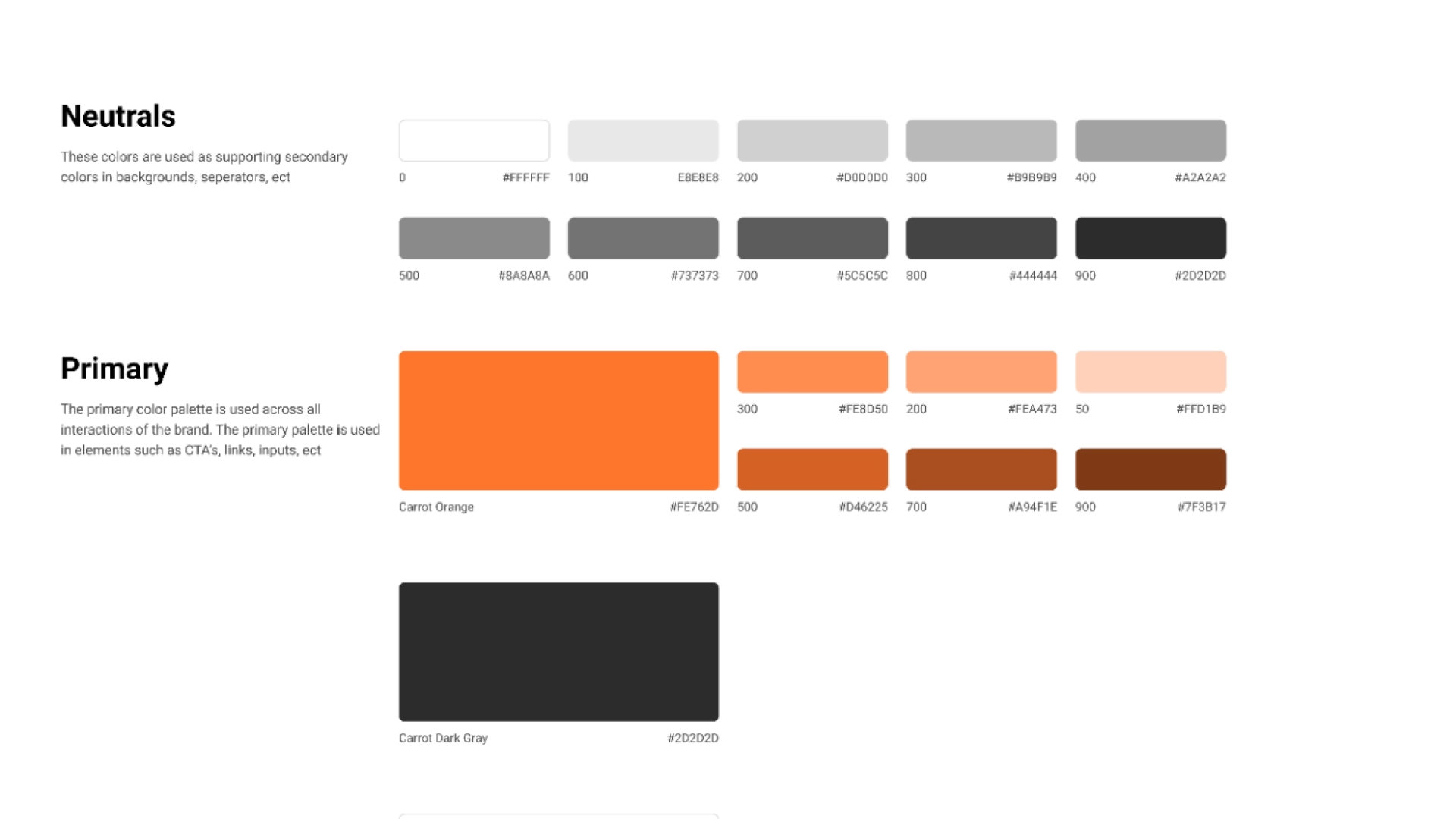
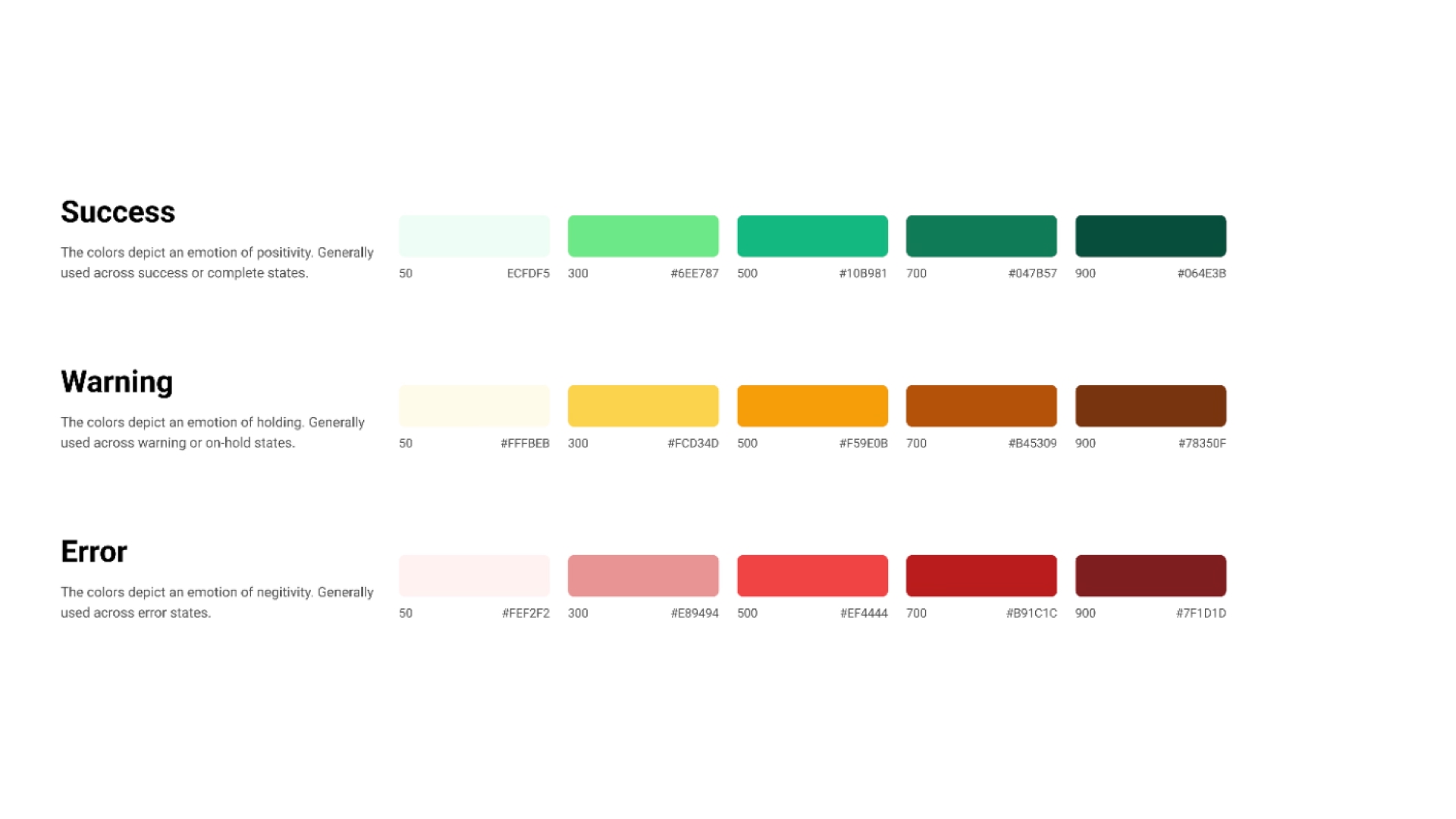
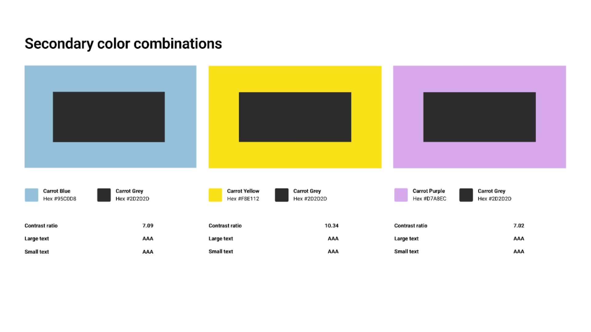
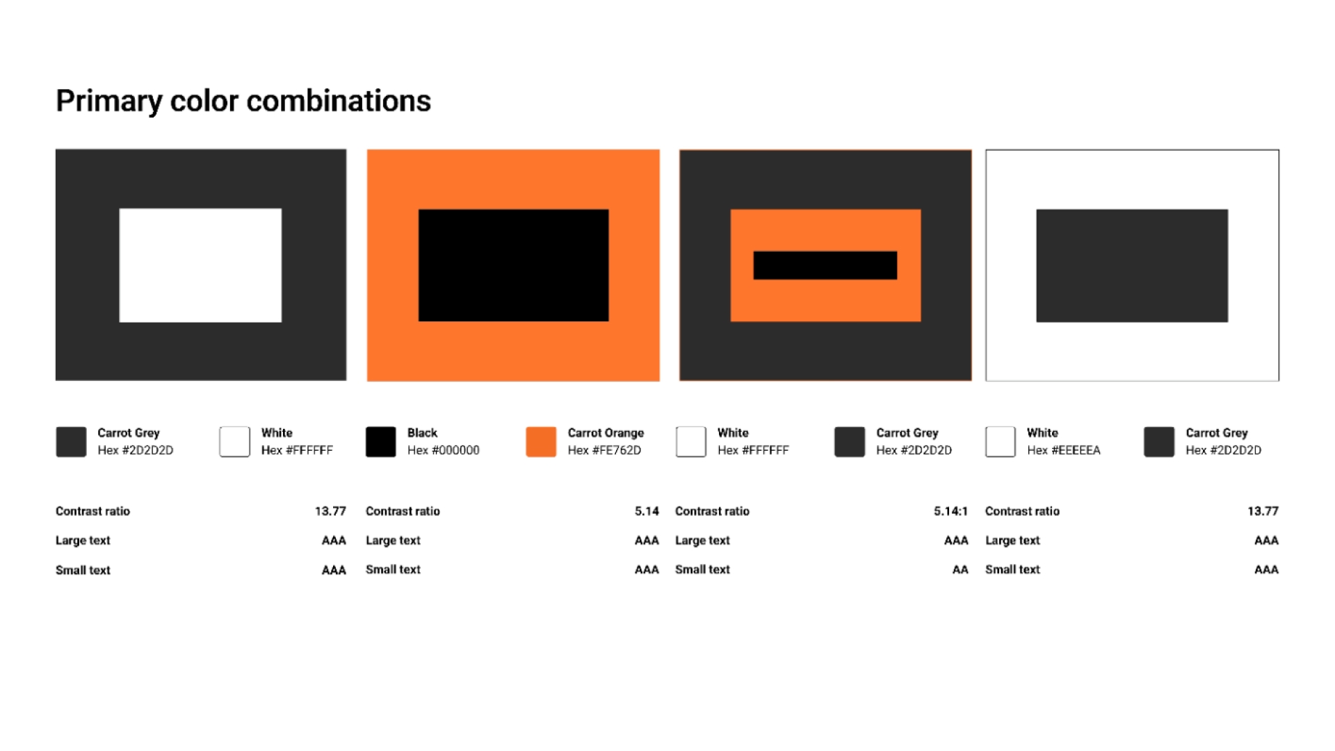
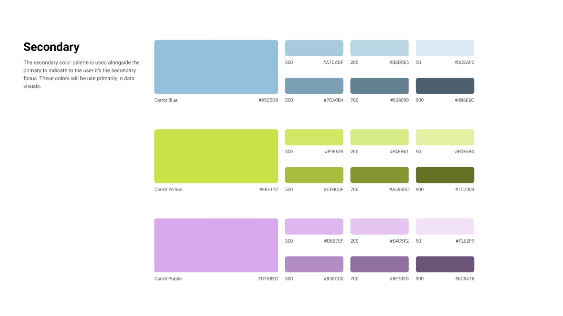
Colors
Seven shades per hue, each optimized for accessibility with clear contrast guidelines. Seven unique patterns to aid differentiation for visually impaired users. This wasn't decoration; it was a system built to scale across a global product used by people in vulnerable moments. Accessibility wasn't a compliance checkbox; it was a brand value made tangible.
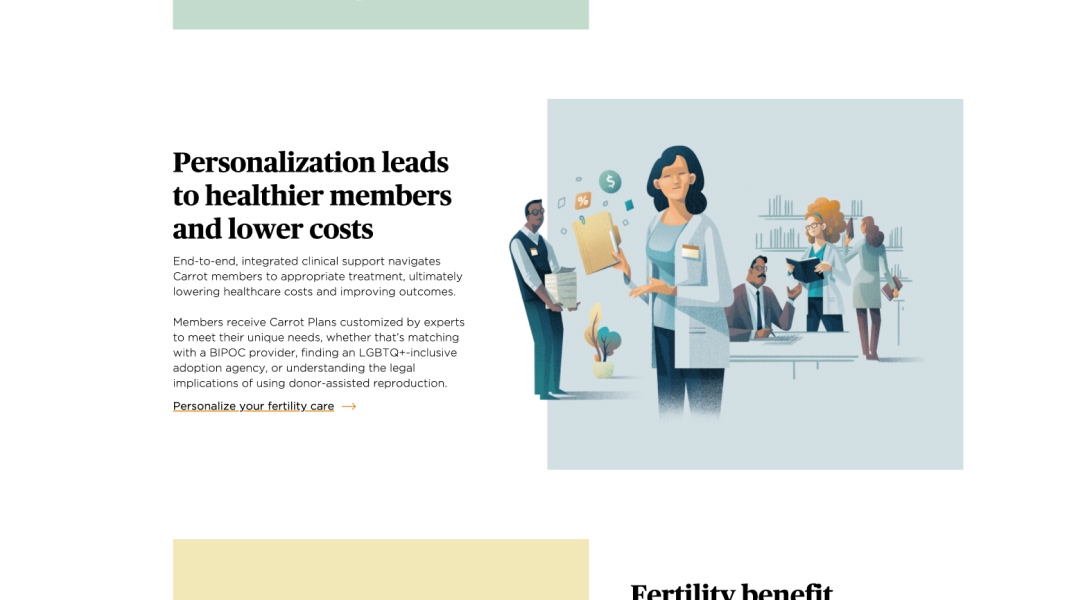
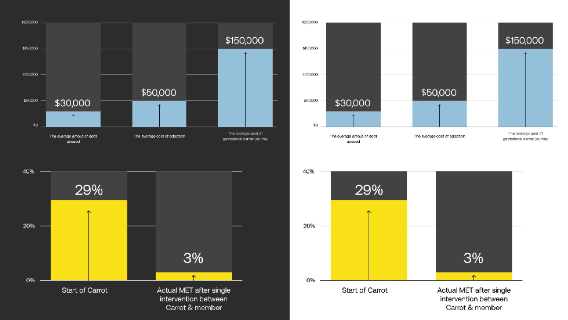
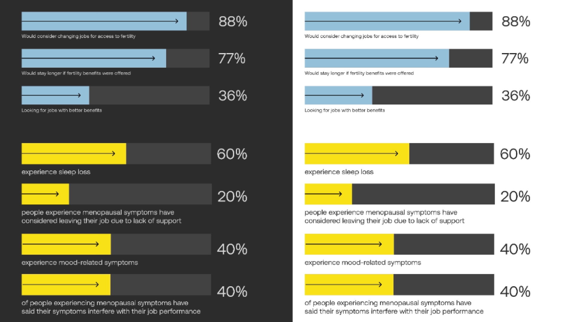
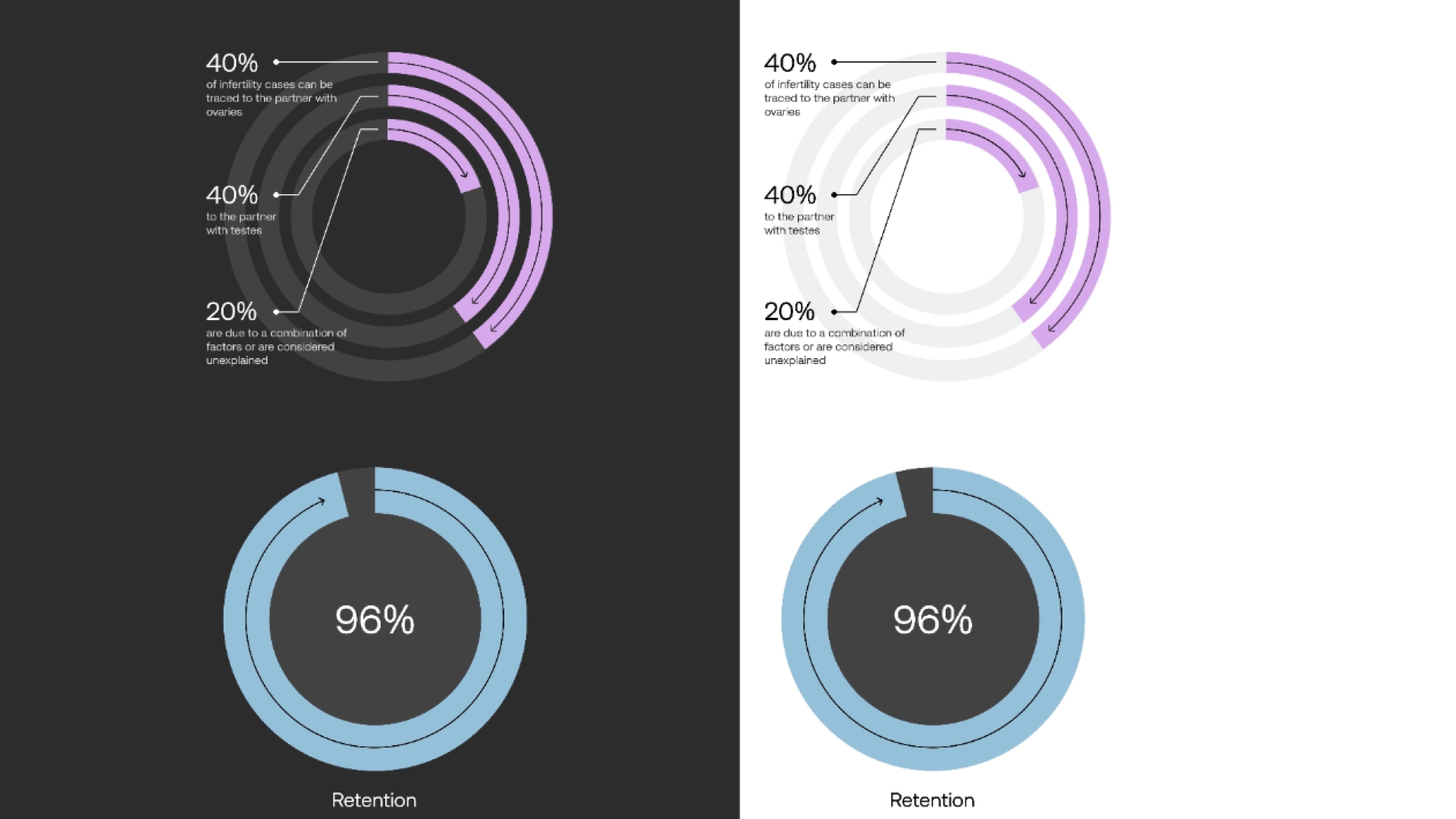
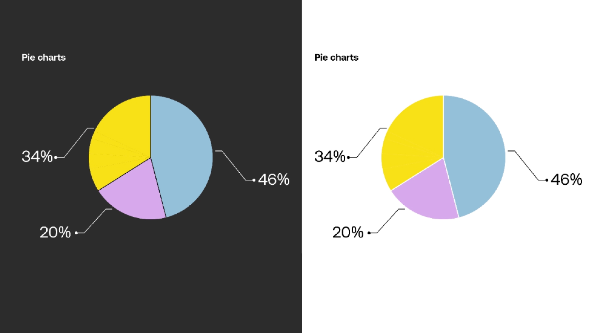
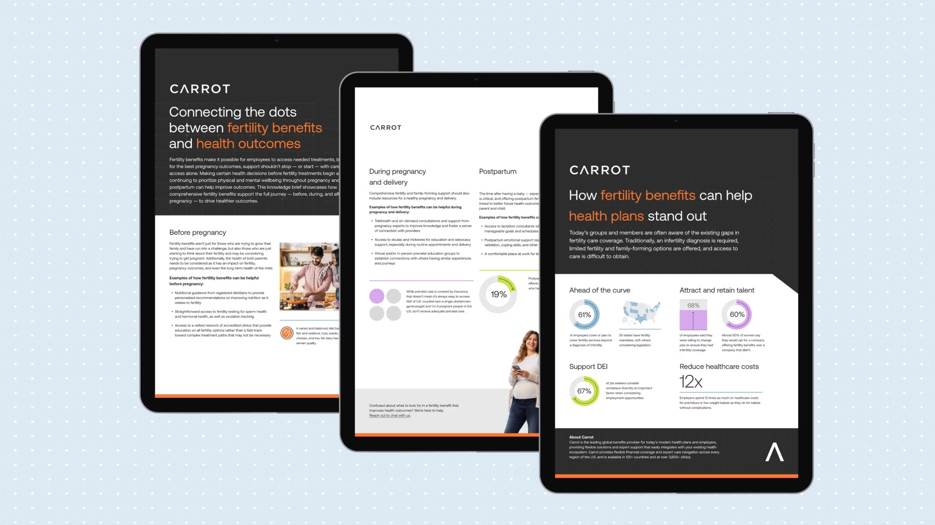
Data Visualization System
We built a comprehensive data visualization system, standardized charts, dashboards, and visual rules, turning Carrot's clinical outcomes data into a consistent storytelling language. This was the most direct expression of the brand strategy: if data is the hero, it needs its own visual vocabulary.
Iconography System
We refreshed our iconography and established clear rules for consistent use and future additions, drawing inspiration from Material Design.
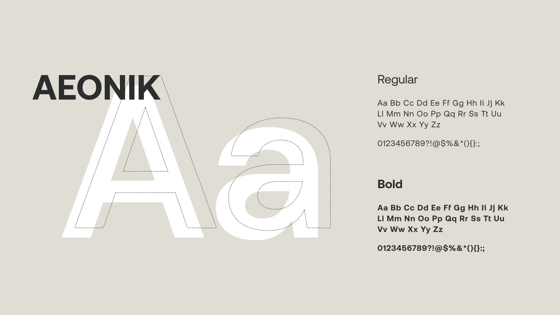
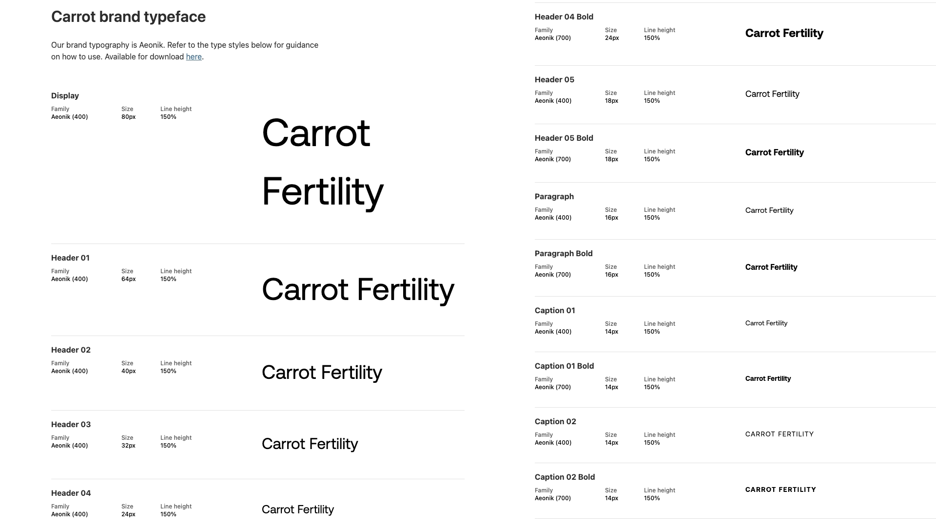
Typography
Clean, authoritative, and highly legible across digital and print. Selected to complement the existing logo and carry the brand's shift toward precision and credibility.
Photography
We replaced stock imagery with a photography direction built around real human moments, diverse, specific, grounded. Fertility is one of the most emotionally charged topics in a person's life. The photography had to honor that without being heavy-handed.


Grids and Patterns

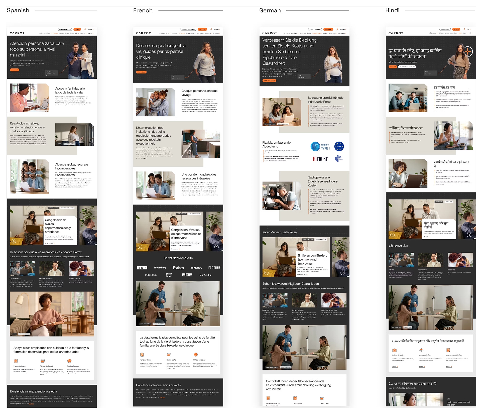
Web Design
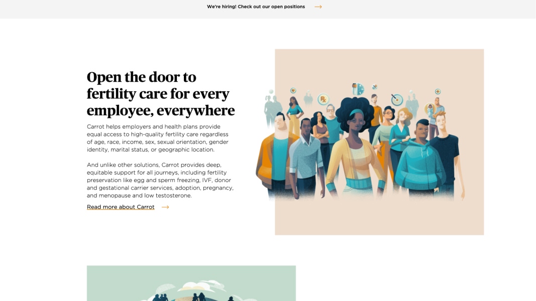
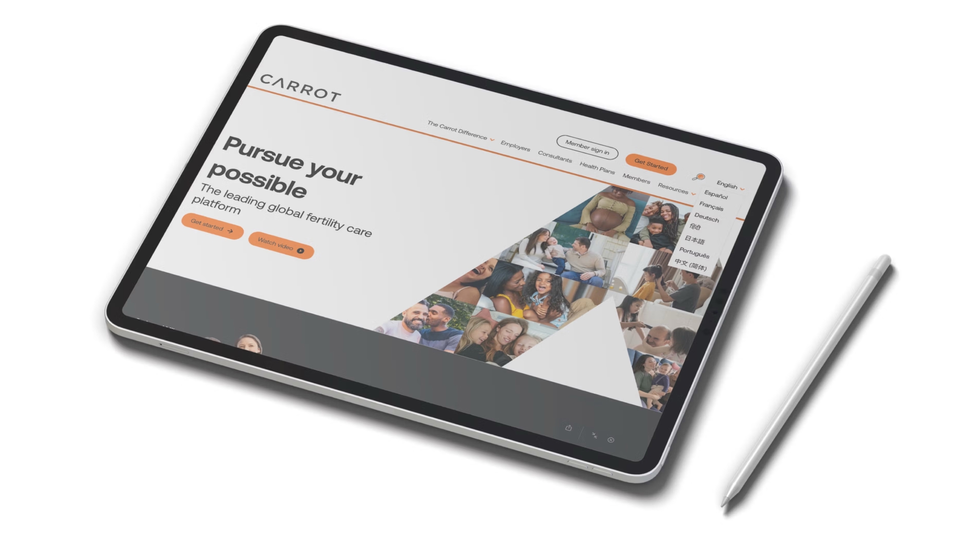
The marketing website was the first full public expression of the new brand direction, where everything we'd built in the system had to come together and work simultaneously.
The design challenge was balancing Carrot's two distinct buyer audiences on a single site: employers evaluating a benefits platform, and health plans and consultants assessing a clinical partner. Different motivations, different vocabularies, different decision timelines. The information architecture had to serve both without forcing either to hunt for what they needed.
The data visualization system did significant work here, translating Carrot's clinical outcomes into visuals that conveyed authority at a glance, without requiring readers to parse dense statistics to understand why Carrot was the right choice.

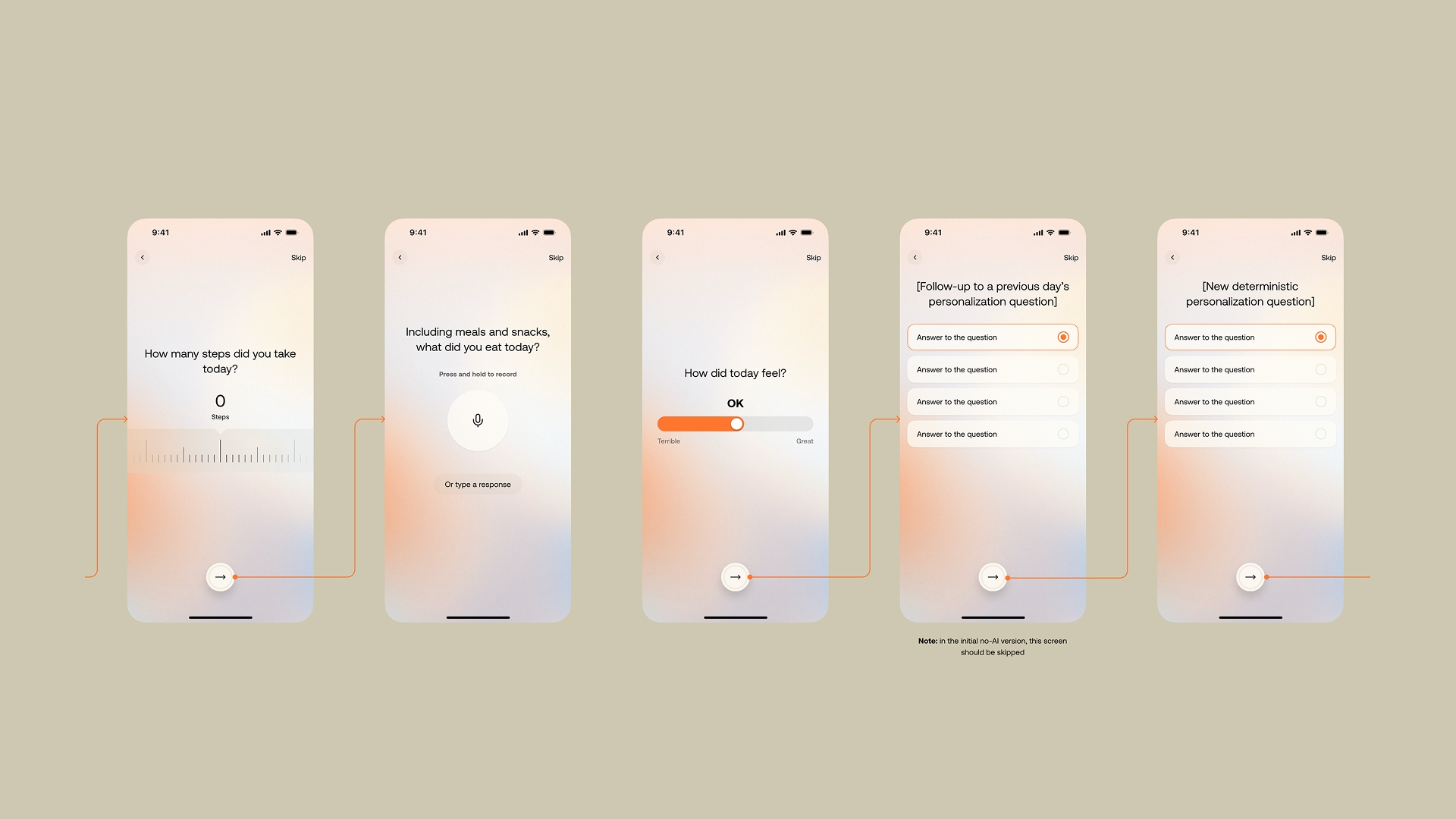
Product Design: Carrot Sprints
The Problem
For individuals trying to conceive, metabolic health is one of the most significant and most overlooked factors affecting fertility outcomes. Obesity, blood sugar dysregulation, and related conditions meaningfully impact conception rates, but the connection between metabolic health and fertility isn't well understood by most people going through the process.
The behavioral challenge is compounding: making and sustaining lifestyle changes during an already emotionally difficult period is hard. Generic wellness advice doesn't work. What people need is something personalized, time-bound, and tied directly to their fertility journey.
The Opportunity
An AI-driven metabolic health program built specifically for people trying to conceive that delivers personalized interventions during the windows when behavior change matters most.
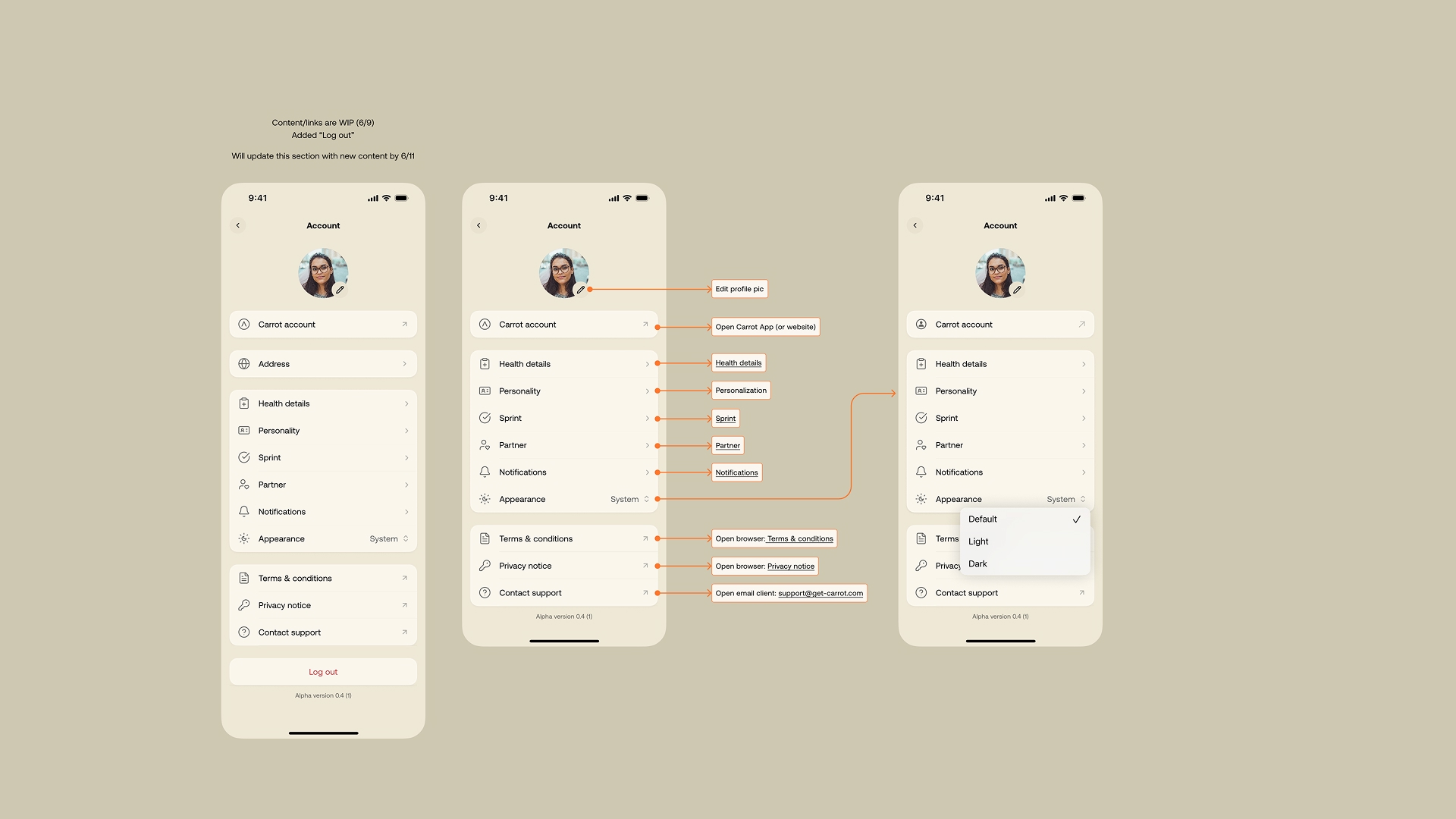
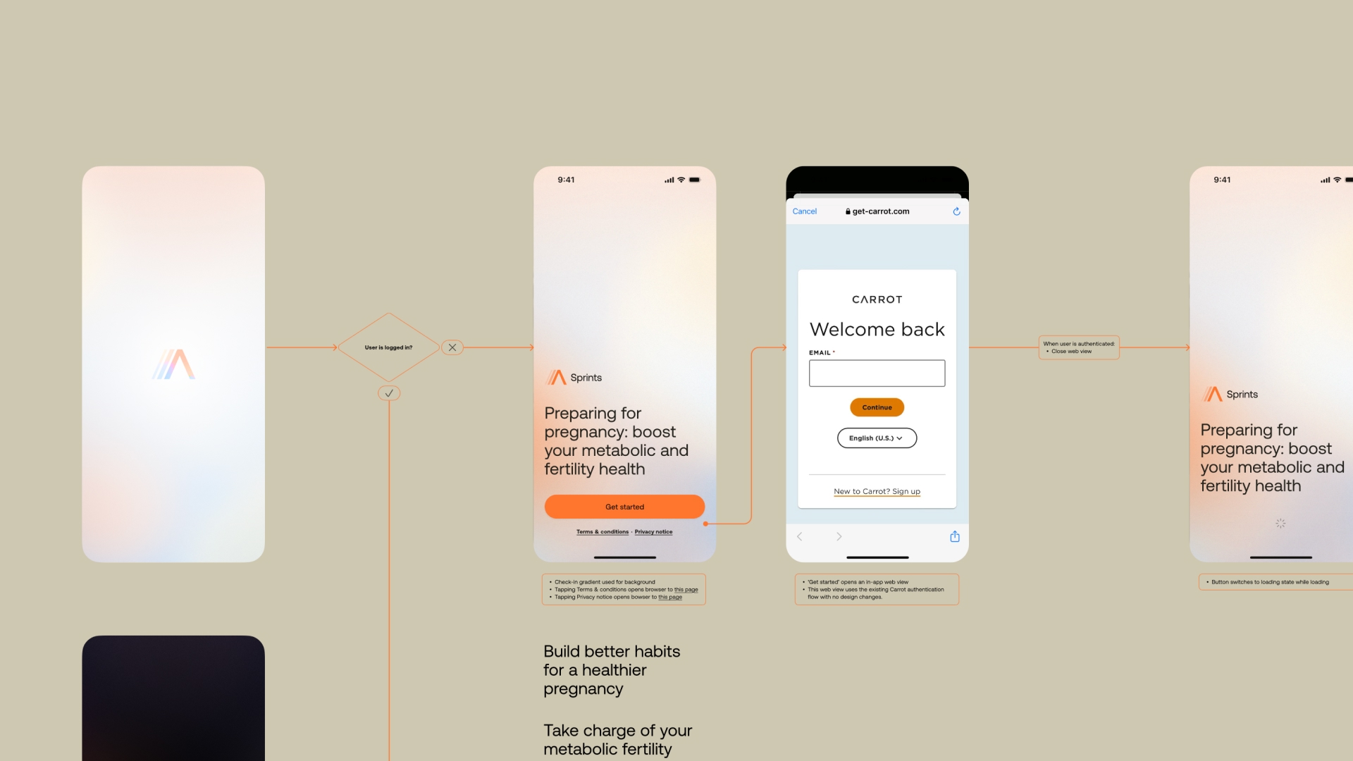
What We Built
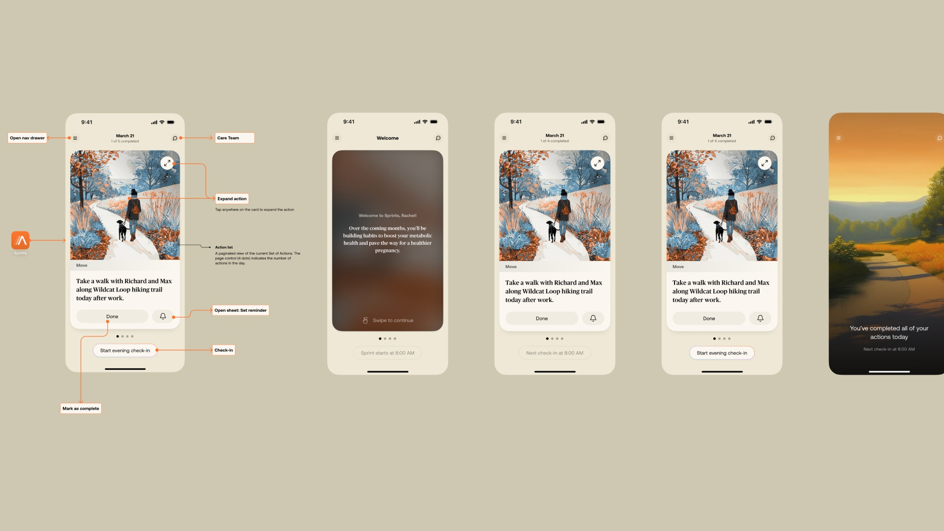
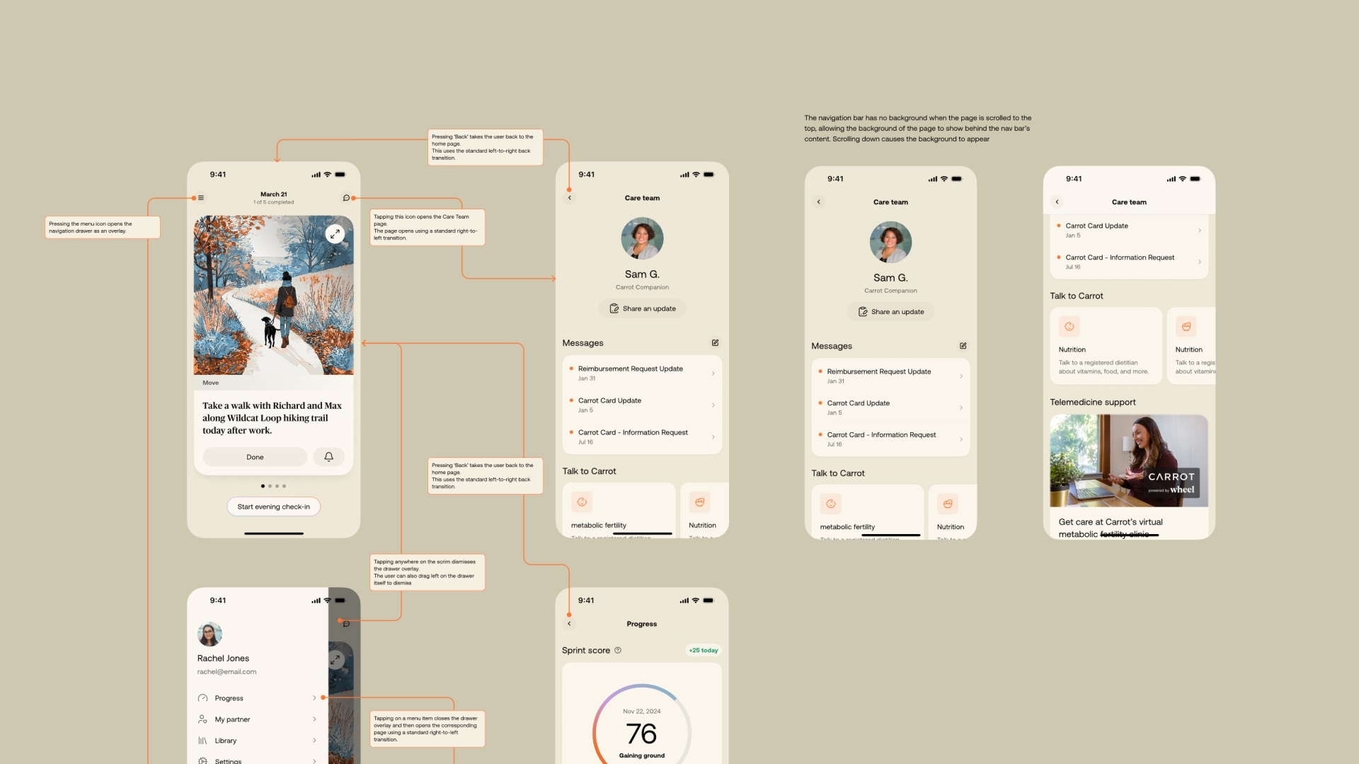
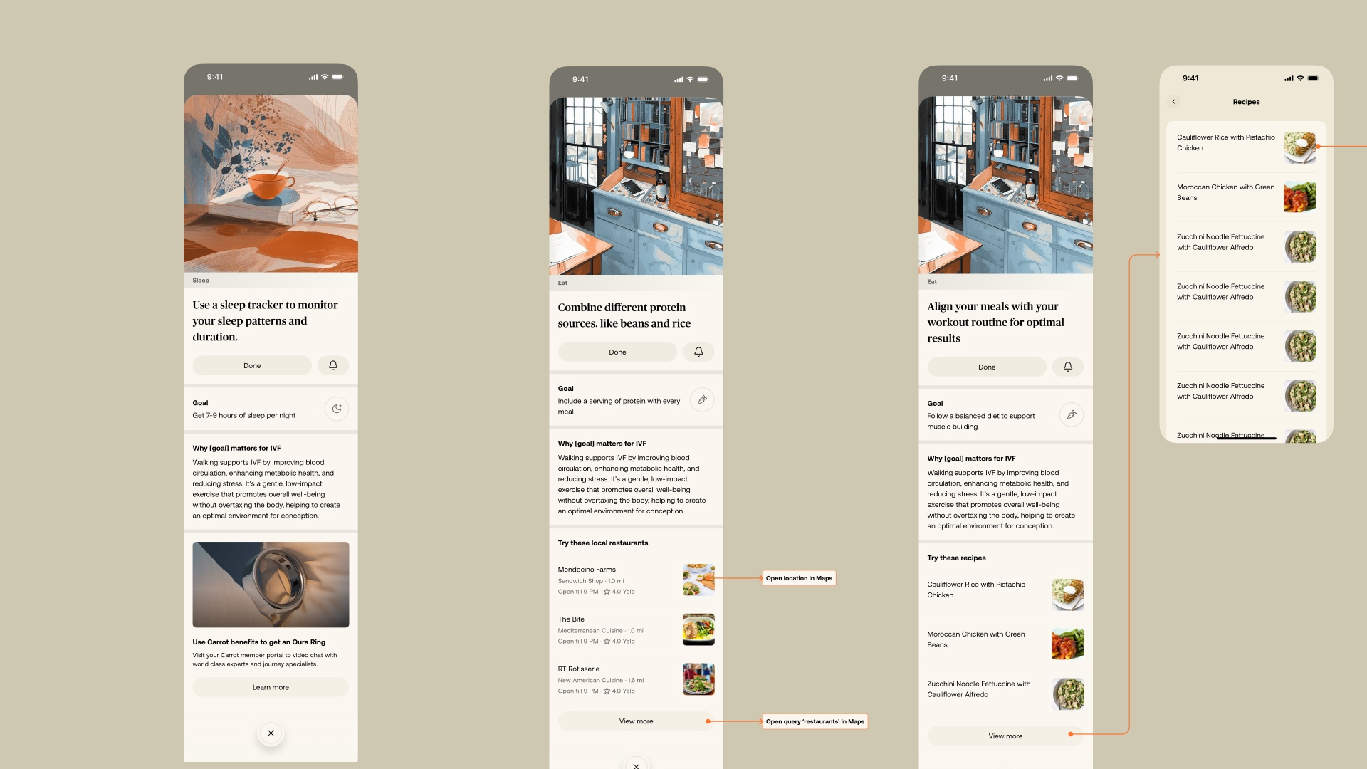
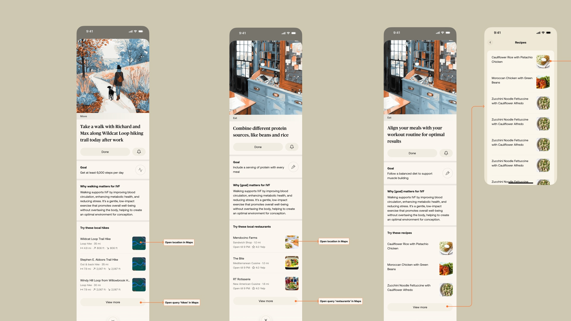
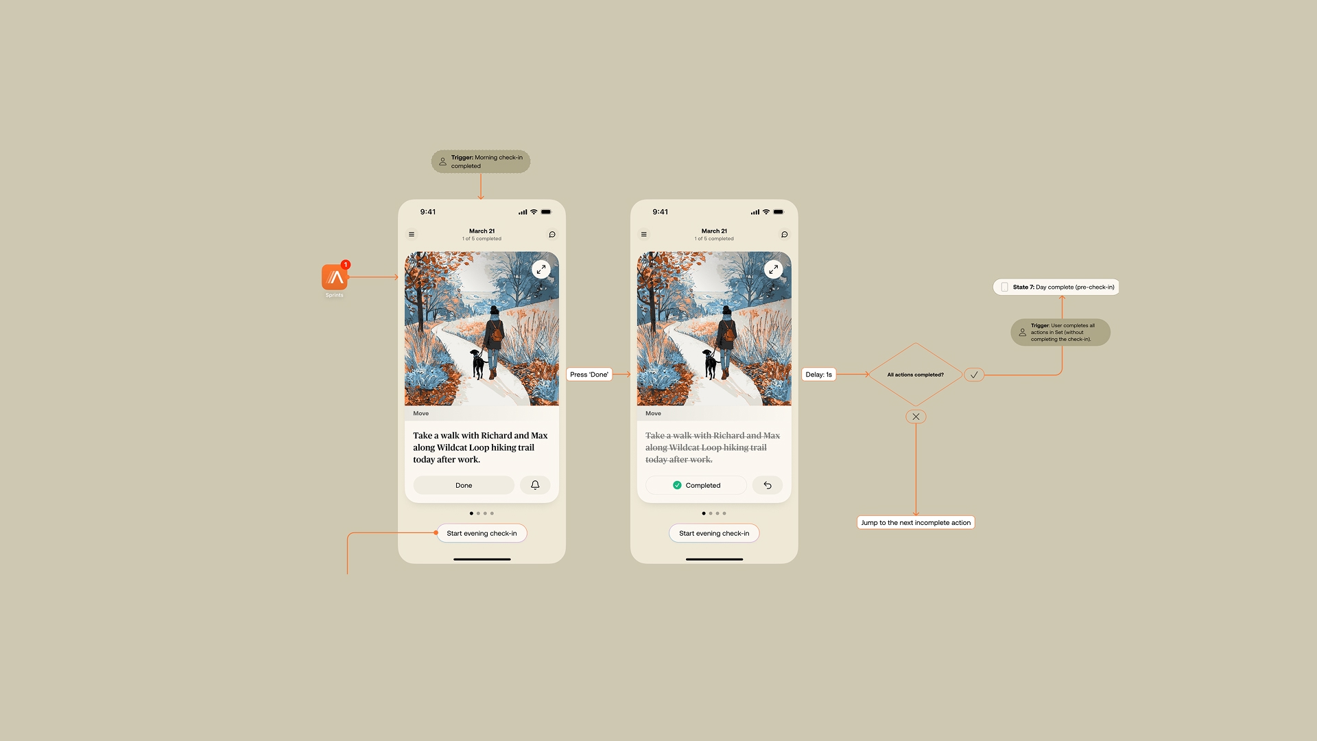
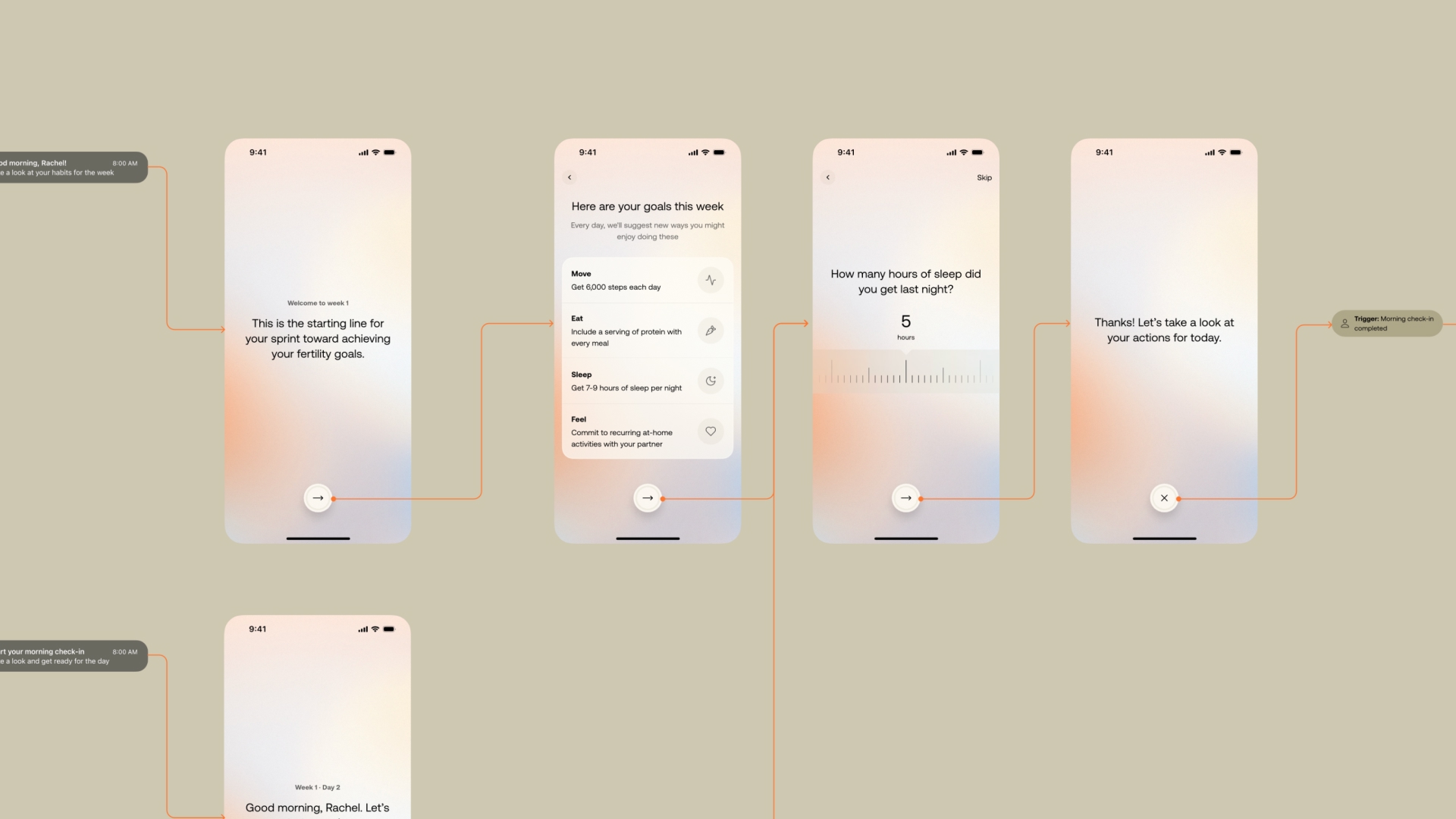
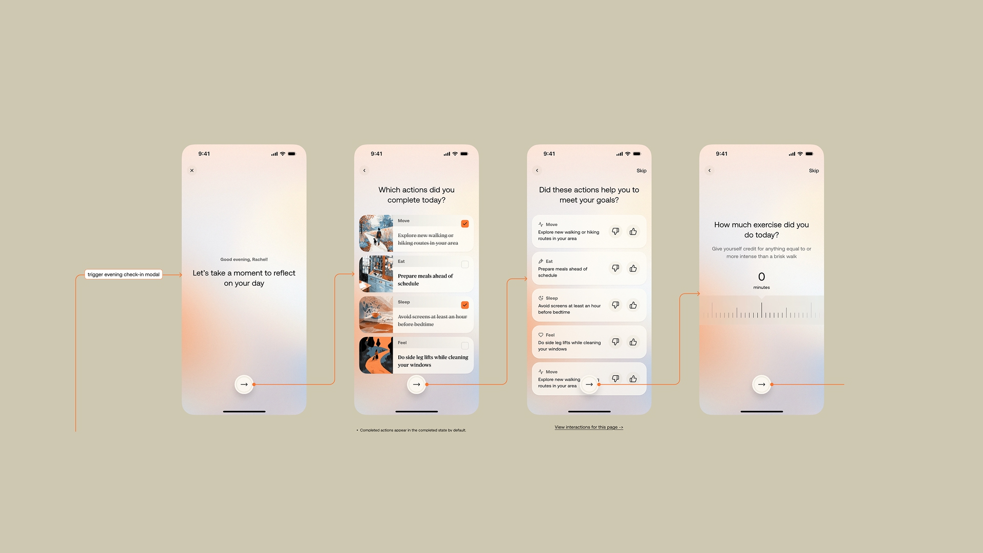
Carrot Sprints is a personalized, time-bound program that addresses the metabolic causes of infertility, including obesity, blood sugar issues, and sperm health, through AI-driven habit formation and coaching. The product meets users at a specific, high-motivation moment: when they're actively trying to conceive and acutely aware that their choices matter.
As Sr. Design Director, I led the product design from concept through beta launch, defining the product vision, information architecture, interaction model, and visual language. This was a true 0→1 engagement: there was no prior product to build from, no established pattern library to lean on. We made foundational decisions about how the product should feel, how it should guide users through a program, and how it should communicate clinical information without sounding clinical.
The product launched in beta. Shipping a novel AI health product from scratch, one that required building interaction models, clinical communication frameworks, and a product vision that didn't exist before we started, is what 0→1 actually means. The outcome isn't a metric yet. It's a product that exists in the world, being used by people trying to conceive, that wasn't there before.
What I'd Do Differently
On the rebrand: I'd emphasized more on the need to change the logo, as a generic shape hurts the brand. I'd invest more time earlier in the data visualization system. We built it in parallel with the broader identity work, which meant some of the early brand expressions didn't fully reflect what the data language was capable of. A tighter sequencing, data visualization first, then extending outward, would have made the early outputs more cohesive.
On Sprints: the 0→1 product design process surfaced a tension I'd want to address earlier next time, between designing for the emotional reality of someone trying to conceive and designing for the clinical rigor the product needed to be credible. We resolved it, but it took longer than it should have. That tension needed a shared framework from the start, not a decision made surface by surface.
Selected Works


heraclio@designstgy.com