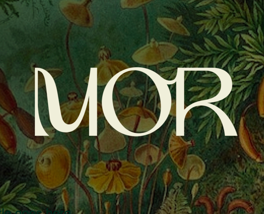
Mor
Employer: All Turtles
Role: Sr. Design Director
Year: 2023
The Team
- Christina King - Design Lead
- Forrest Bryant - Content Lead
- Peter Kemme - Motion Design
- Carlos Rocafort - Illustration
- Clio Atencio - Sr. Design Director
Services Provided
- Design Strategy
- Visual Identity
- UX & UI Design
- Copywriting
My Role
As the Sr. Director of Design led the Design team and led the Design Strategy. My role focused on enabling the team to thrive in a fast-moving, uncertain environment—clearing blockers, shaping creative direction and growth strategy, and ensuring strategic alignment across disciplines.
The Problem
Death in America is broken, defined by systemic failures that prioritize aggressive medical intervention over quality of life. Families are left to navigate staggering financial costs and overwhelming administrative burdens, leading to widespread burnout and emotional distress. This focus on crisis management often strips the experience of its meaning, overshadowing opportunities for connection and legacy. We must transform death from a source of isolation and confusion into a humane, supported, and meaningful part of life.
“Funeral and end-of-life planning is something no one likes to do, but Americans are particularly bad at it. We act like death is a lifestyle choice that isn’t right for our family…. I think real change would require a more realistic orientation toward aging and death."
- Josh Slocum, Executive Director, Funeral Consumers Alliance
Approach to Death
In America, death remains a social taboo, avoided in conversation even when imminent. This silence is a barrier to preparation; research shows only 10% of Americans have discussed end-of-life wishes with a provider, leaving families unequipped for critical decisions. Our cultural discomfort replaces openness with avoidance, hindering practical planning and preventing us from approaching life’s end with the clarity, compassion, and humanity it deserves
The Opportunity
The global relationship with death is undergoing a profound shift as the cracks in our current systems become impossible to ignore. From this urgency, the “death positive” movement has emerged, reframing death not as a taboo medical event, but as an essential part of an emotionally healthy life. By confronting mortality with openness, compassion, and creativity, we can transform the end-of-life experience from a crisis into a meaningful opportunity for connection and healing.
The Solution
Mor is a barrier-breaking brand that transforms how we relate to death through rich mixed-media content and a compassionate community. By fostering both online and in-person spaces for reflection, Mor replaces avoidance with open dialogue and support. Beyond conversation, the platform offers curated products and services to help families navigate end-of-life needs with clarity and dignity. Combining education with practical tools, Mor reimagines death not as a mere ending, but as a meaningful part of a well-lived life.
We do not fear life, so we do not fear death.
The presence of death is the defining truth of life.
And we choose to embrace the truth.
Respect death, and celebrate life.
Today, in this singular moment:
LIVE!
The Brand
The Name Process
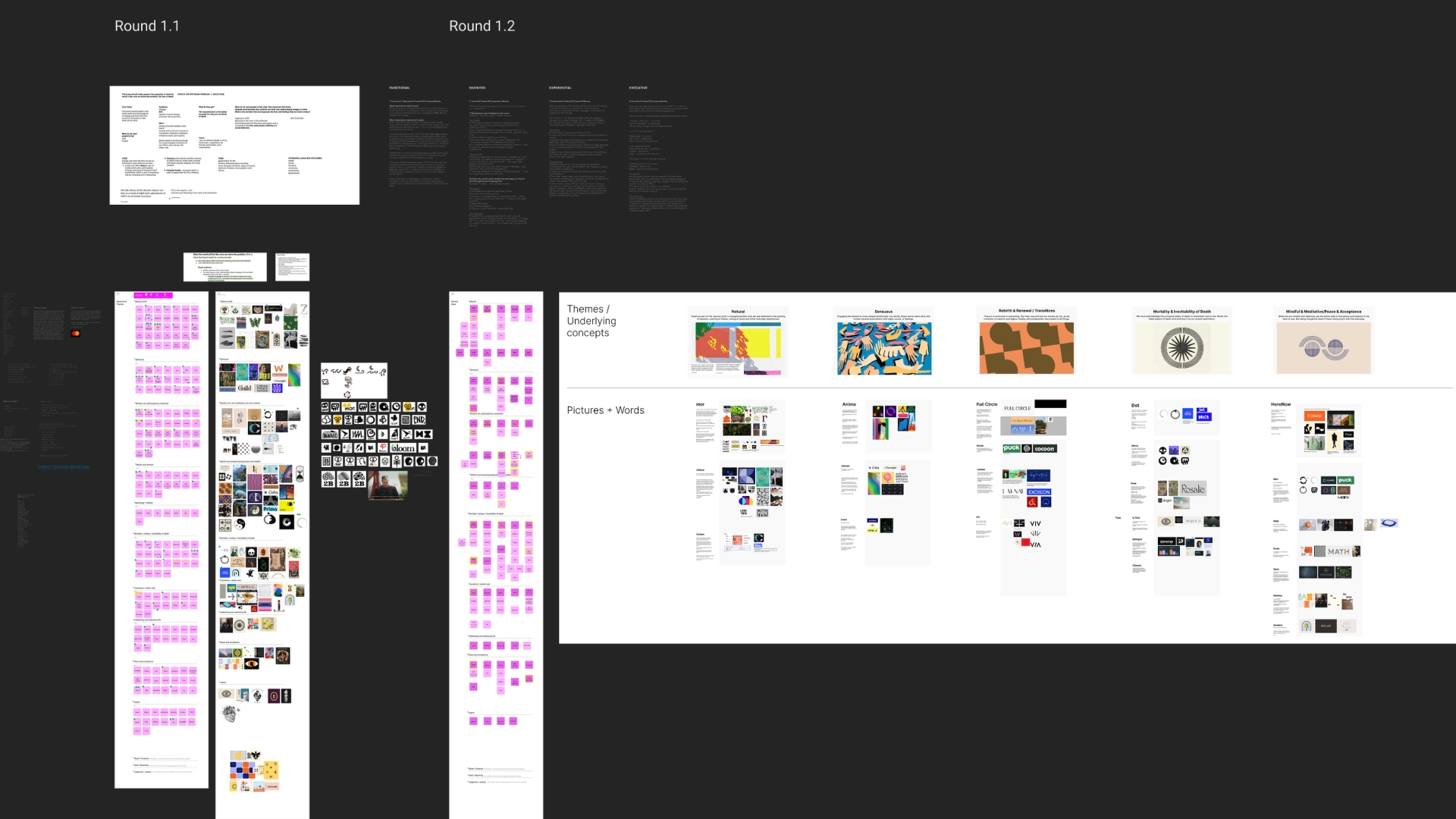
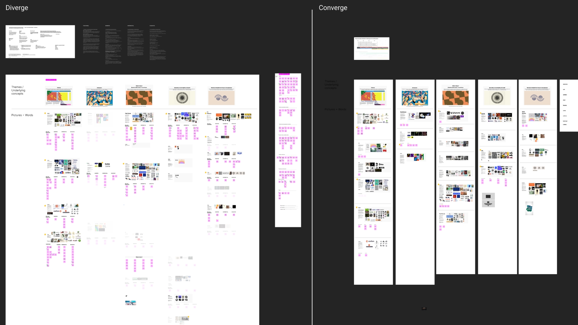
After doing the primary research with the founders and the executive team and performing secondary research, we started our creative process following a iterative double diamond approach, were we diverge and generate a vast amount of name ideas paired with visuals, and then filter based on the best ones, we repeated that process 7 times and it got us to the final name with a clear direction for a visual identity..
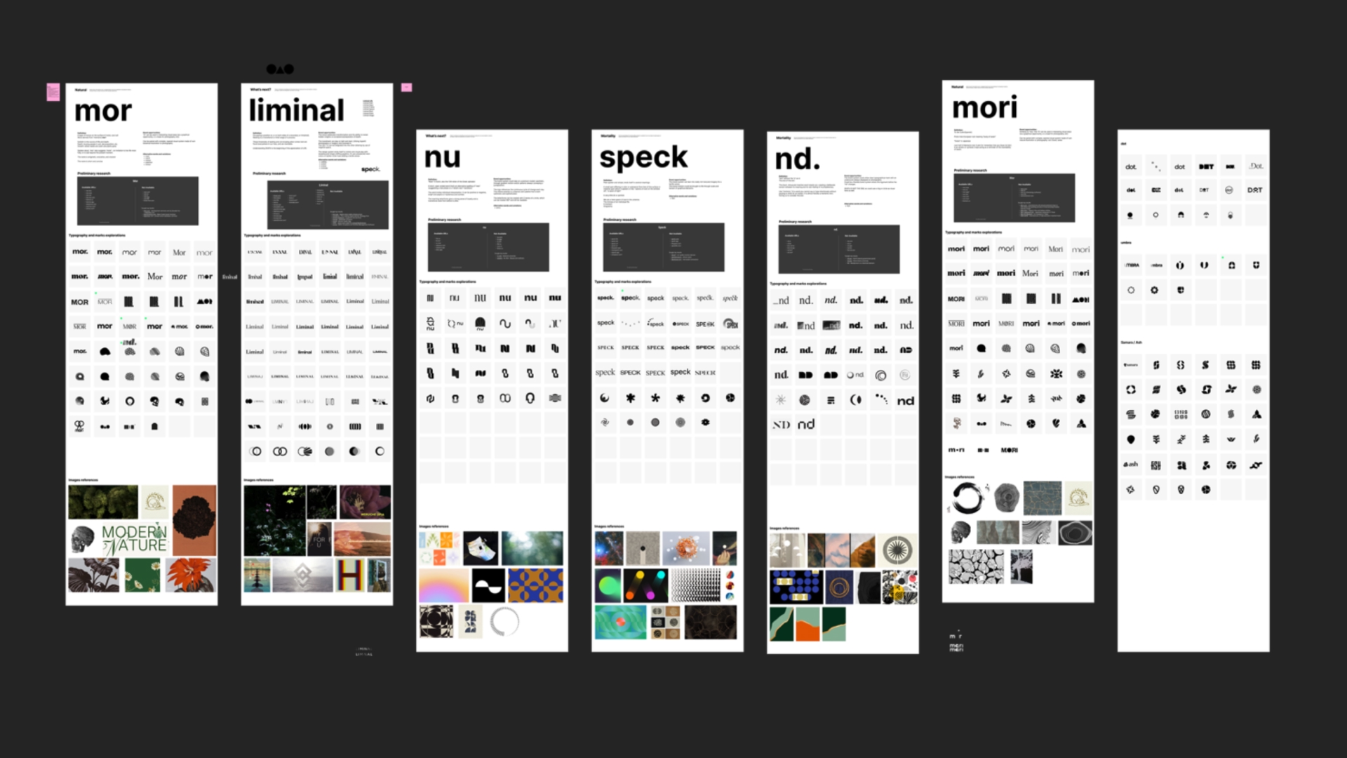
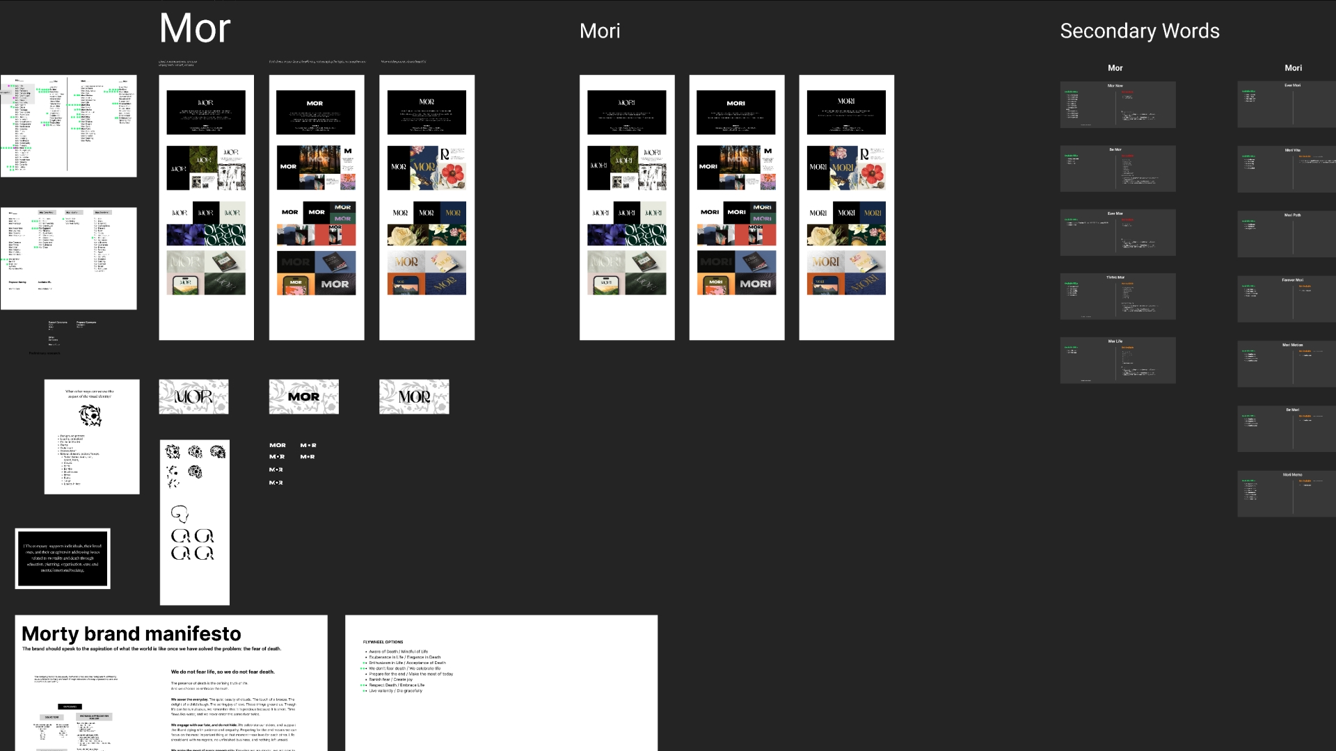
The Name: Mor
represents a layer of humus on the surface of moist, cool soil. The Word is derived from "memento mori." Soil/dirt is the source of life and death.
Death: burying people in soil, decomposition, etc.
Brand Mission
and Vision
Mor helps people cope with death so they can have more present & Vision, and meaningful lives.
Supporting individuals, loved ones, and caregivers, we replace fear and confusion with educational, organizational, and emotional foundations that foster acceptance, constructive action, and making the most of our limited time on Earth.
Brand Values
What do we want people to feel when interacting with the brand?
EMPOWERED
VALIANT
SAFE
GUIDED
NATURAL
NORMAL
CENTERED
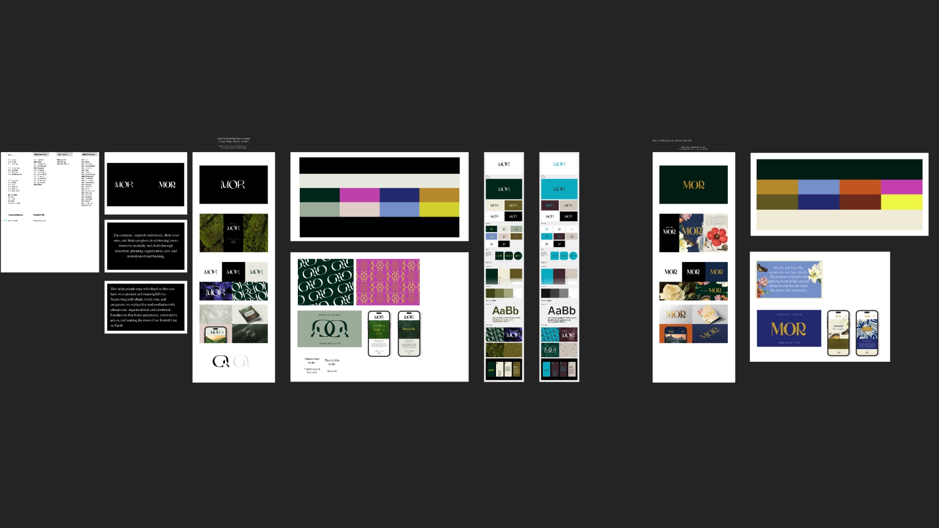
The Visual Identity
The Logo
Brought to life through a sinuously graceful, bespoke modern logotype, containing elegant circular letterforms representing fluidity and wholeness.

Positive & Negative Logos
This is the primary logo, the main visual expression of the brand. Only use the logo provided in the link below.

Grayscale Logo
The application is only to be used in a situation of print color limitations. Examples may include a sponsorship or a print asset in a newspaper.

Safe Space and Scale
Please ensure there is enough safe space around the logo and use the height of the "R" to determine the measurement.
This distance is used to not crowd the logos with other graphic elements or partnership logos.

The Typography
The Mor brand uses two typefaces that complement the sinuous bespoke typography of the wordmark. Together they share the same proportions, but with different personalities.
Neue Haas Grotesk is utilitarian, matter-of-fact, and strong, whereas Tiempos Headline has unexpected detailing creating a refined, sophisticated look with painterly flourishes and details. They work both separately and together, and give the brand personality depth and contrast, a nod to the transition between life and death.
Mor's primary typeface is Neue Haas Grotesk, a grotesque typeface characterized by its stark, geometric lines and angular shapes. It is one of the oldest and most universally treasured and legible fonts used in the world.
Mor's secondary typeface is Tiempos Headline. It is to be used in Light for larger headlines and in Roman for smaller body copy.
When paired together, the spacing and weights of the fonts need to be slightly adjusted to work harmoniously together across digital and printed environments.


Color
Color Palette
Mor's primary color palette is verdant, earthy, and grounded with soft neutrals. The secondary palette features vibrant accents that convey hope and joy.
The overall palette highlights what Mor represents — respecting natural death, and embracing life, feeling empowered by the truth.
Mor's color system and guidelines are flexible and dynamic, providing the brand with a distinctive character that is easily recognized.

Brand Symbols
These stylized symbols are an extension of the brand, serving as supporting elements within the larger brand system. Use cases include the favicon, as a glyph to separate blocks of text, or stylized in patterns.


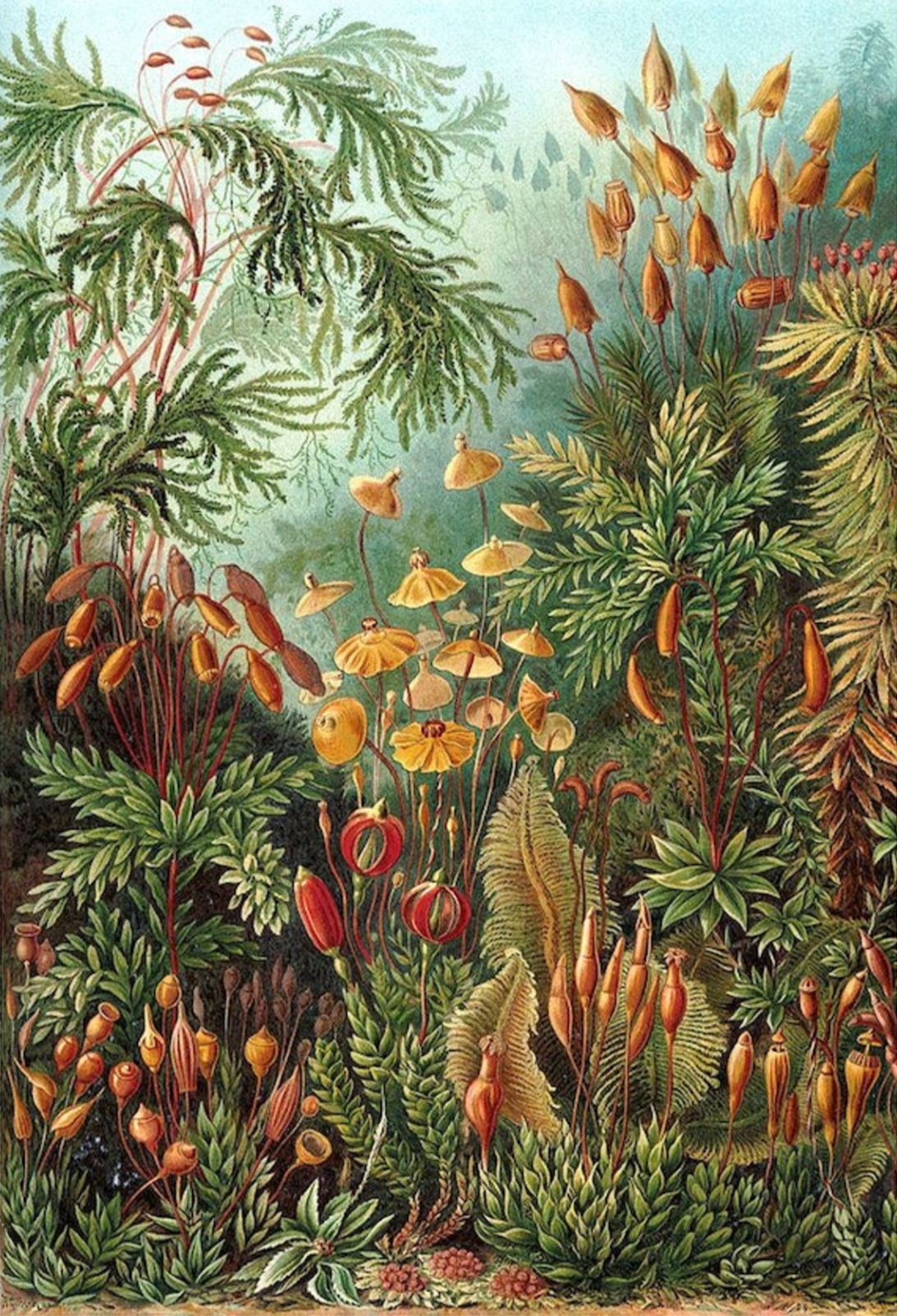
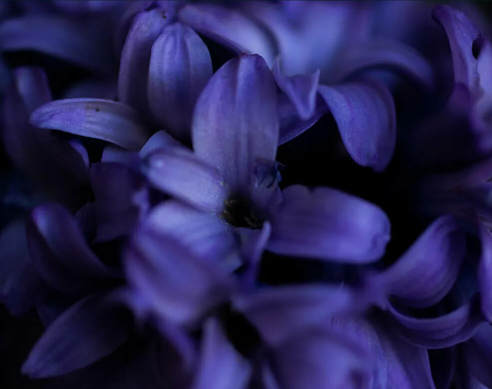
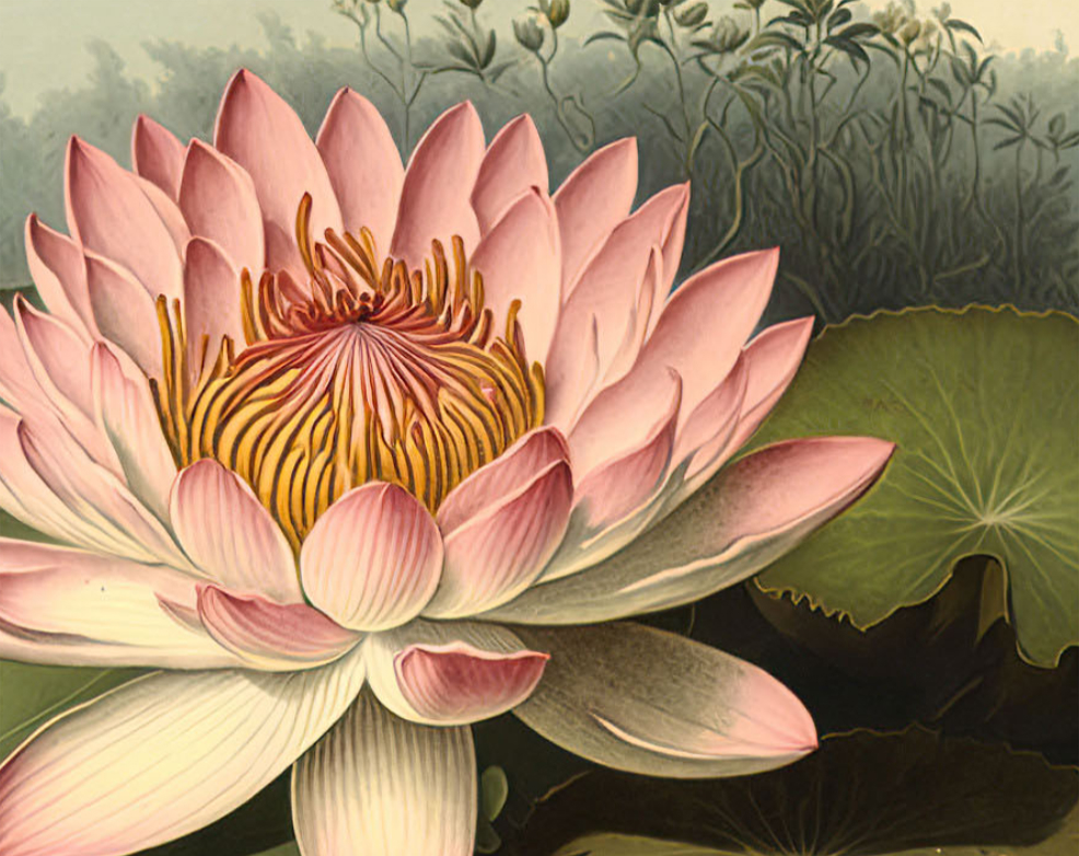
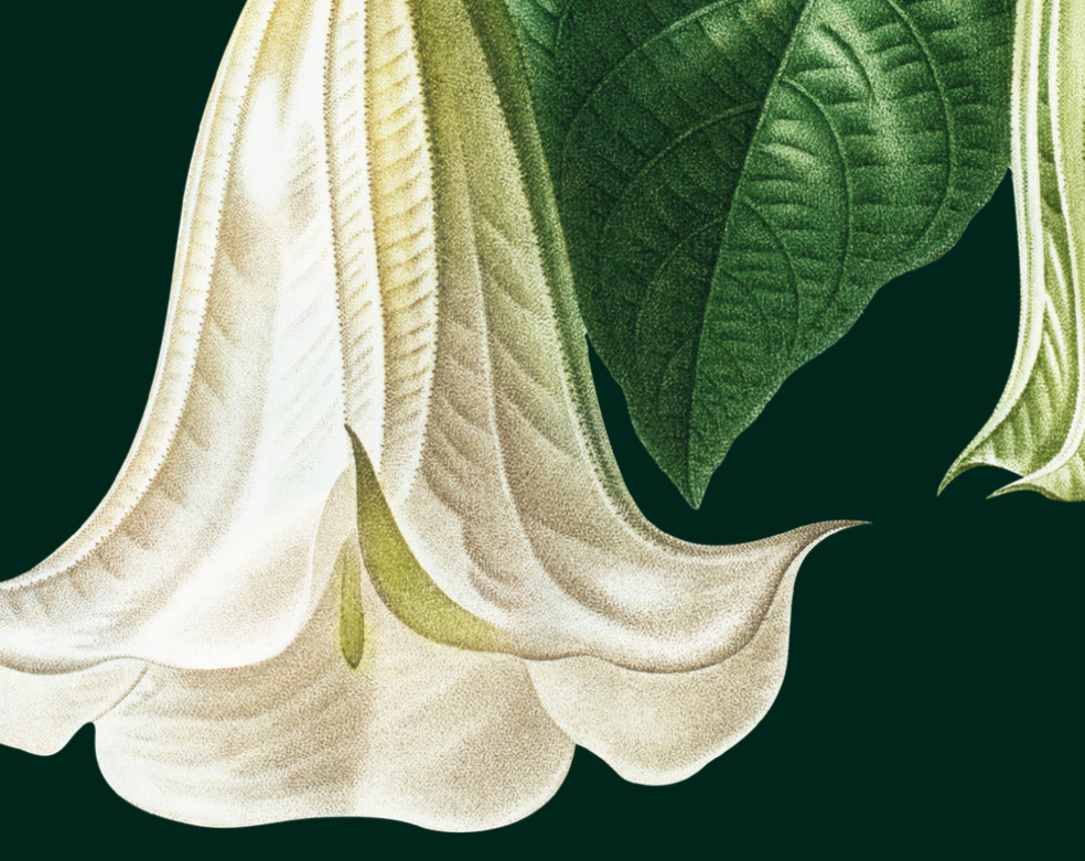
Brand Imagery
The name Mor relates to both mindfulness of death and the organic components of soil. The brand image library is similarly organic. We use illustrations and photography that are rich, earthy, sensuous, and evocative - steeped in the vibrancy of living things.

Applications
Digital Application Examples
On screens, the brand comes to life through bold organic imagery and clear, straightforward messaging.

Multichannel Application Examples
Mixed media digital experiences for discovery and reflection, Online and IRL community building activities for gathering and connecting, and curated products and services to choose and take action.

General Application Examples
These are an extension of the brand, showcasing various applications through pattern, printed pieces, a wordmark atop photography, and embroidery on cloth.


Selected Works