Sora Union
Employer: All Turtles
Role: Sr. Design Director
Year: 2022-2024

The Relationship
Sora Union was incubated and created at All Turtles. My Design team served as an embedded strategic design partner for the organization, working on developing the brand, products, hiring, and management
The Team
Dala Botha - Design Lead
Allie Packard - Design
Namika Hamasaki - Design
Ivan - Engineering Lead
Peter Kemme - Motion Design
Carlos Rocafort - Illustration
Clio Atencio - Sr. Design Director
Services Provided
- Brand Identity
- Design System
- Motion
- Digital Design
- Technical Consulting
- Team management
My Role
I supported the Design team in creating and expanding the Visual Identity. I simultaneously helped Sora Union with the hiring of talent, incorporated and managed several Sora designers into projects I worked on during my tenure at All Turtles.
What is Sora Union?
Sora Union is a globally distributed extension of Teams, helping companies access top talent on-demand without full-time commitments. By building dynamic, cost-effective teams, Sora Union accelerates execution while reshaping remote work for at-risk knowledge workers—connecting talent with stable opportunities regardless of location.
The Identity Work
The Name: Sora
The word 'Sora,' meaning 'sky' in Japanese, sounds like the word soaring, to fly or rise high in the air. It also feels regal, aspirational, and melodic to pronounce. The impact of war and climate change may force people out of their homelands—but the sky, the sunsets, and the stars always remain.
Visual Identity
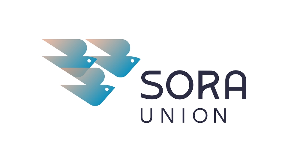
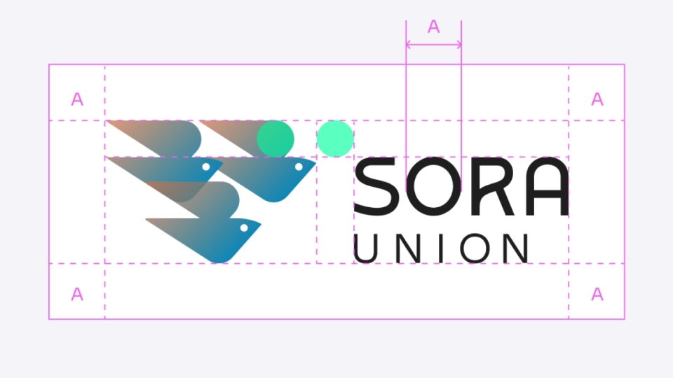
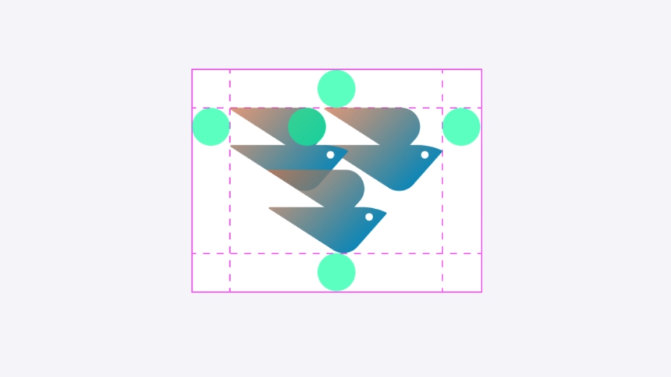
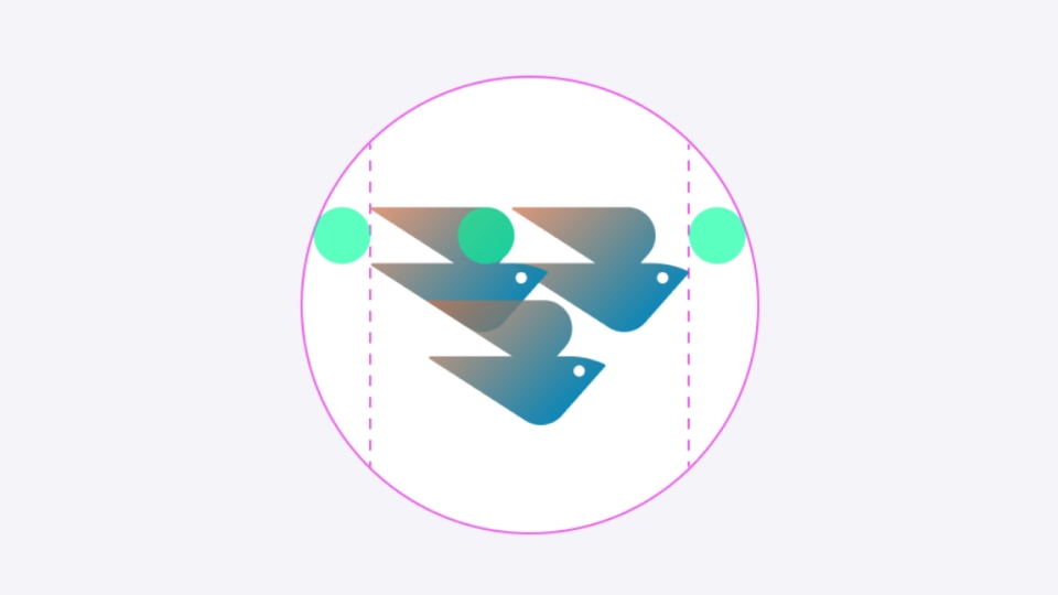
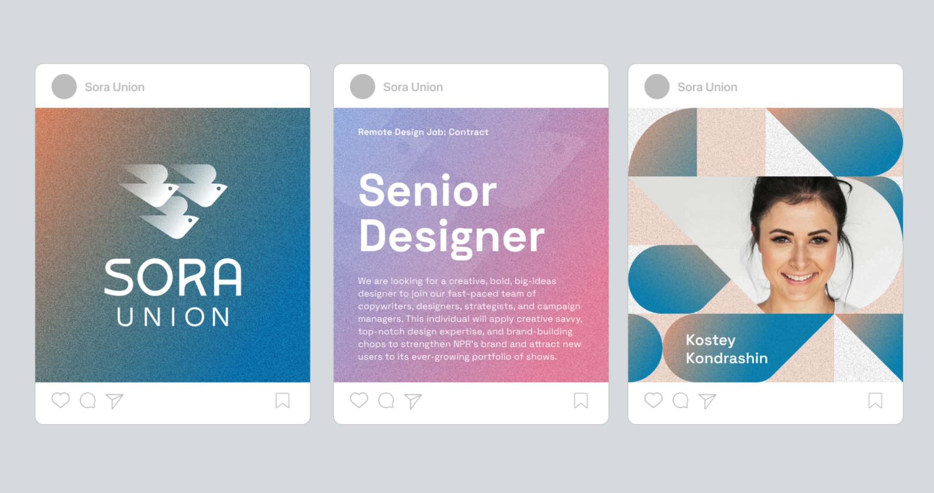
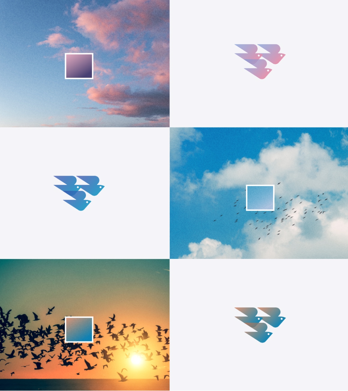
Sora Union’s brand needed to speak to two audiences: companies seeking talent and the talent itself. The visual identity strikes a balance between credibility and inspiration, evoking hope while reflecting a hyper-creative, globally distributed workforce. Its primary icon, three birds in flight, symbolizes community and teamwork, while the dynamic color palette mirrors the changing sky. The result is a memorable, aspirational identity that builds trust with clients and attracts top talent.
Color System
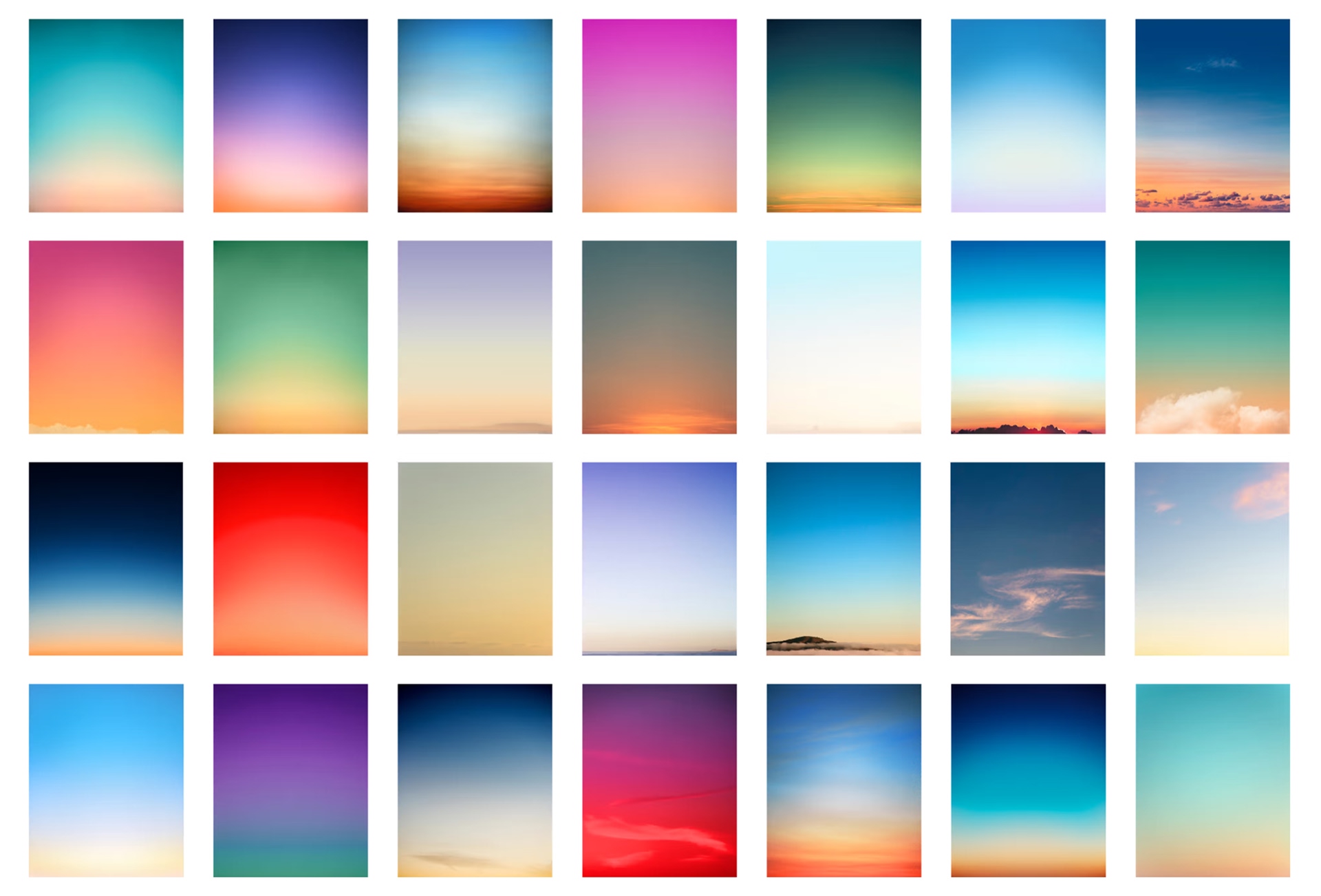
What is the color of the sky right now?
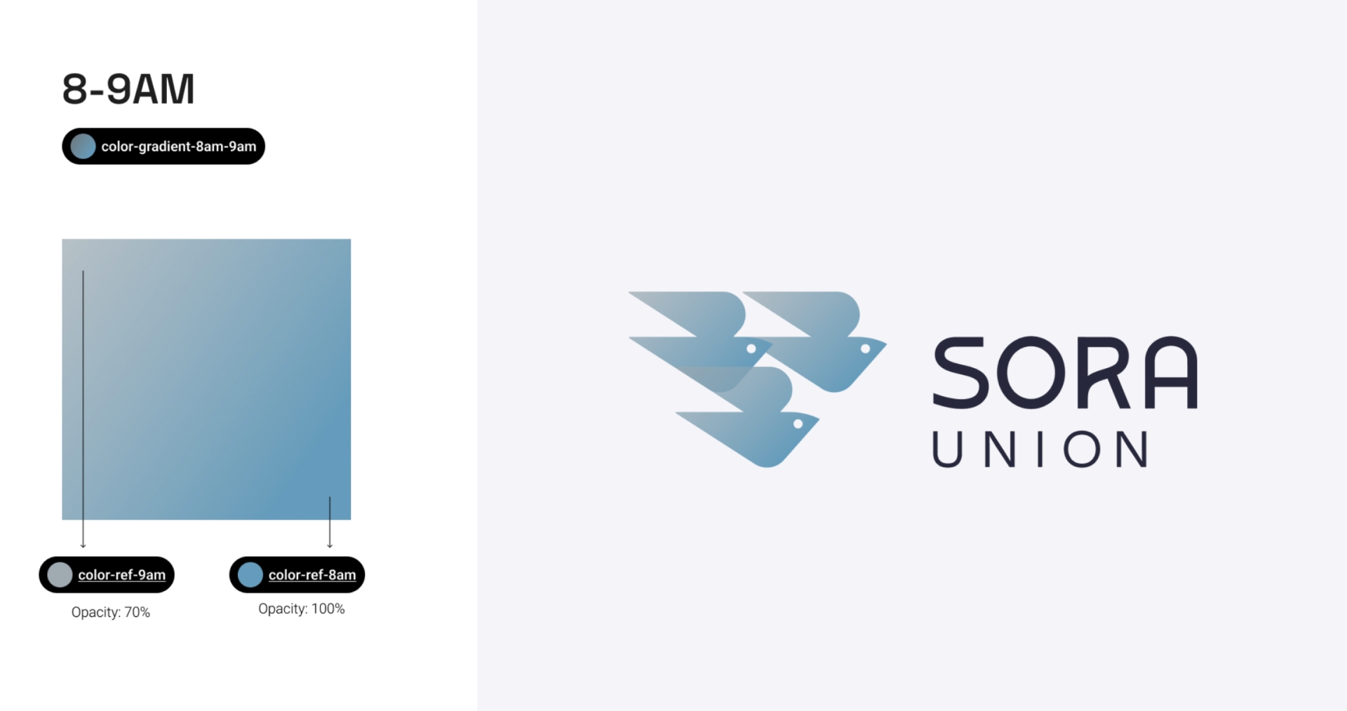
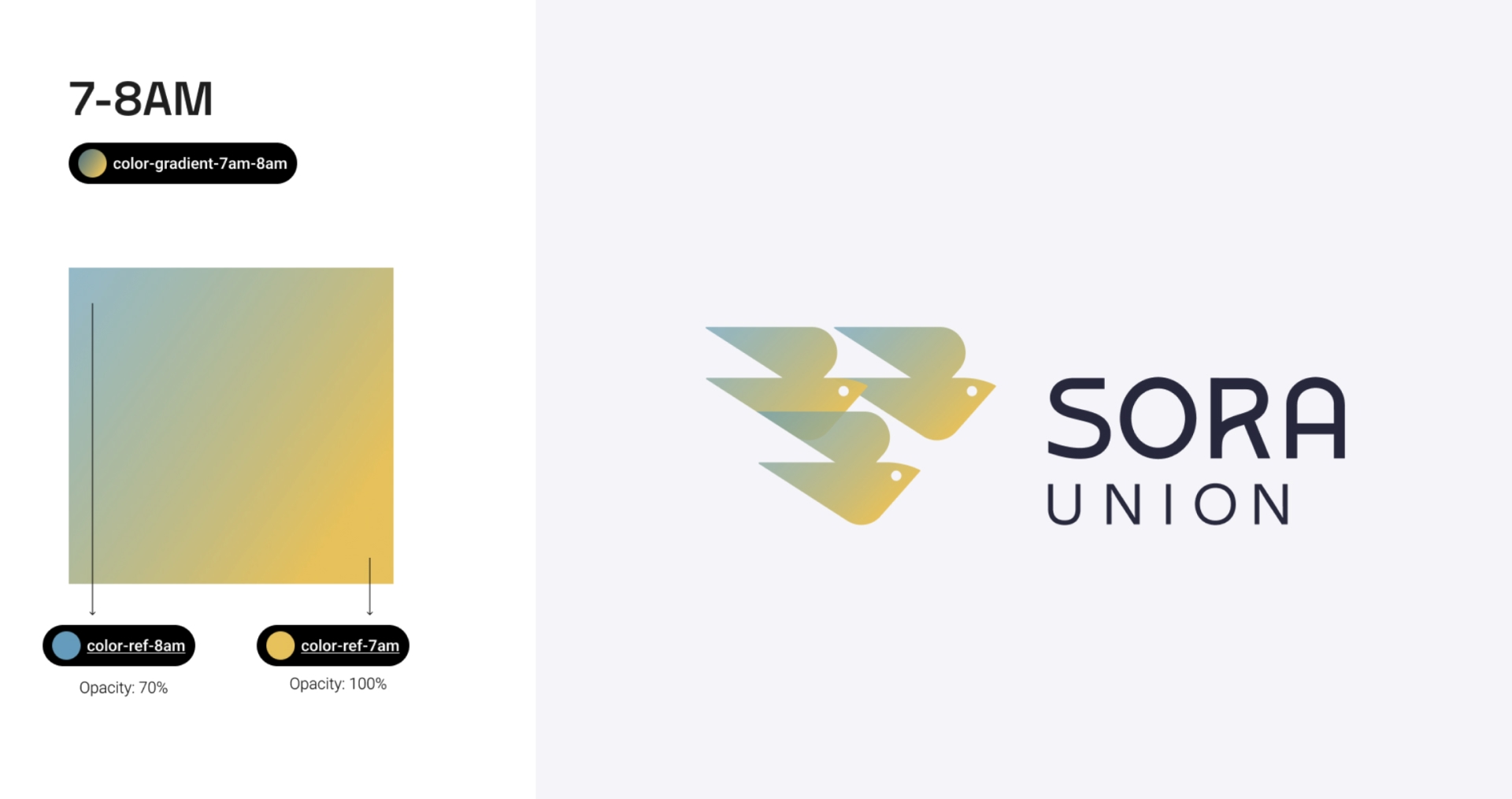
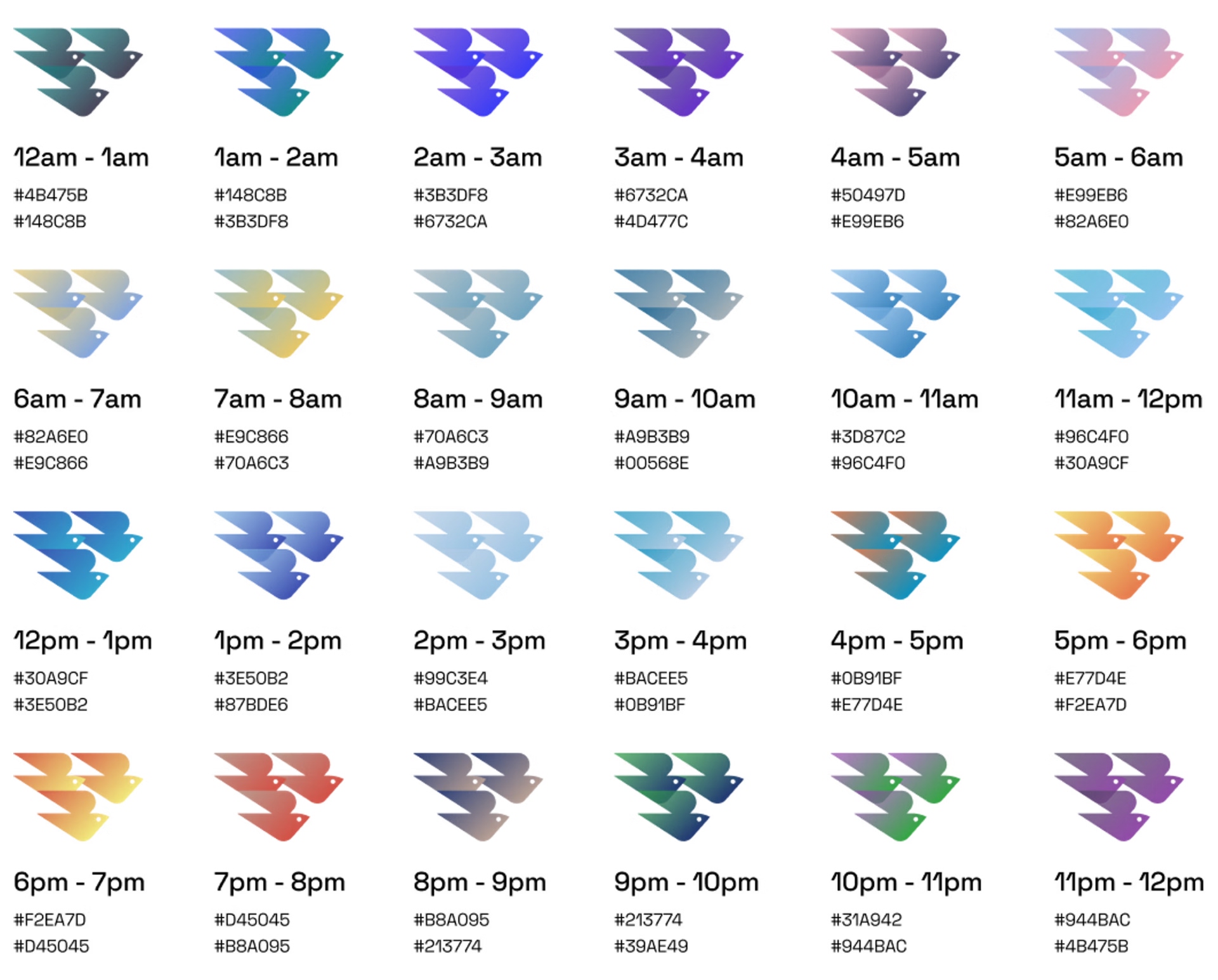
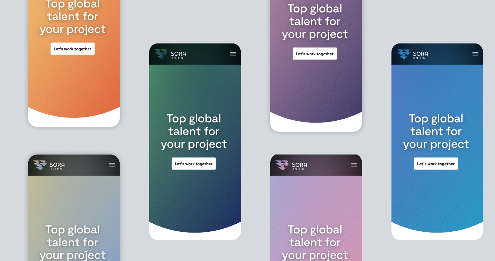
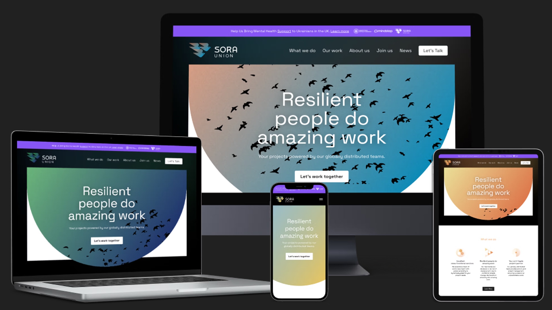
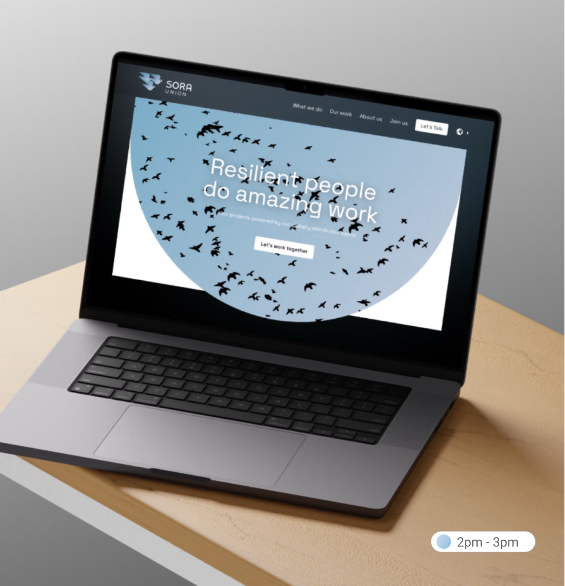
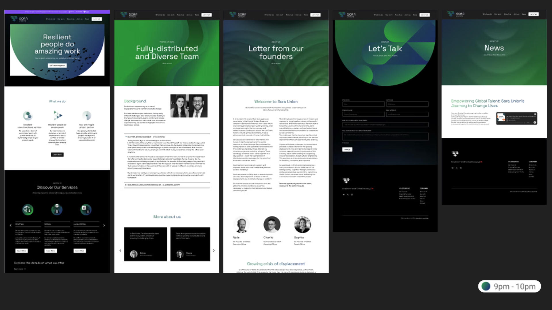
Sora Union’s color palette reflects the ever-changing sky above its global team. Website colors adapt to each visitor’s time zone, with background gradients shifting hourly—from sunrise blues to sunset oranges—creating a dynamic, connected experience. While subtle for first-time visitors, repeat users can appreciate the brand’s bold, evolving visual identity.
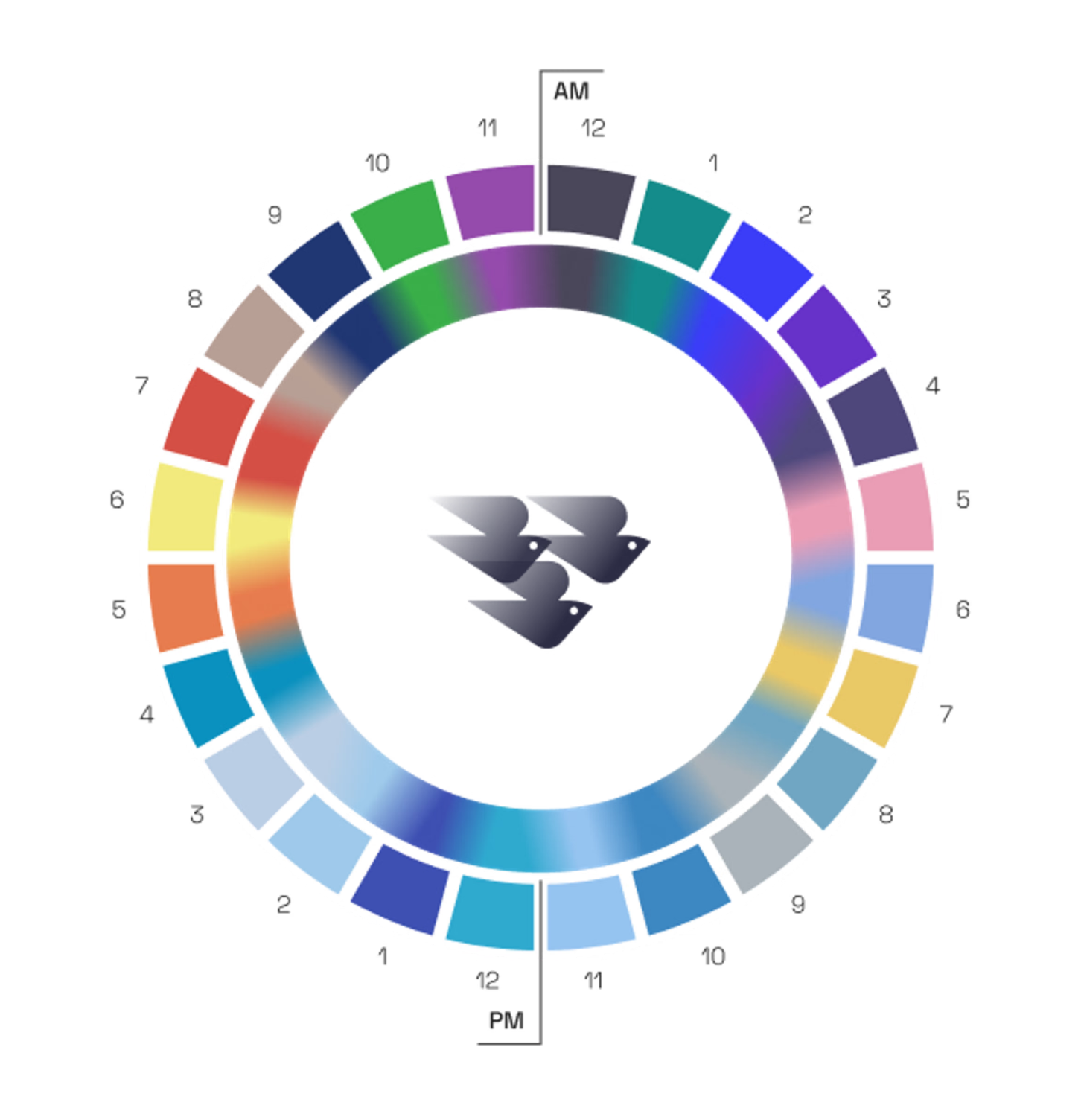

Primary Color Palette
Hey there, this is the default text for a new paragraph. Feel free to edit this paragraph by double clicking on it. After you are done just click on the yellow checkmark button on the top right to save. Have Fun!

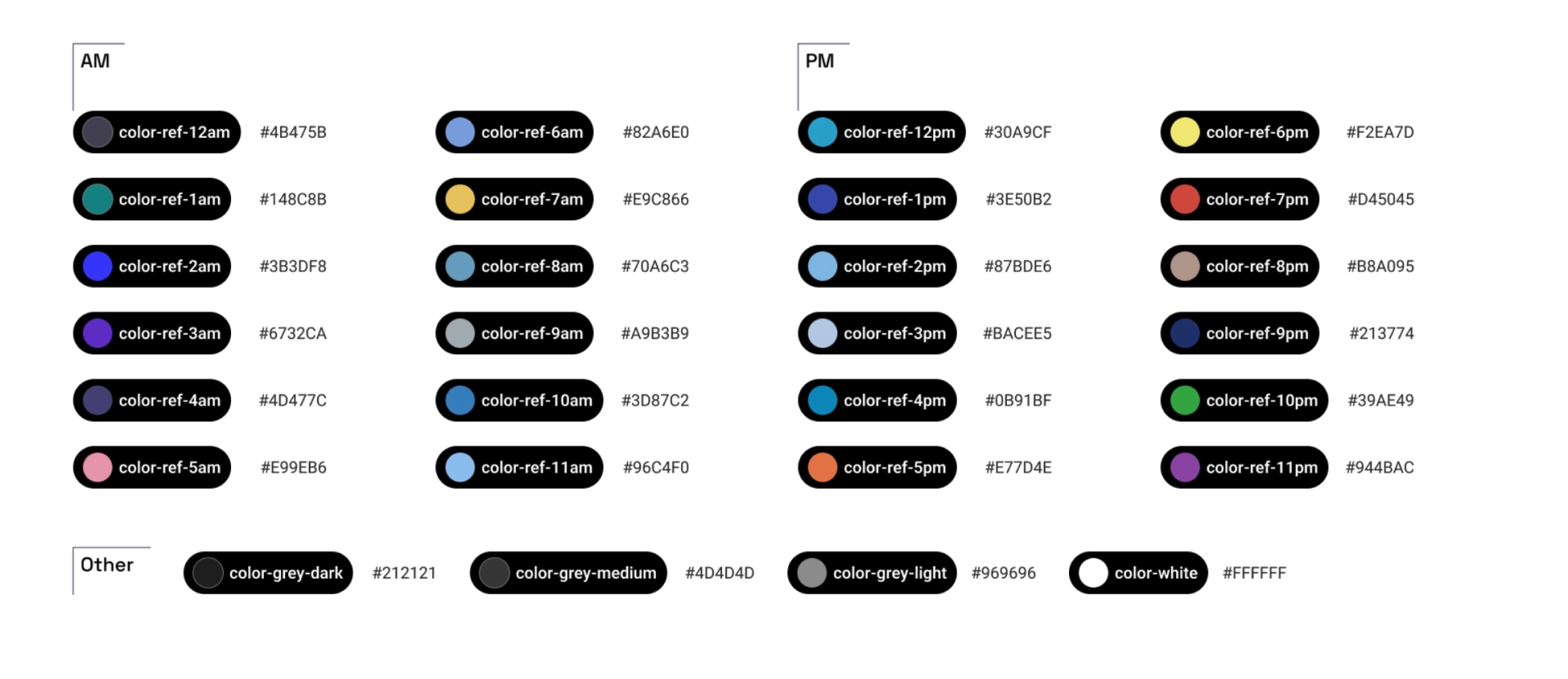
Design Tokens: Reference Color
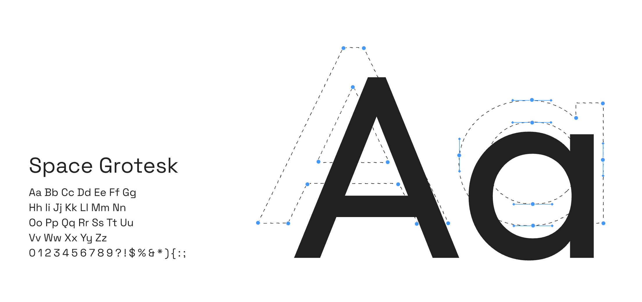
Typography
Our attention to detail extended to the typeface. We tested hundreds of typeface weights and alignments to find the perfect combination with the logo.Ultimately, we crafted each of the letters to create a bespoke wordmark. The font for the word “Union” that stood out came from a Google font called - wait for it - Sora.
Visual Brand System


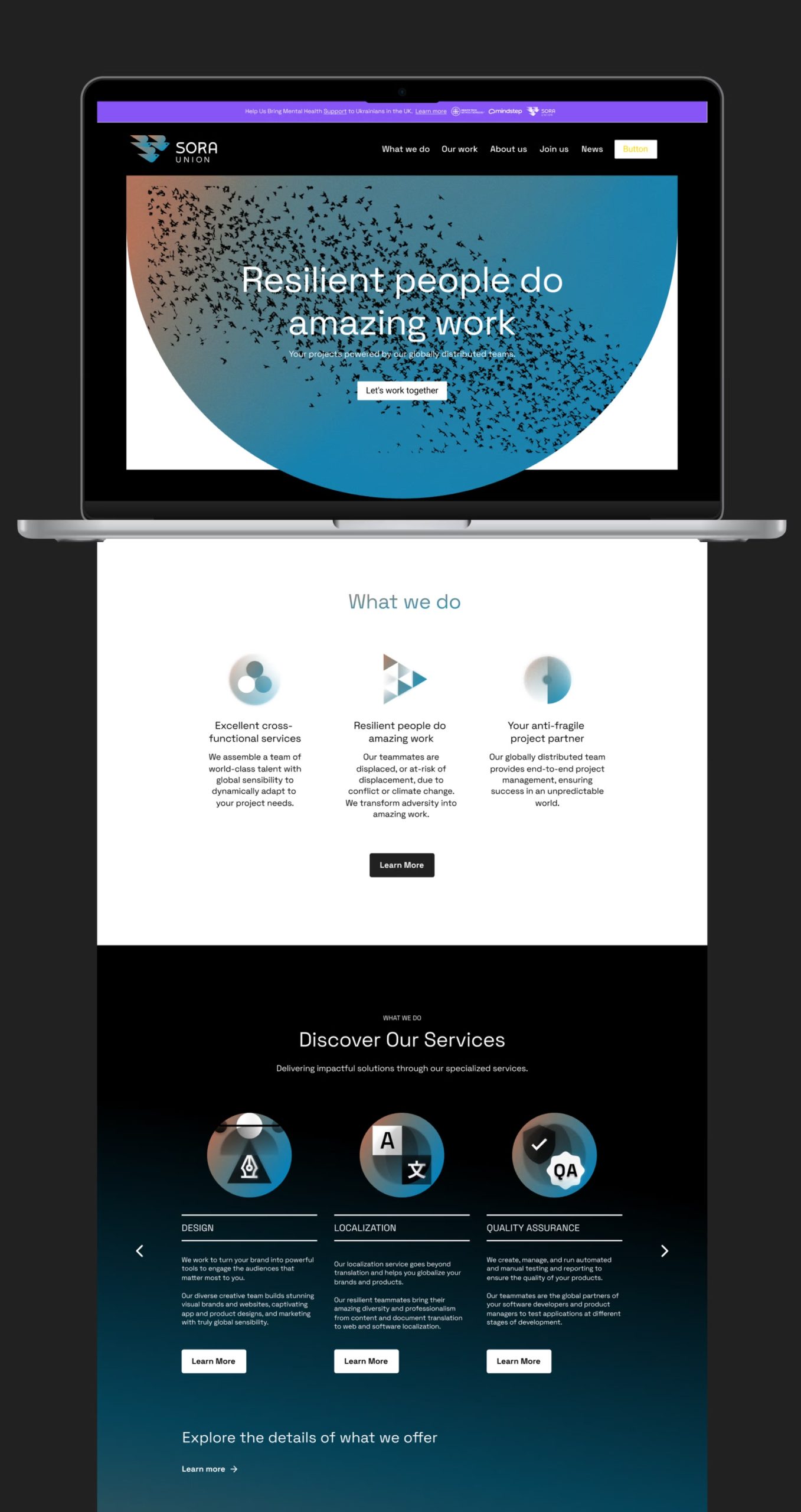
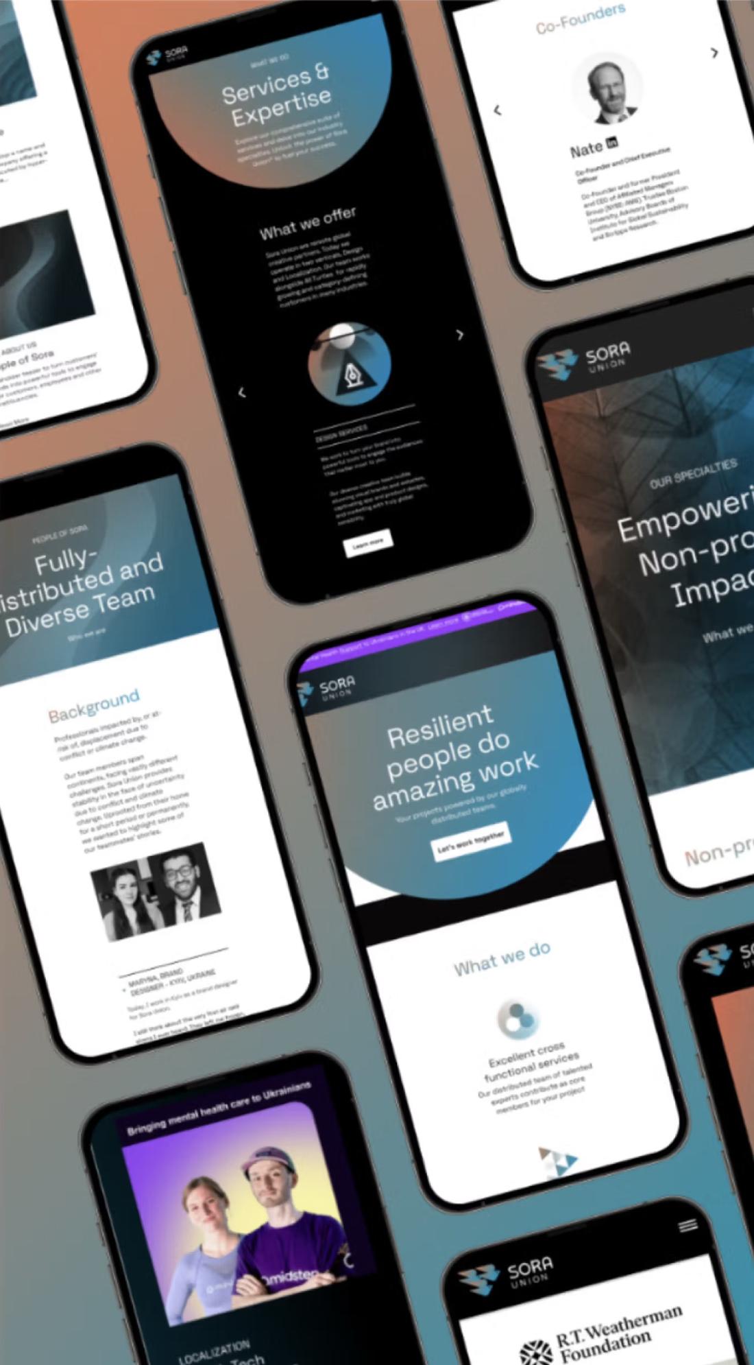
The Website Work
The Outcome
The final result was a robust identity system that exudes premiumness, inspired by an innovative color system and a memorable website.
One of our leading questions at the beginning of this project was: “What do we want people to feel when they encounter this brand?”
We wanted Sora Union to inspire people, uplift them, and make them feel hopeful. On the other hand, we aimed to convey the values of a hyper-creative, competent, and globally distributed workforce. The combination of brand elements accomplishes what they are set out to do.

Selected Works
heraclio@designstgy.com
