
Firefox Browser Branding
Employer: Mozilla
Role: Head of Brand Design
Year: 2020
Context
The Situation
Firefox had a brand problem that was also a culture problem.
Mozilla built Firefox on the idea that being different was a feature: unconventional, independent, unapologetically weird. That spirit attracted a passionate volunteer community that had shaped the brand for years. It also meant that inconsistency had become normalized. Different teams, different markets, different contributors; everyone had their own interpretation of what Firefox looked and felt like, and nobody had a strong reason to change that.
My job as Head of Brand Design wasn't just to build a better visual system. It was to create a structure that a community built on creative freedom would actually adopt, without feeling like I was flattening what made Firefox interesting.
That's a harder brief than "redesign the brand."
The Team
- Jennifer Rouse - UX Design Lead
- Mark Weaver - Brand Design Lead
- Sean Martell - Illustration
- James Dybvig - Motion Design
- Rob Antley - Copy Writer
My Role
As Head of Brand Design, I directed the full brand overhaul, audit, strategy, visual identity, design system, and guidelines. I also owned the organizational challenge: building stakeholder alignment across marketing teams and creating a system rigorous enough to drive consistency without being so rigid it killed the creative energy that made Firefox worth working on.
What We Found
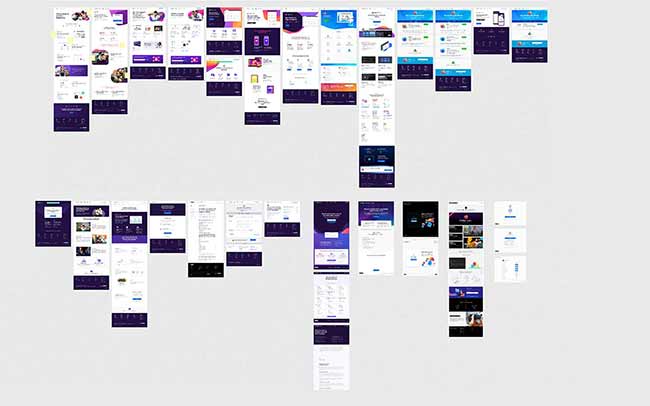
The audit told a clear story. Firefox's brand had grown organically, and it showed.
The guidelines existed only as a PDF, inaccessible, frequently outdated, and prone to version confusion. The layout had no grid system. The text was wide, dense, and hard to navigate. The usage rules were vague enough that two designers could read them and produce completely different outputs.
The color system was described, essentially, as a rainbow; use whatever. The result was visual chaos across markets and channels. There was no defined audience. No iconography system. No illustration framework. No tone of voice. No web-safe typography fallbacks. Brand shapes, nicknamed "noodles" internally, were used inconsistently and often oversized to the point of absurdity.
The brand wasn't broken in any single way. It was scattered in every direction simultaneously.
Impact
- Led the development of Firefox’s global brand foundation, improving clarity, cohesion, and consistency across markets and channels.
- Built and scaled a unified design system adopted across global teams, increasing speed of execution and reducing fragmentation.
- Created core brand assets that strengthened recognition and enabled more consistent storytelling across product and marketing.
The Work
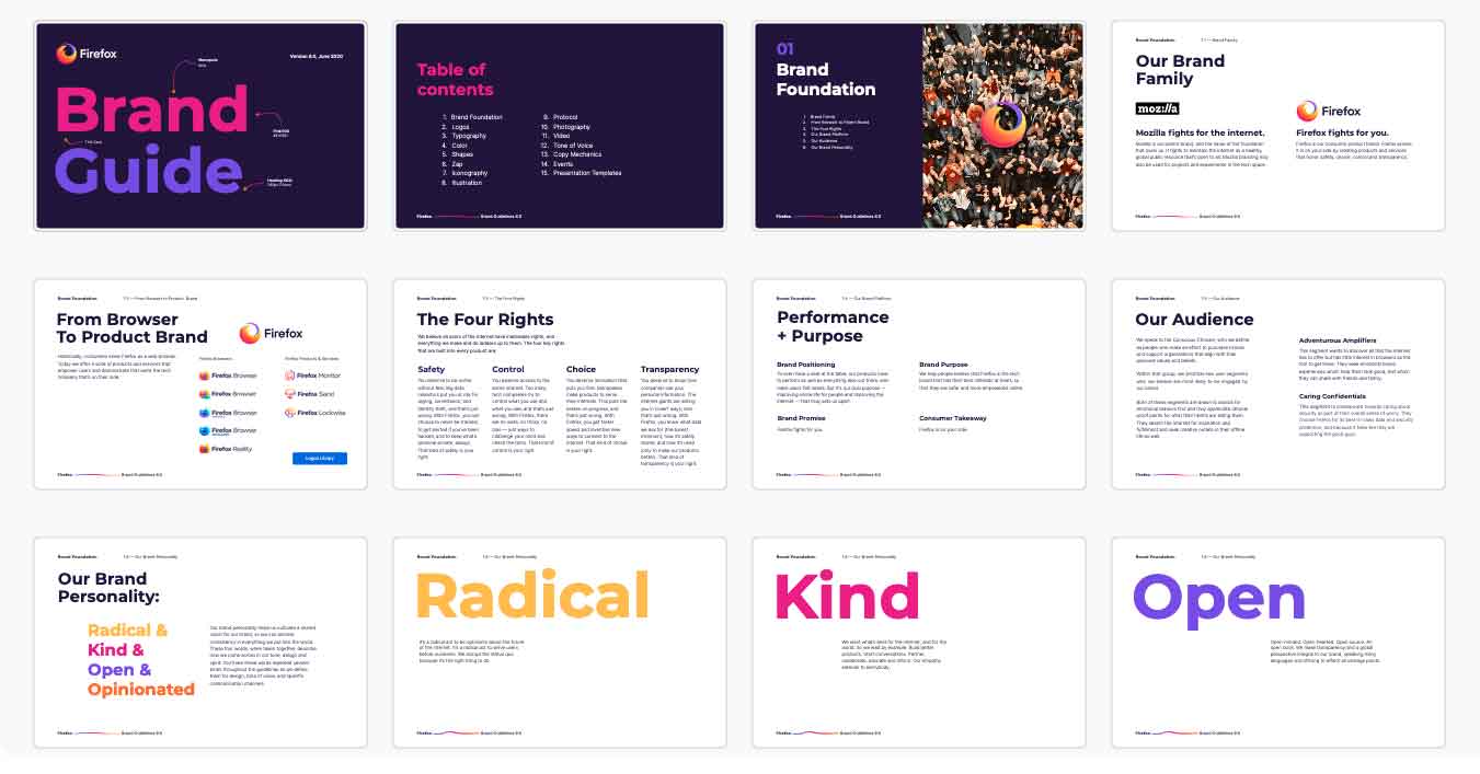
Brand Foundation: The Four Rights
Before redesigning anything visual, we needed to answer a more fundamental question: what does Firefox stand for?
The answer was already there; it just hadn't been made explicit as a design brief. Firefox is built on four digital rights:
- Safety: You deserve to be online without fear. Firefox protects your privacy and identity by default.
- Control: You deserve access to the whole internet. Firefox avoids manipulation and bias.
- Choice: You deserve innovation that serves you, not corporate interests.
- Transparency: You deserve to know how your data is used. Firefox operates with radical honesty.
These four principles became the filter for every brand decision that followed. If a visual direction didn't serve one of these values, it didn't make the cut.
Brand Personality
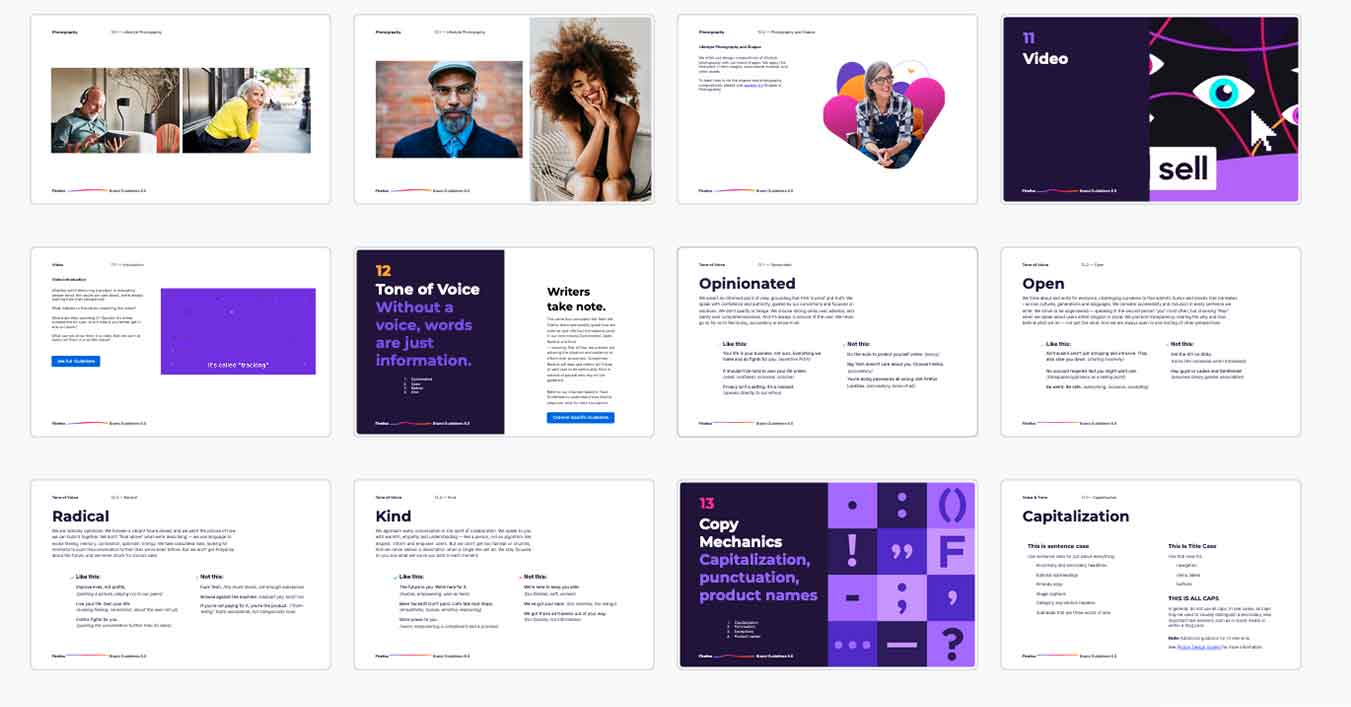
Radical.
Kind.
Open.
Opinionated.
Four words that are intentionally in tension with each other. Radical and kind. Open and opinionated. That tension is what makes Firefox interesting; it's not a safe brand, and the personality framework shouldn't be either. These words anchor tone, design, and expression across every market.
Competitive and Cultural Insights
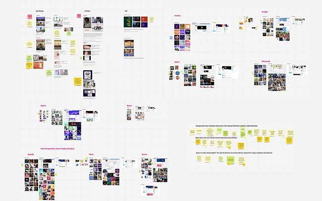
We continuously audited brand expression across all Firefox touchpoints globally. We also studied Tier 1 market cultures to ensure local relevance. I led ongoing competitive reviews to identify whitespace and opportunities to visually differentiate.
Color System
The before-and-after on color is the starkest transformation in the whole project.
Before: a palette described as "all colors in the rainbow, use whatever." In practice, that meant every team made its own color decisions, and the cumulative result was visual noise with no coherent identity.
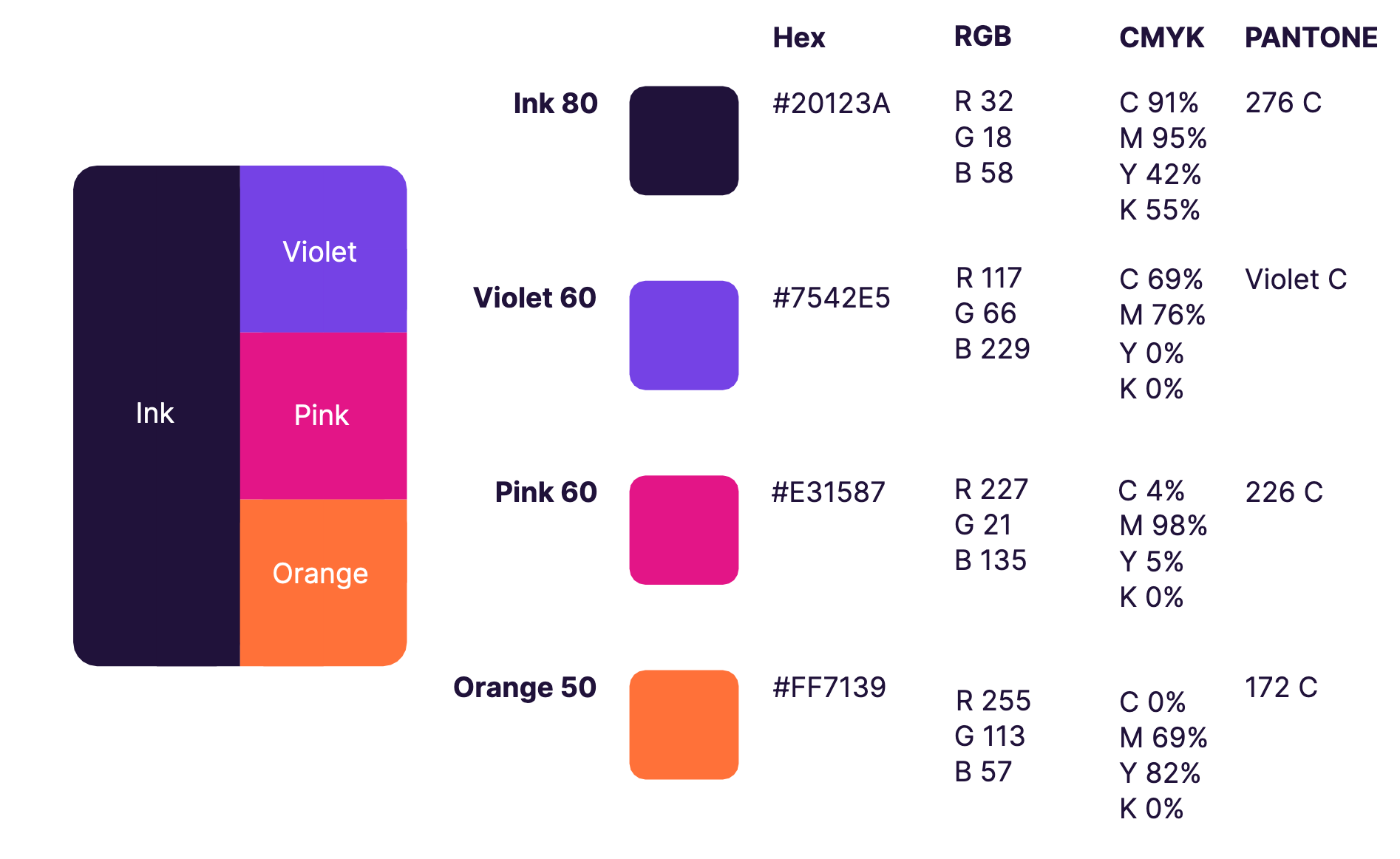
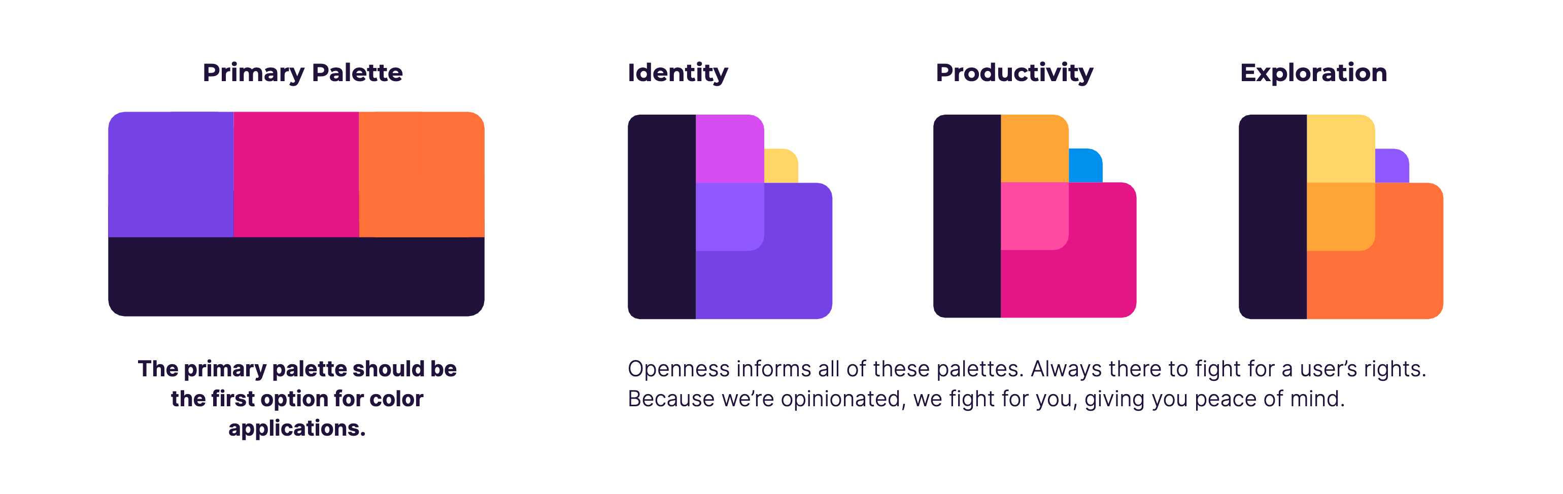
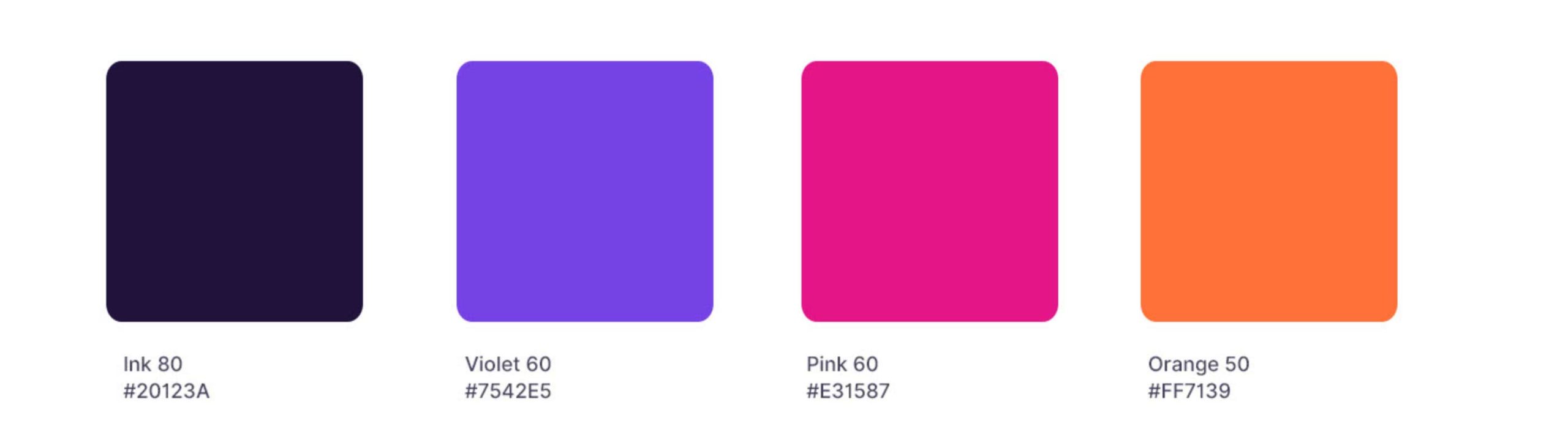
After: one master palette of four colors, with three secondary palettes for product and campaign flexibility. The four primary anchors of Firefox's identity across all global communications. The secondary palettes give teams room to differentiate without breaking coherence.
Getting stakeholders to commit to four colors after years of unlimited choice was one of the hardest organizational sells of the engagement. The argument I kept making: constraint isn't the enemy of creativity. It's what makes creativity legible at scale.
Iconography
The pre-existing icon situation was a specific kind of chaos: multiple versions of the same icon, shield icons, for example, coexisting in the same user flows with no consistency in style, weight, or usage context.
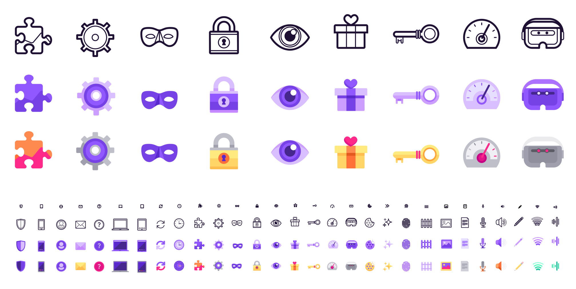
We built a two-tier system to solve it:
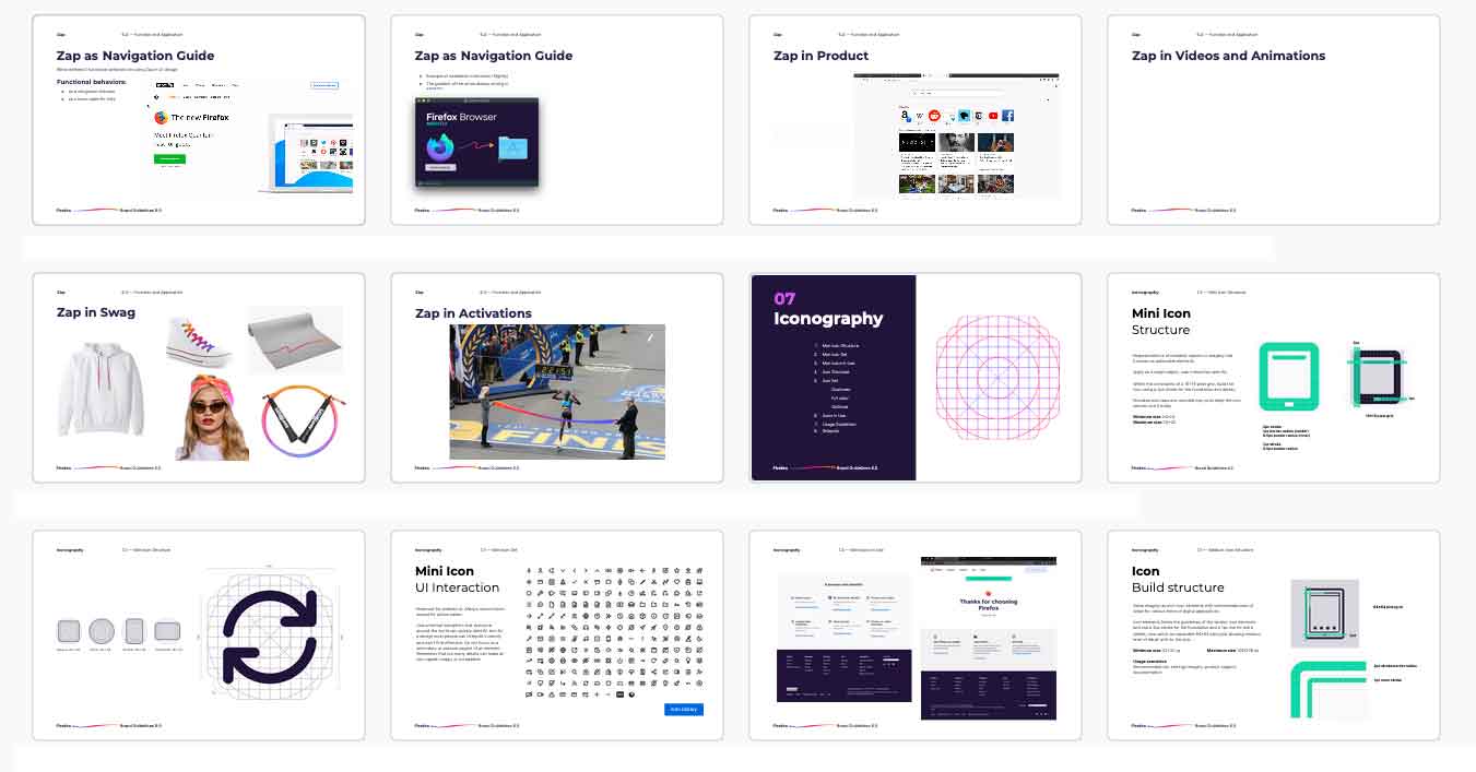
- Mini-icons, functional, low-fidelity icons for UI use, optimized for legibility at small sizes.
- High-fidelity icons, for marketing and storytelling, with more expressive detail and color.
I led a cross-disciplinary team spanning product and marketing designers to co-create the system. The goal was a framework both teams would actually use, which meant both teams had to have a hand in building it.
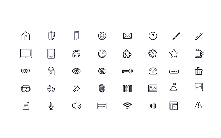
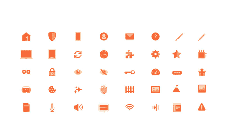
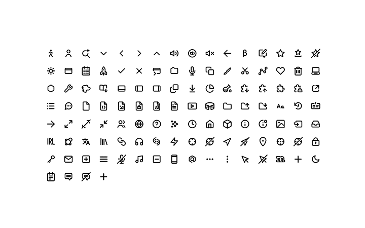
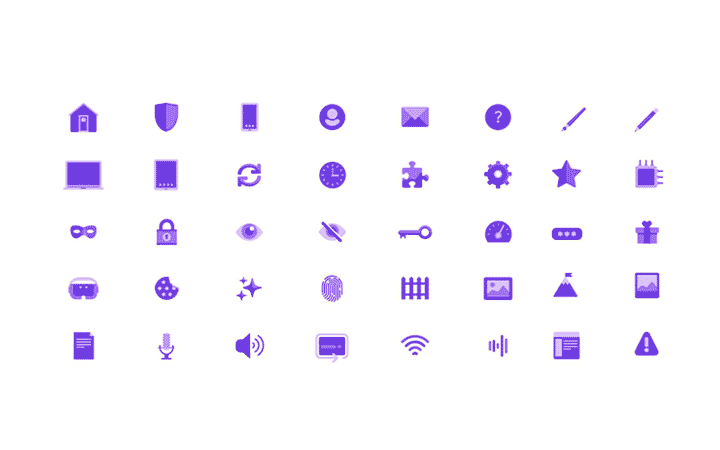
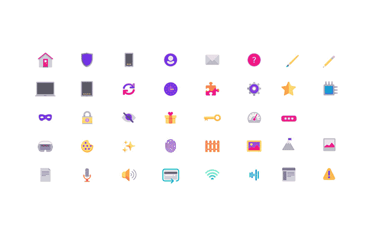
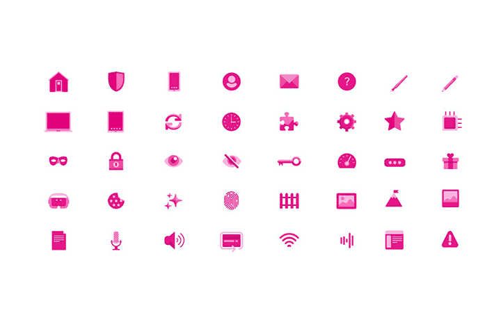
Illustration System
Firefox illustrations had always been informative rather than decorative — a good instinct that needed structure to scale. We formalized it into a three-tier system:
- Pictograms: simple metaphors for clear, functional communication.
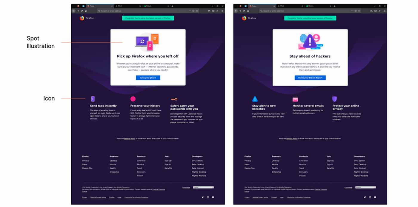
- Spot illustrations: medium-detail visuals that support copy without competing with it.
- Freestyle illustrations: concept-driven artwork for social media, campaigns, and storytelling. The most expressive tier, with the most creative latitude.
The three tiers gave teams a clear framework for choosing the right illustration type for the right context, instead of making that judgment call from scratch every time.

Pictograms: Simple metaphors to convey clear ideas

Spot Illustrations: Visual support for copy, medium detail
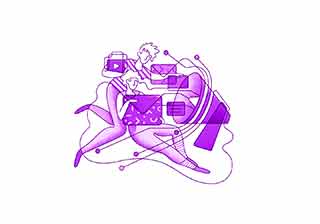
Freestyle Illustrations: Concept-driven artwork, ideal for social media and storytelling
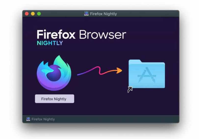
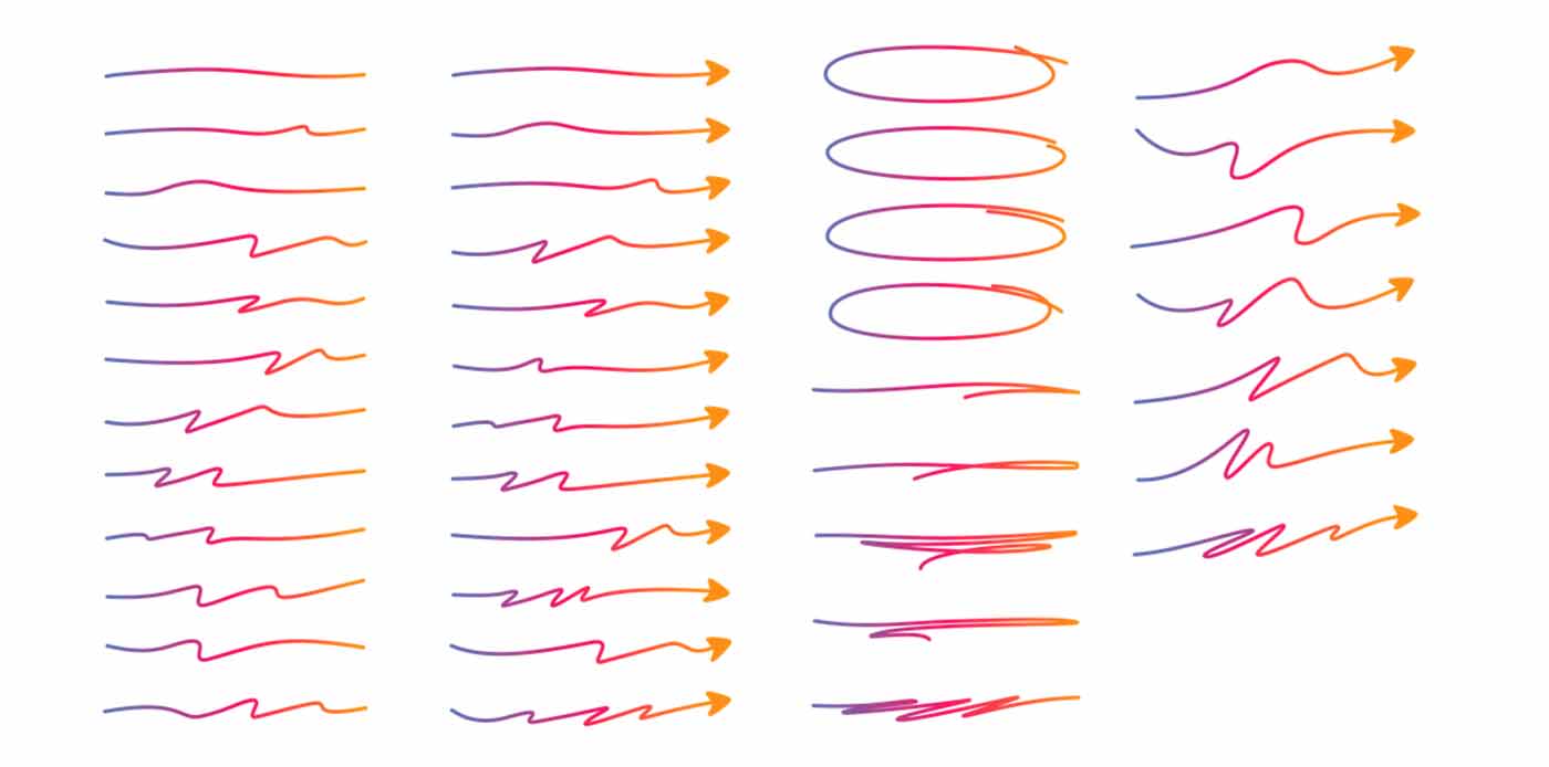
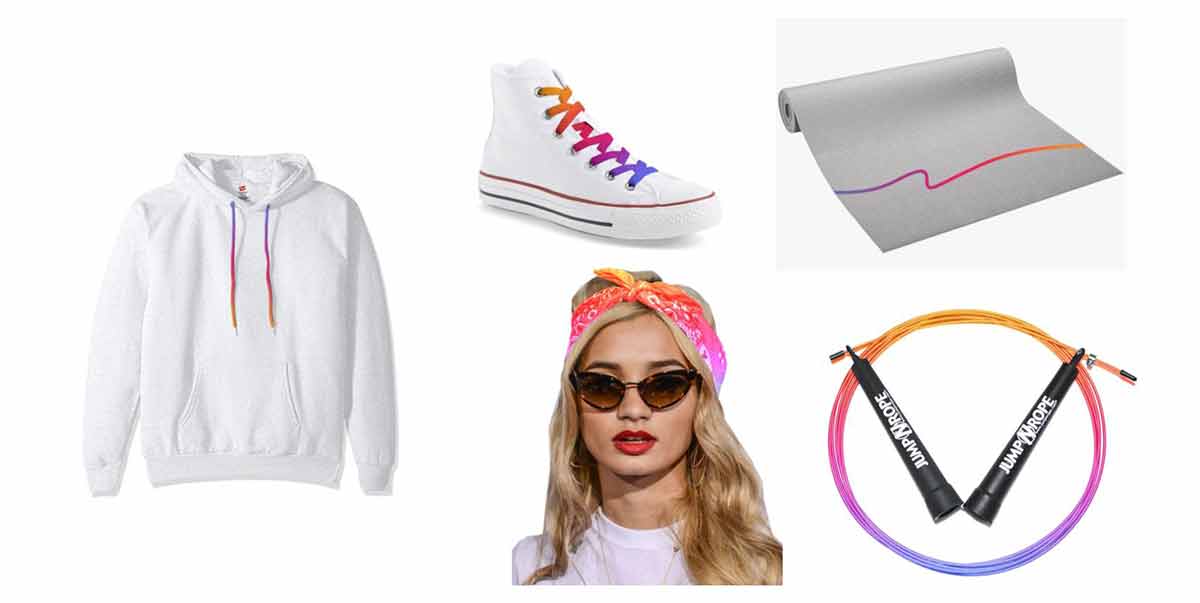
The Zap
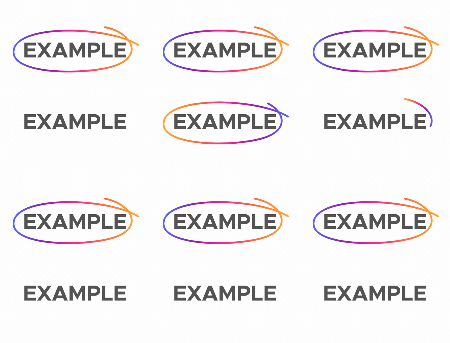
The Zap is the brand element I'm most proud of, and the one that surprised me most by how widely it was adopted.
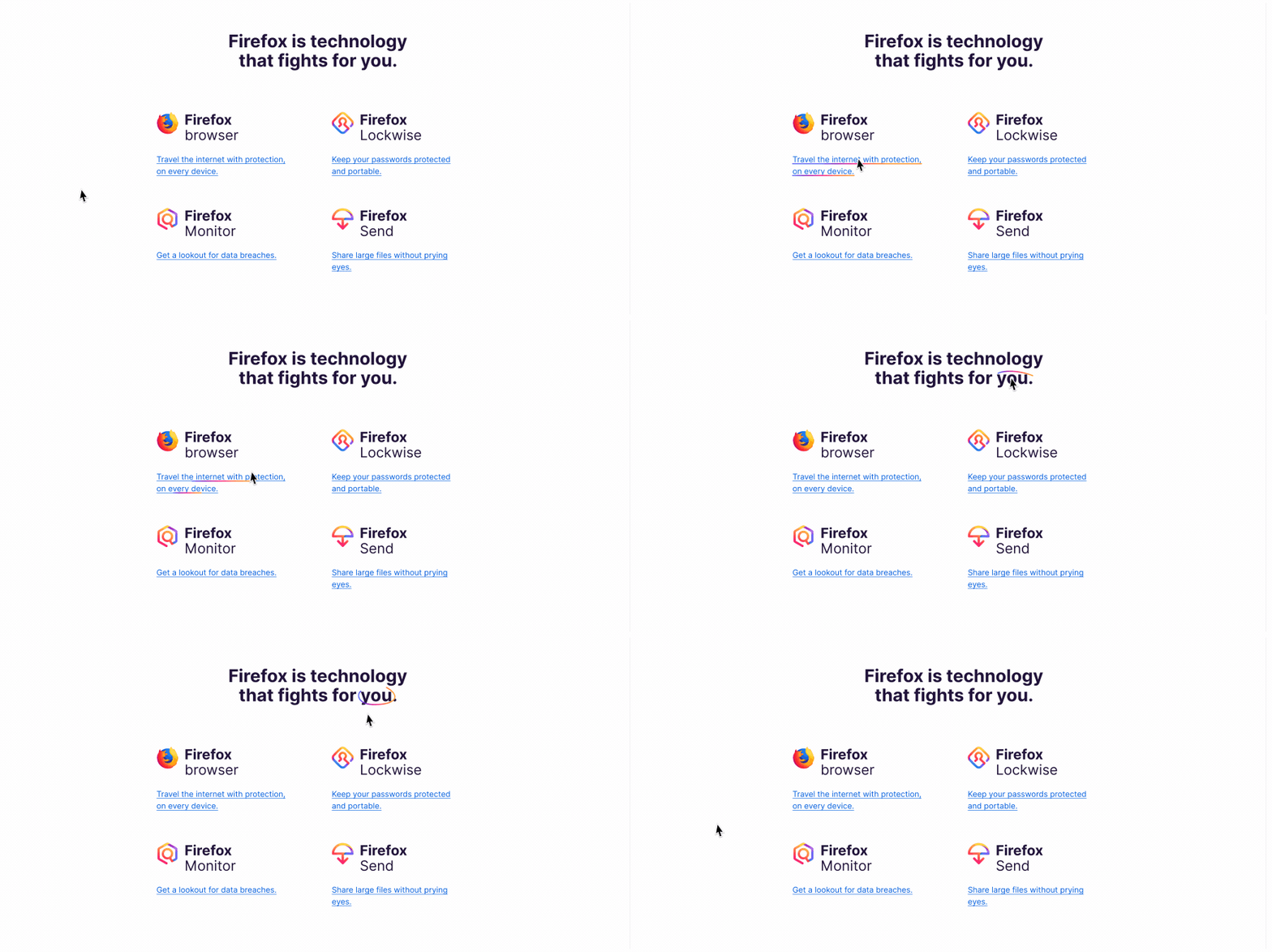
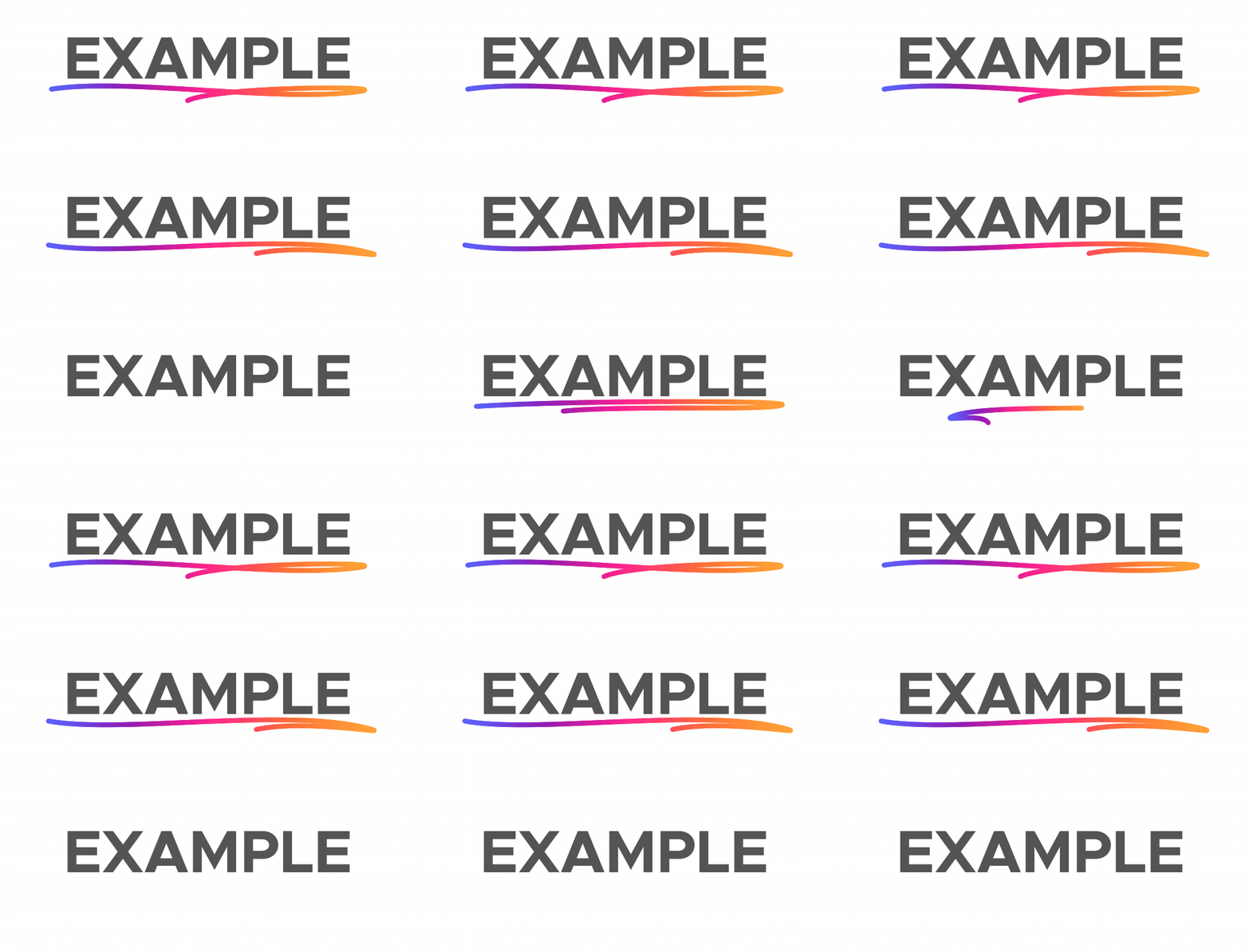
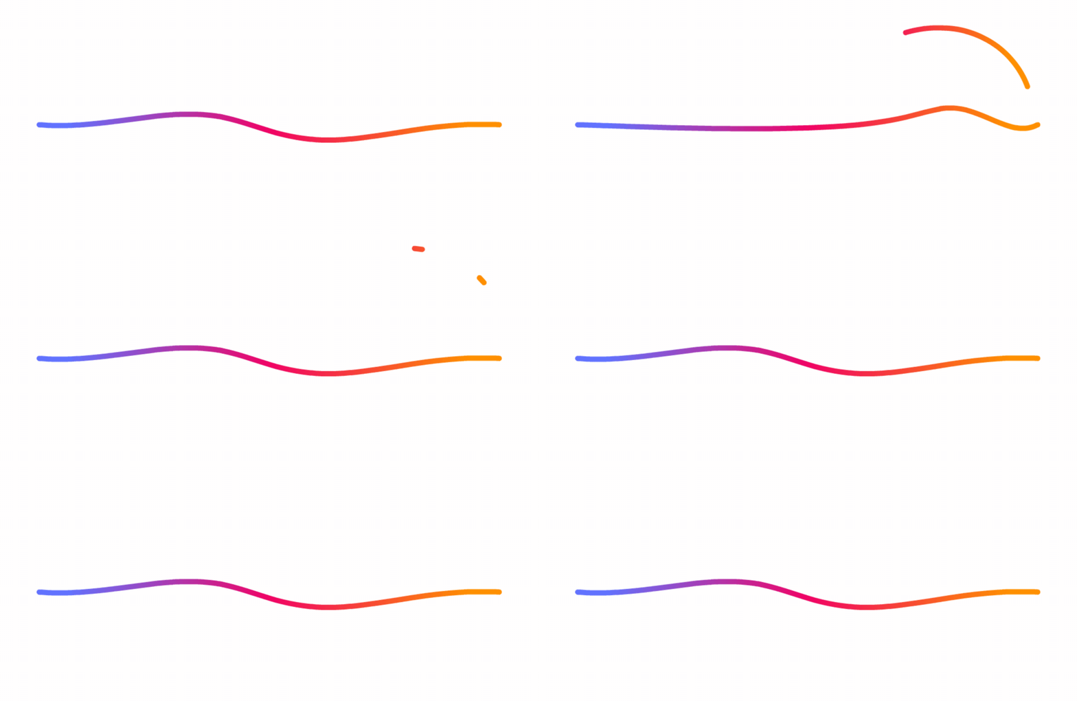
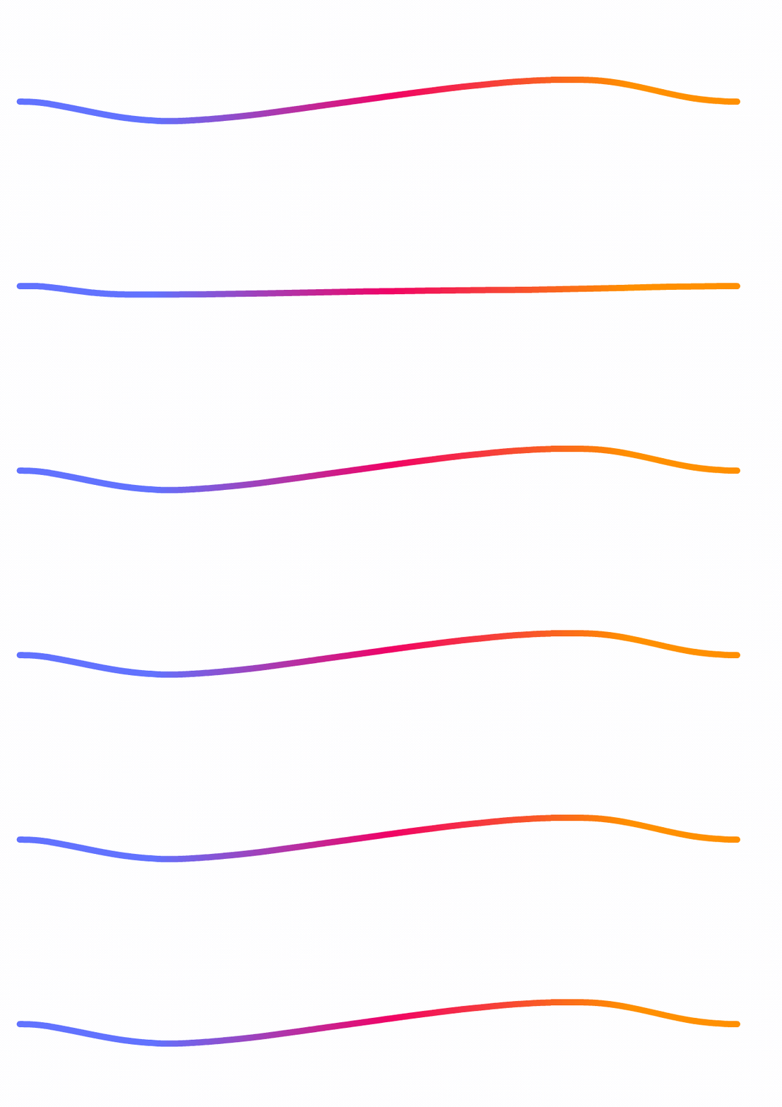
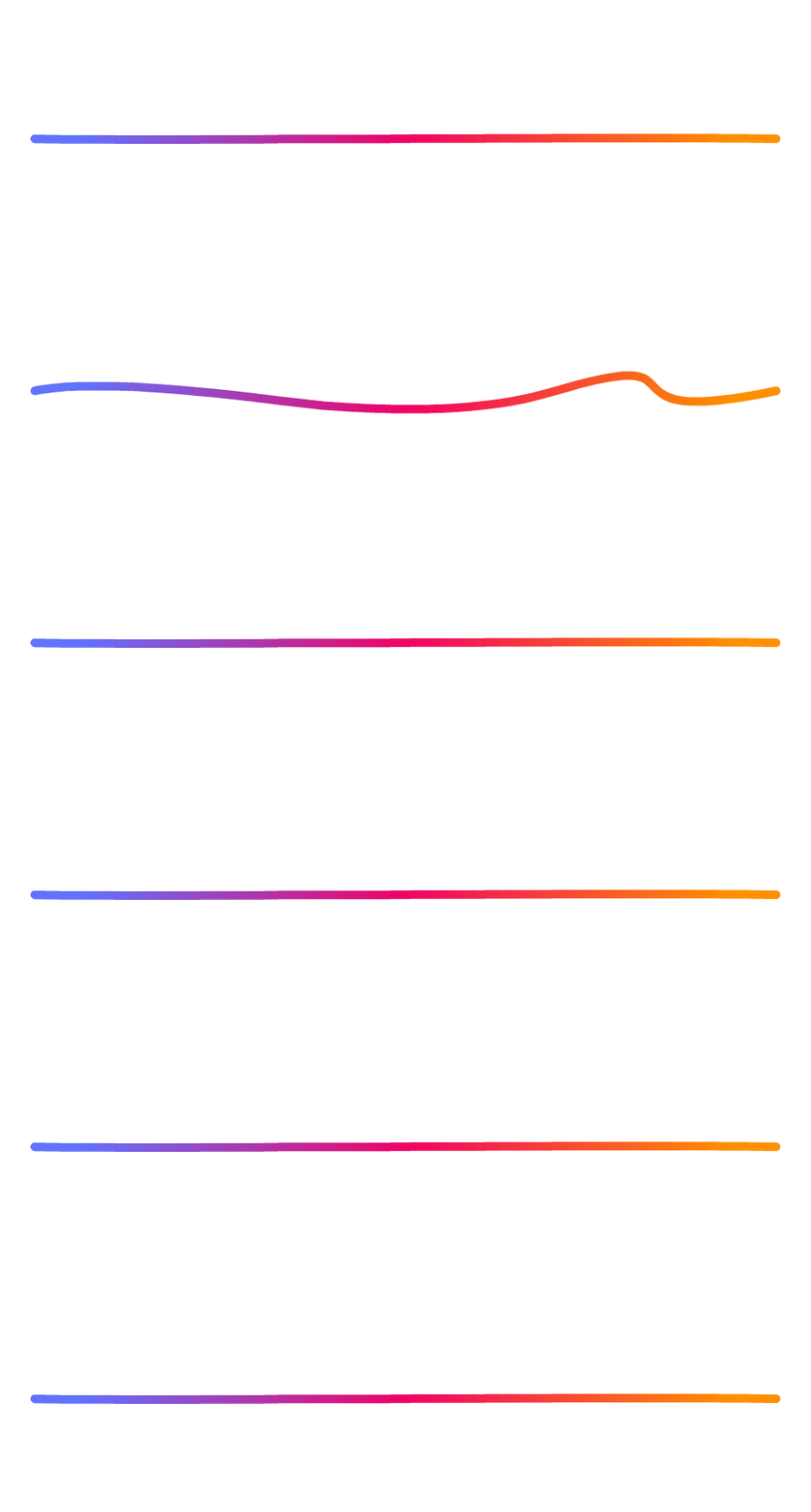
It's a handmade line element: a whimsical, continuous curve that adds energy, movement, and human character to any composition. It looks simple. It isn't. The rules that make it work, full gradient, rounded corners only, continuous line, subtle curves, maximum three zags, are specific enough that it stays recognizable across thousands of executions without becoming mechanical.
The Zap works because it captures something true about Firefox's personality. It's not a corporate graphic. It looks like it was drawn by a person. In a brand built on the idea that technology should be human, that matters.
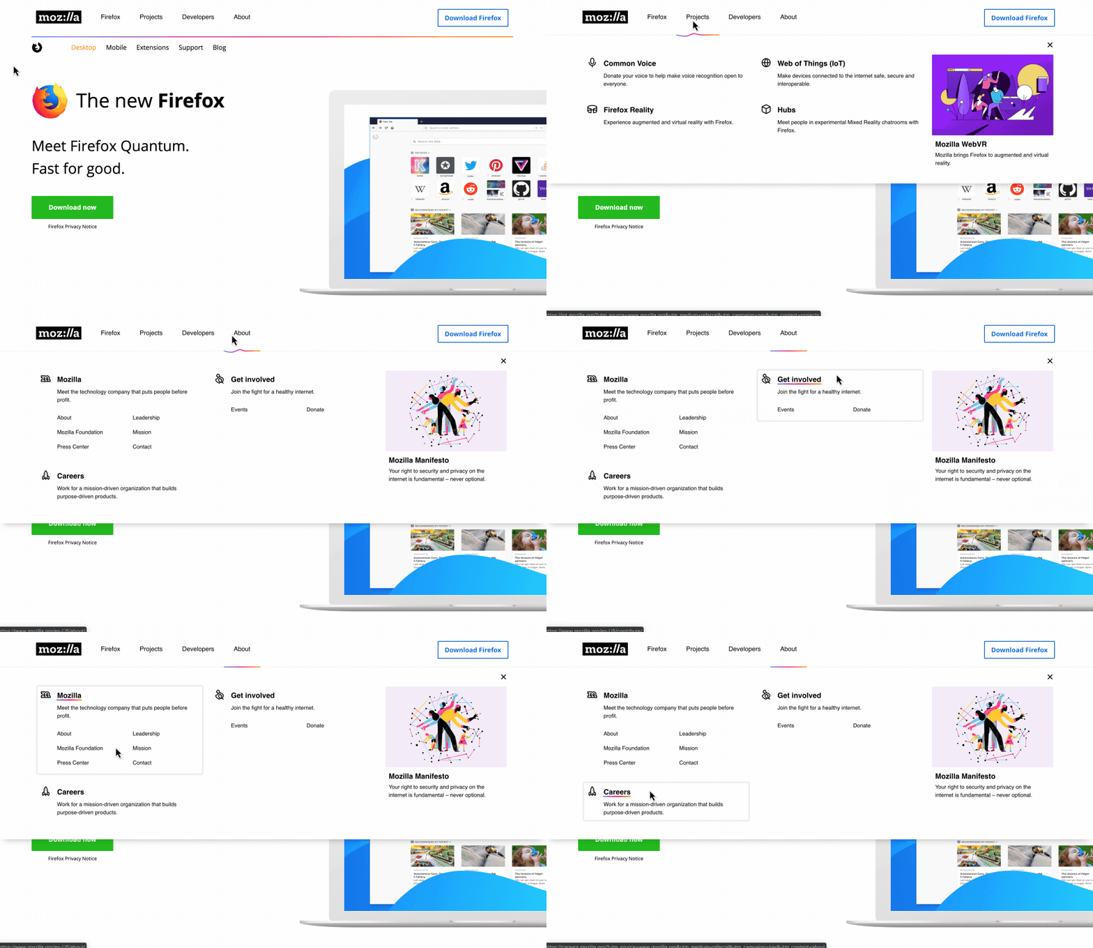
Use cases: navigation, videos, websites, campaigns, UI, and more. It ended up everywhere.
Shape Language
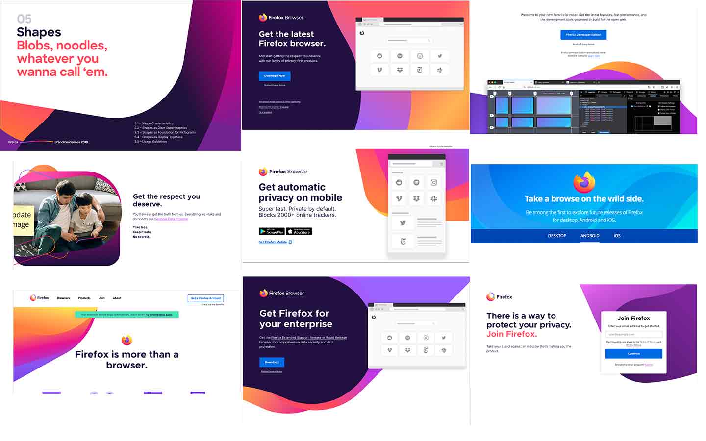
Old Shapes
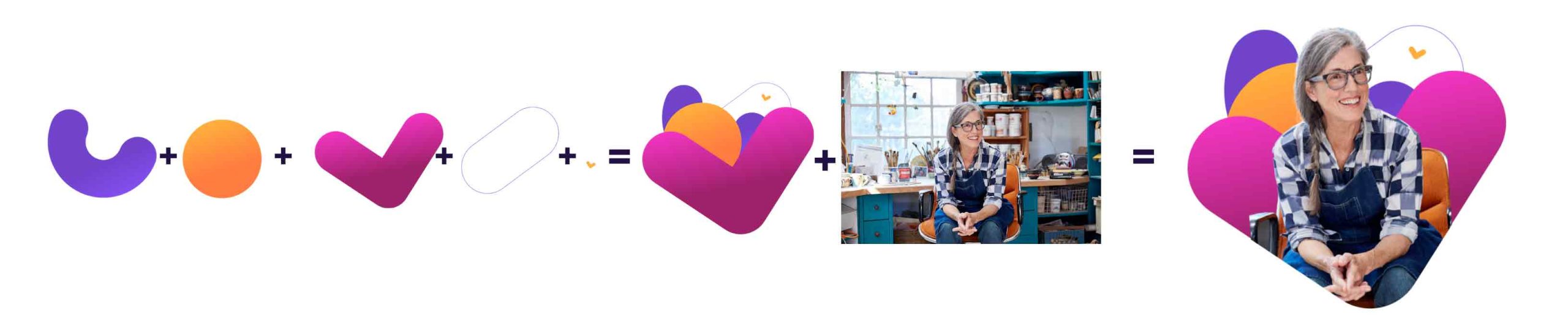
👎 The old shapes, known internally as "noodles", were inconsistently applied, frequently oversized, and abstractly decorative. They added visual noise rather than visual meaning.
The Solution:
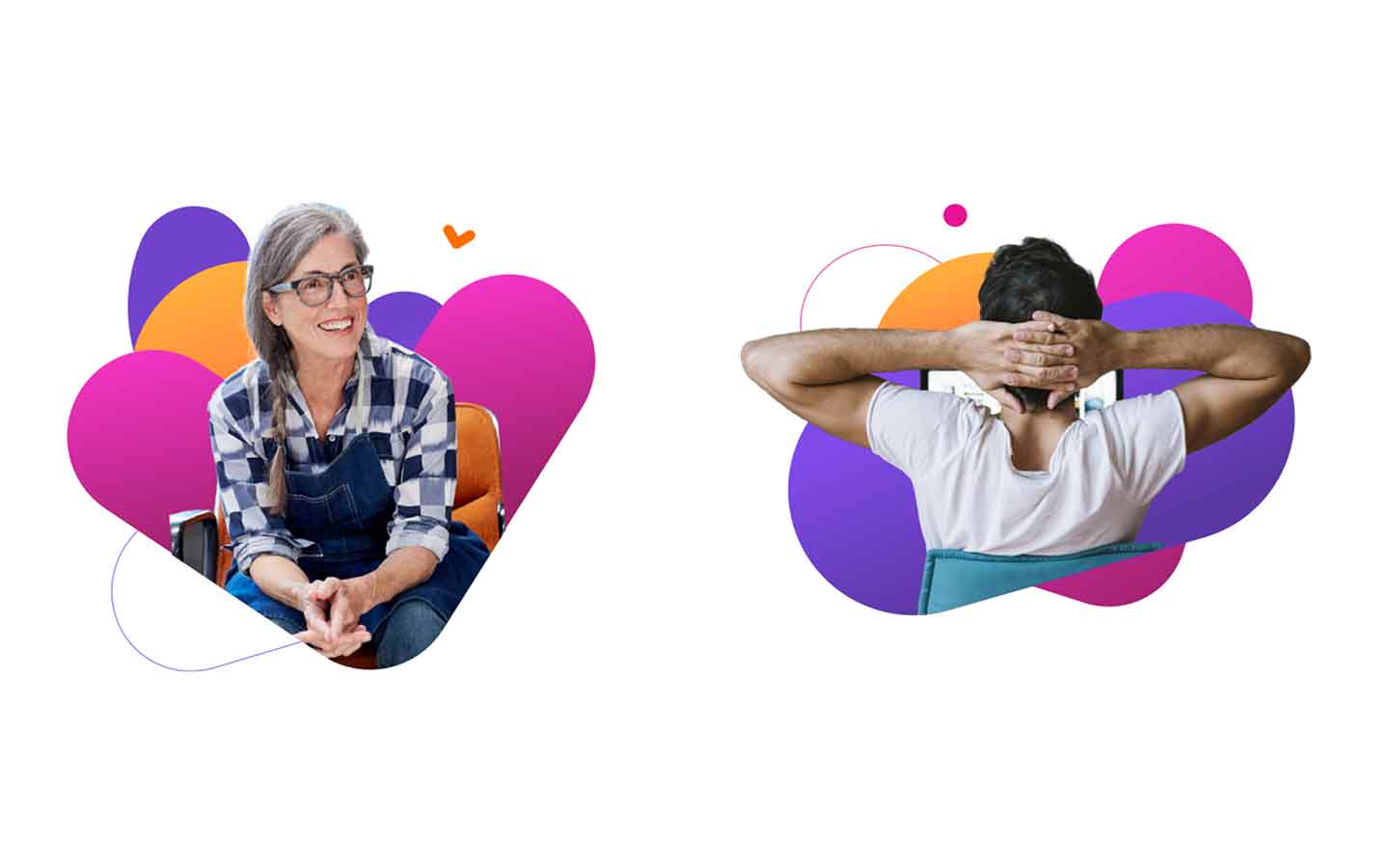
The solution was rules, not replacement. We kept the shapes but defined how to use them: three to four shapes per composition at most, recognizable proportions, applied meaningfully as backgrounds, image masks, and layout elements. White space and balance became explicit requirements.
The shapes didn't change much. The discipline around them changed completely.


The Firefox Marketing Design System
The brand overhaul and Marketing Design System were running in parallel, and they had to. A visual identity without a design system is just a PDF that teams ignore.
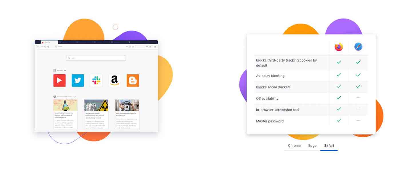
Mozilla's web presence had grown into a fragmented ecosystem of 1,500+ pages over two decades. Because design had been largely decentralized among volunteer contributors, the digital estate suffered from inconsistent UI behavior, a lack of shared standards, and no single source of truth. The brand guidelines said one thing. The actual pages did another.
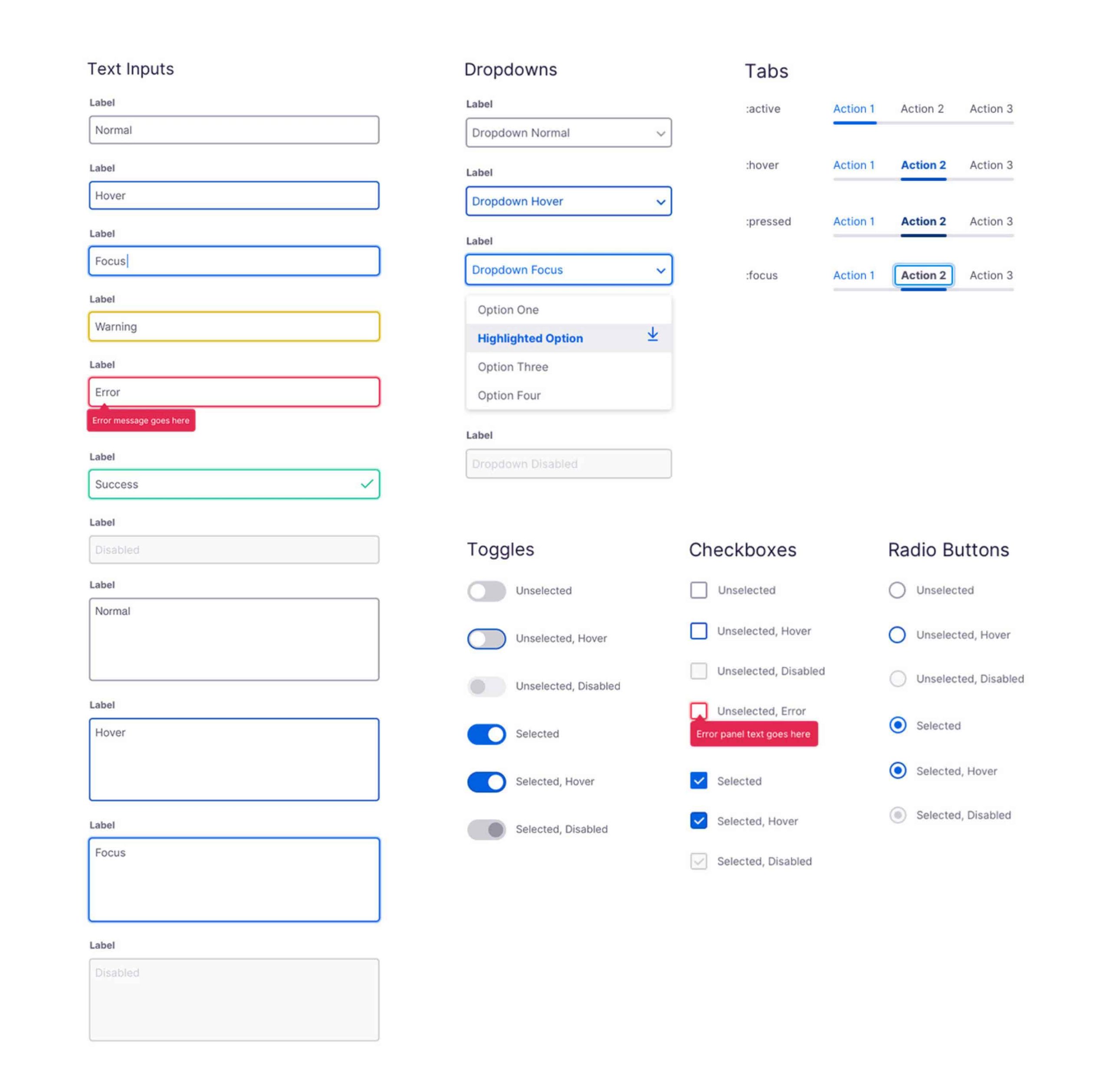
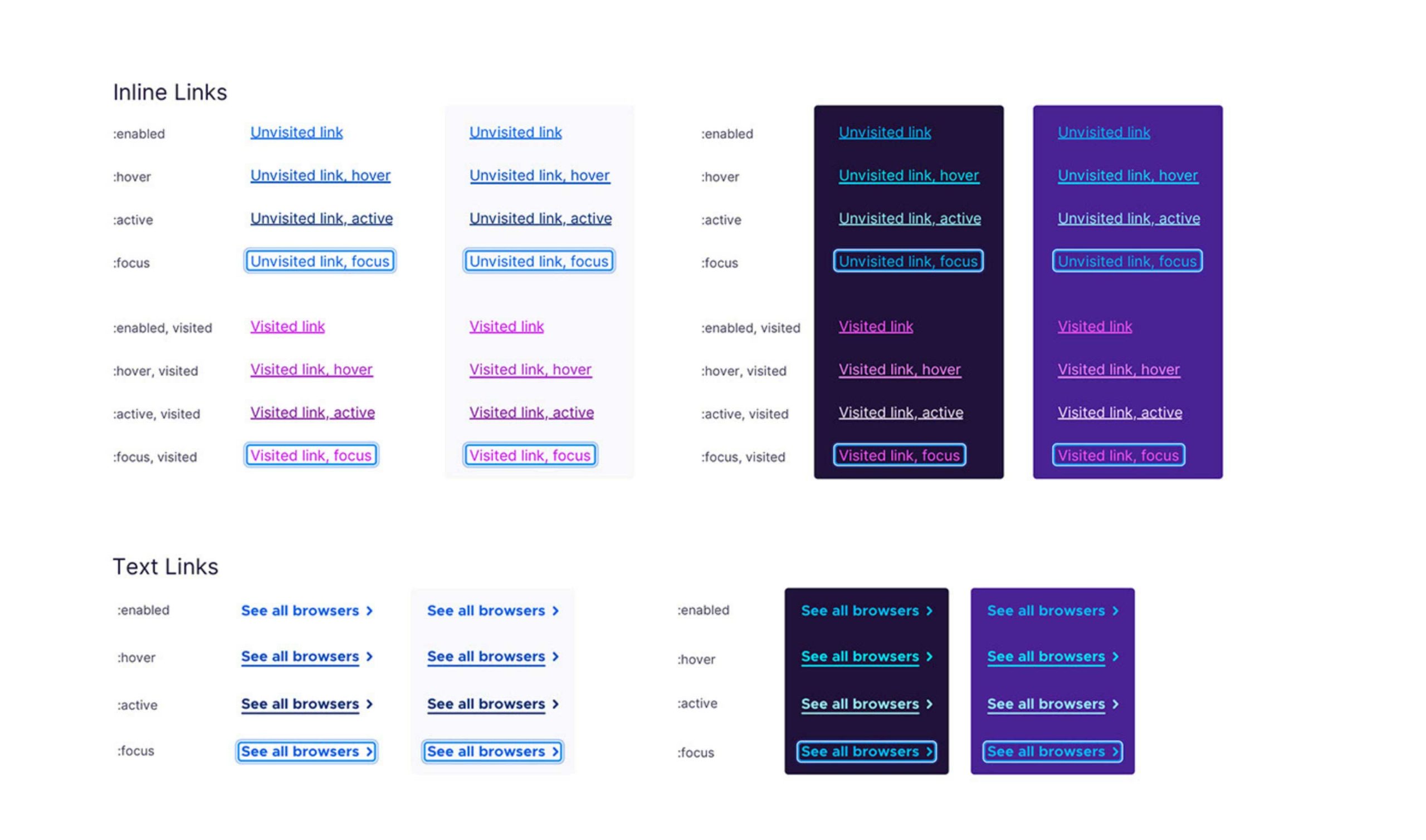
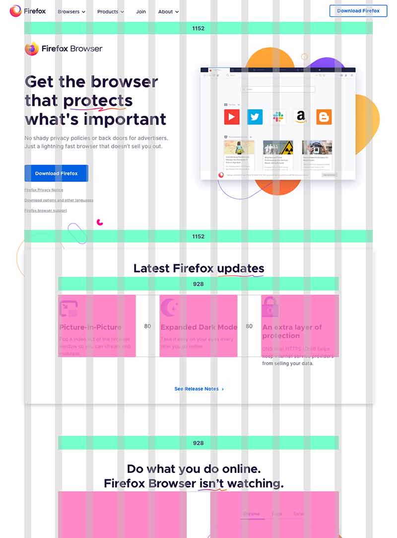
Marketing Design System was built to close that gap, a unified system of components, content guidelines, and accessibility standards that could govern Mozilla's entire digital footprint. Not a constraint on creativity, but the foundation that makes creativity consistent.
Getting the Marketing Design System team to function effectively was a leadership challenge in itself. Meetings were long and unfocused. Decision-making was fragmented. Core contributors couldn't protect time for system work because product work always took priority. I helped restructure the working cadence, clearer ownership, protected working sessions, and fewer voices at each decision point, so the team could actually ship.
The system it delivered became the single source of truth for Firefox's global web presence.
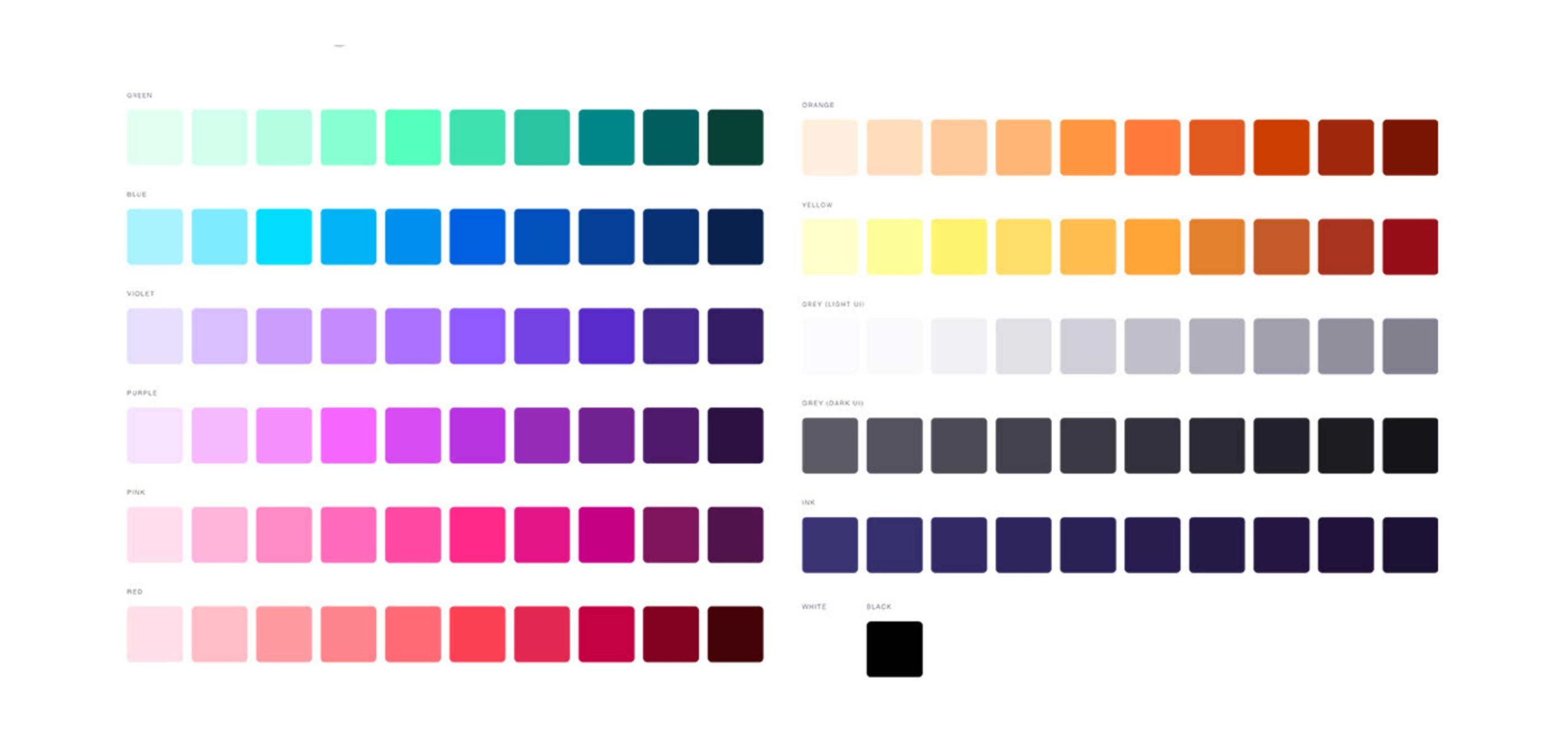
Primary Colors
Secondary Colors
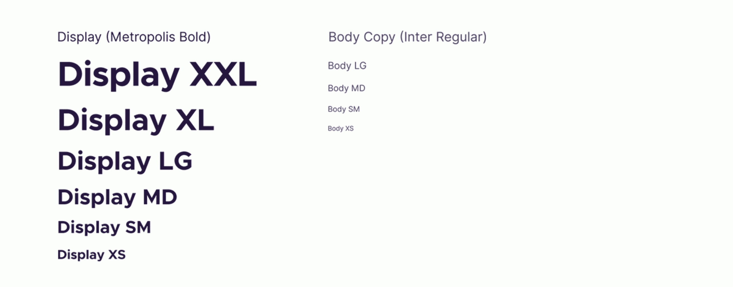
Typography
Spacing

Grid System

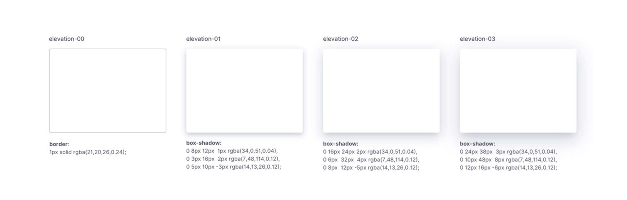
Box Shadows
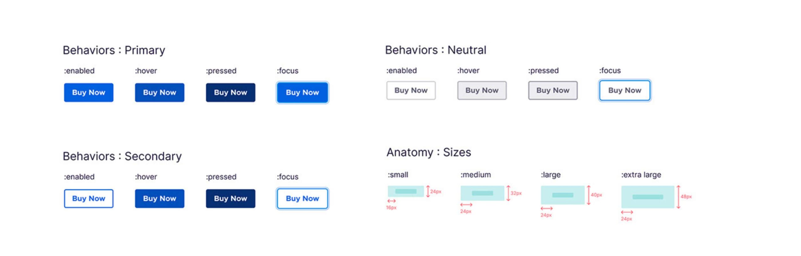
Buttons
Inputs
Links
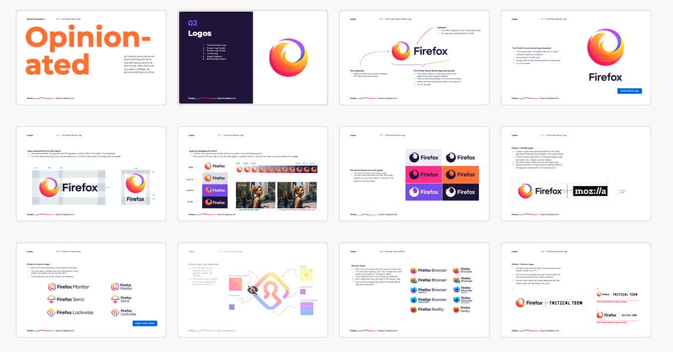
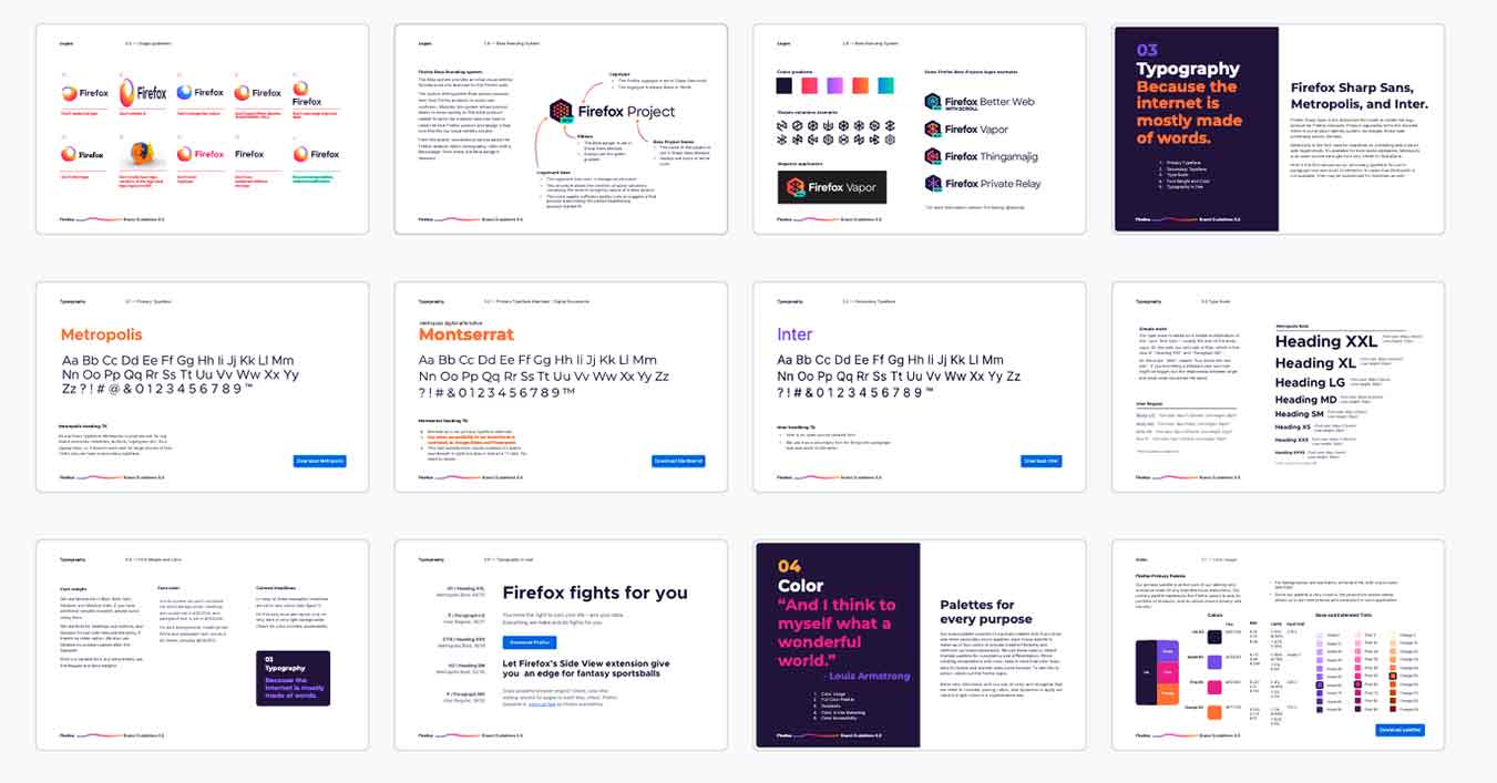
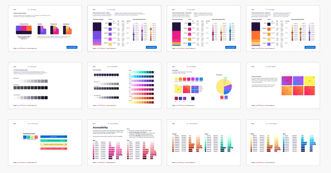
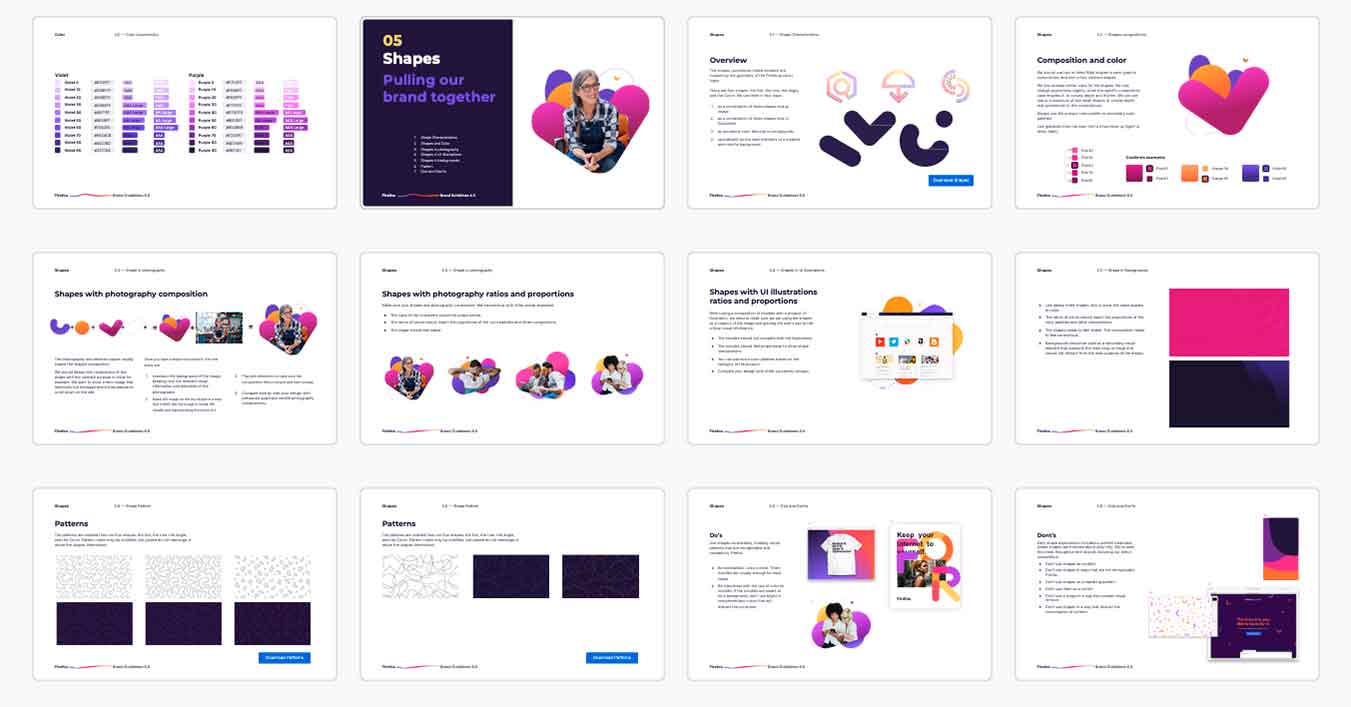
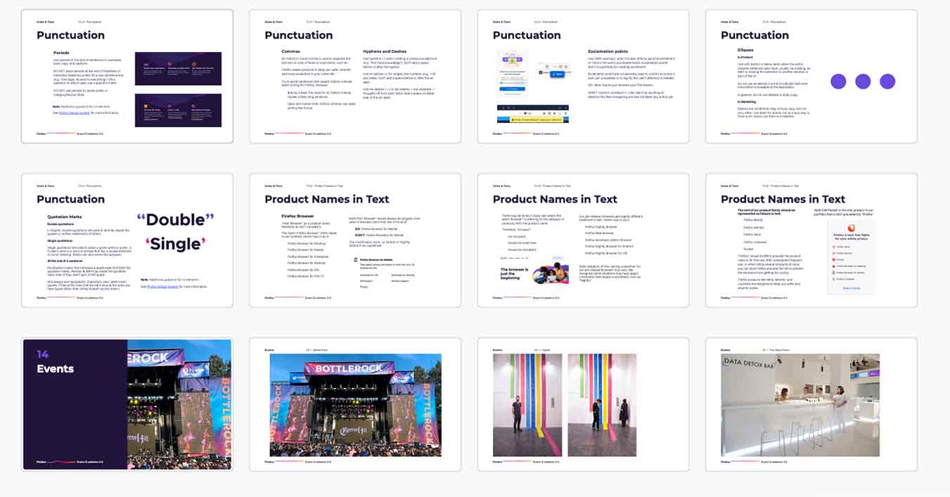
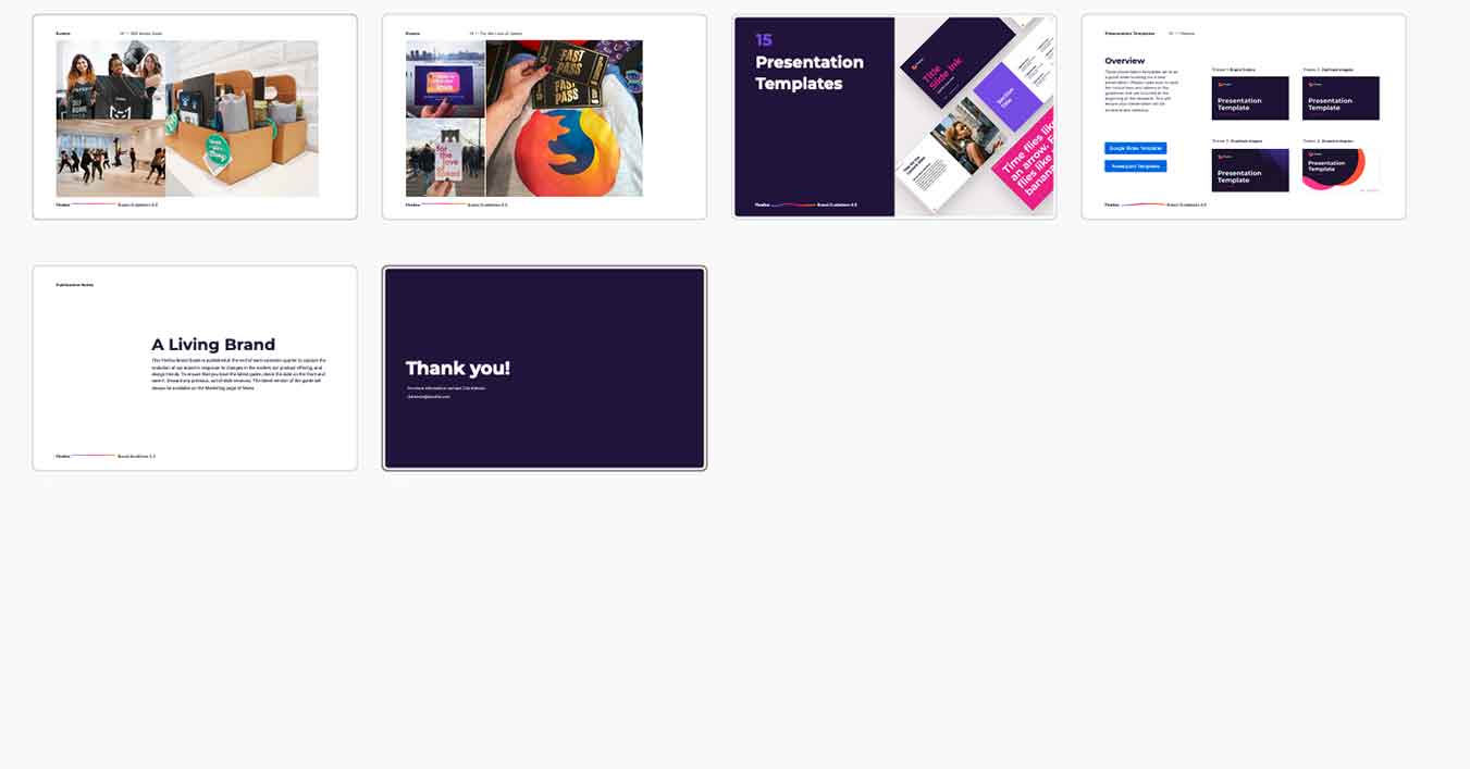
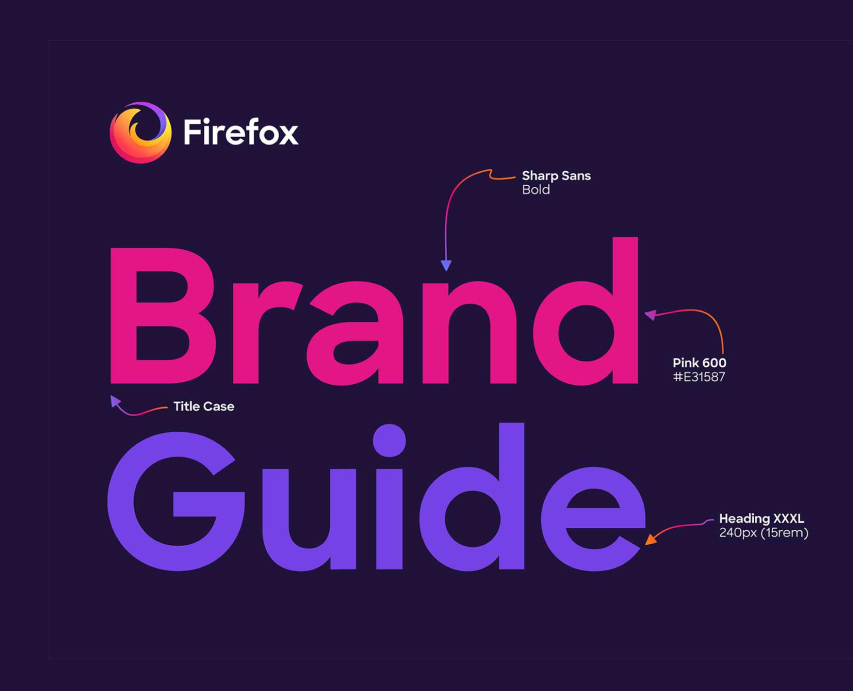
Brand Guidelines Overview



What I'd Do Differently
I'd invest more in change management earlier. The brand system we built was strong. The harder challenge was adoption, getting hundreds of contributors and dozens of teams to actually use it consistently in a culture where creative individualism was a point of pride.
We built good guidelines. What we didn't build early enough was a community of practice around them, advocates inside each team who understood the system deeply enough to evangelize it from the inside. External guidelines tell people what to do. Internal advocates make them want to. I'd start building that layer of human infrastructure before the visual system was even finished.
Selected Works




heraclio@designstgy.com