
Digitel AppStore Redesign
Date: 2014
Client: Digitel
Role: UX Research & Strategy, UI Design
The Challenge
Digitel, one of Venezuela’s leading mobile carriers, launched the Digitel Store in 2010 as a hub for apps, entertainment, and information—targeting users with limited smartphone access. However, as smartphones became more common and user expectations evolved, the store fell behind.
By 2014, the platform had become outdated, visually unappealing, and hard to navigate. The content was buried within a cluttered architecture, the UI felt obsolete, and users struggled to find value in the experience. Digitel needed a complete redesign to transform the store into a dynamic, engaging, and user-centric digital experience.
The Opportunity
To modernize the Digitel Store into a key digital touchpoint that aligned with users' behaviors and expectations. The goal was to create a platform that:
- Showcased Digitel’s offerings clearly
- Provided a delightful browsing and content discovery experience
- Reflected a more modern and high-tech brand identity
Approach & Methodology
We used a human-centered design process combining research, synthesis, prototyping, and iteration:
- Audit of existing store architecture
- Primary research: In-depth interviews with 40 users (ages 18–28, based in Caracas)
- Secondary research: Market and competitor analysis
- Jobs-to-be-done mapping
- User needs synthesis
- Co-creation and ideation workshops
- Prototyping and usability testing
- Validation and implementation
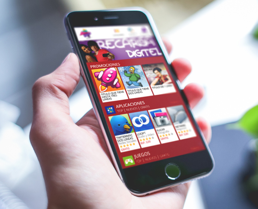
Old Design

Research Highlights
User Profile
- Male and Female
- Ages 18–28
- Smartphone users based in Caracas
Positive feedback on the original store:
- Uses familiar brand colors
- Offers a variety of content
- Has a basic sense of organization
Key user pain points:
- Outdated and simplistic design
- Visually flat, lacked interactivity
- Poor readability (small text, low contrast)
- Static and generic imagery
- Obsolete animations
- Didn't feel innovative or “techy”
- Overuse of red and white, lacking vibrancy


The Solution
We reimagined the Digitel Store as a smarter, more vibrant digital experience with a focus on clarity, usability, and delight.
Core improvements included:
- A clean, modular layout for easier content discovery
- A visually dynamic interface with updated typography, larger imagery, and interactive components
- Improved hierarchy and navigation, based on real user behaviors
- A refreshed color palette—while retaining Digitel’s signature red, we introduced secondary colors for contrast and accessibility
- A design language that communicated innovation, without overwhelming the user


The Outcome
The redesign positioned the Digitel AppStore as a more engaging and useful platform—one that better reflected both Digitel’s brand and the evolving expectations of Venezuelan smartphone users.
Selected Works


heraclio@designstgy.com