
Flow Kana
Role: Designer
Date: 2016
Overview
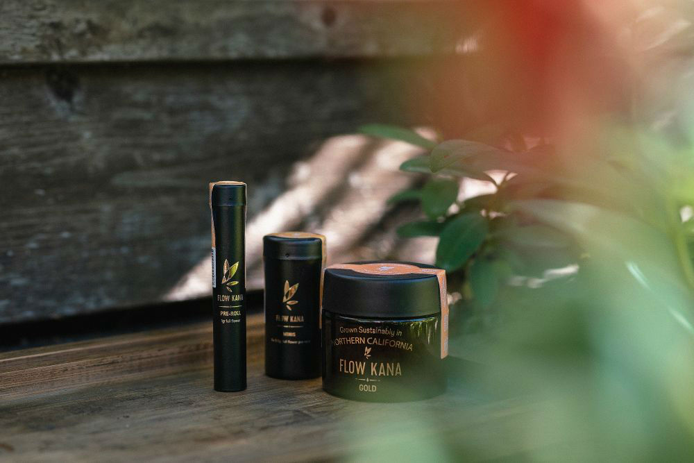
Flow Kana is California’s first sustainable, sun-grown cannabis brand. It offers boutique small-batch strains grown by artisan farmers in some of the state’s most exceptional microclimates. Despite its premium product and values, the brand's packaging and presentation didn’t match the quality of the cannabis or the aspirations of its target audience.
The Challenge
Flow Kana’s packaging system was perceived as low-quality and inconsistent with its premium offering.
- All products, regardless of strain or size (1g, 3.5g, 7g, or pre-rolls), used the same jar, offering little distinction.
- The packaging lacked clarity, with minimal information about the product’s origins, strain category, or composition.
- There was no consistent way to honor the individual farmers behind each batch.
- On-shelf display lacked brand recognition and failed to convey a high-end feel.
The Opportunity
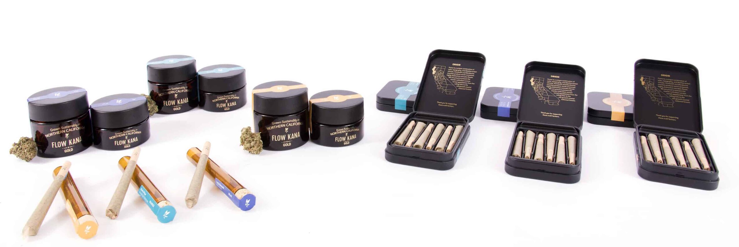
To elevate Flow Kana’s brand perception, I proposed a modular and scalable packaging system that:
- Clearly distinguishes strain types and SKUs.
- Honors the farmers by highlighting their names and stories.
- Offers flexibility for small-batch production.
- Communicates product composition and origin.
- Delivers a more aspirational and premium experience at the point of sale.
Approach
A multi-phase, iterative process combining strategy, design, and testing:
1. Research
- Competitor analysis (primary and secondary)
- Jobs-to-be-done workshops
- Packaging perception surveys
- SKU availability and format mapping
2. Design Iterations
- Three design phases, each followed by stakeholder and customer feedback loops
- Mockups and micro-pilot testing in POS settings
- Testing focus: usability, shelf appeal, brand differentiation, SKU convenience
3. Validation & Production
- Packaging system refinement based on insights
- Final artwork delivery
- Production oversight
Key Stakeholder Insights
- “I love the natural, organic feel. It’s authentic.”
- “Let’s elevate the design to something more aspirational and beautiful.”
- “We need to improve brand visibility and make it more shelf-friendly.”
- “The gold foil adds a premium touch the brand was missing.”
- “The strain tag system is going to be a game-changer for personalization.”

First round of Design Explorations
Option 1
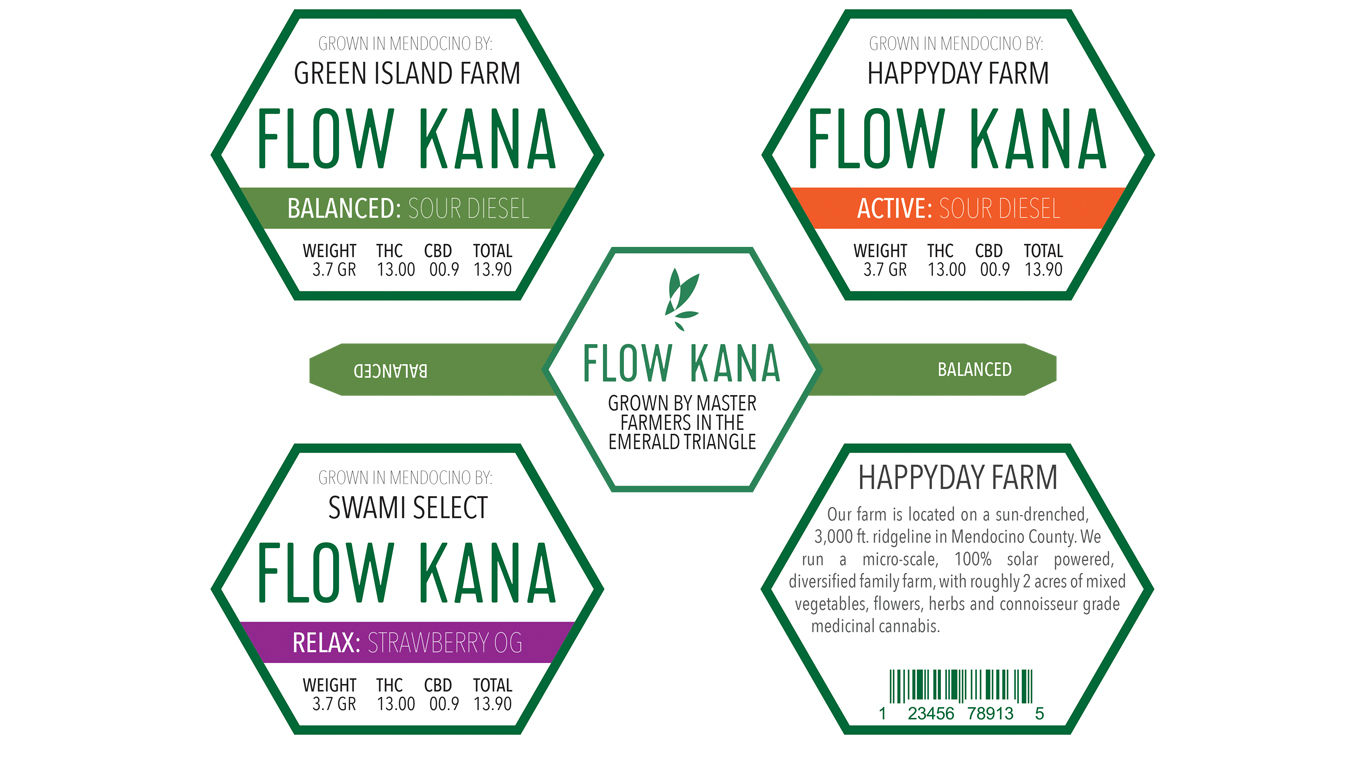

Option 2
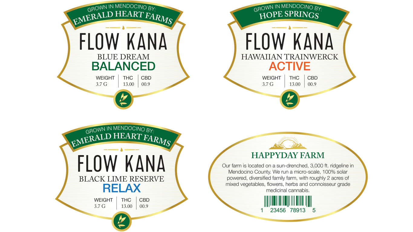

Option 3

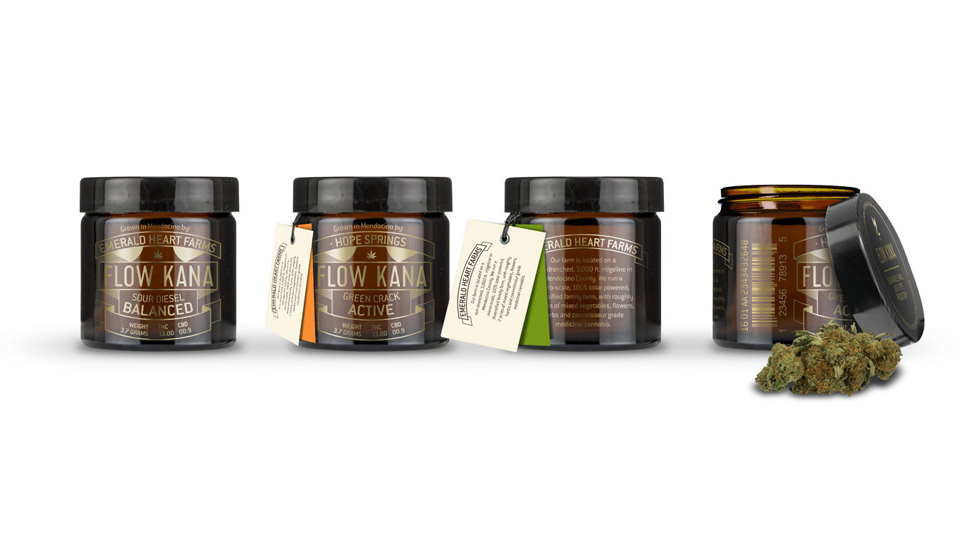
Option 5
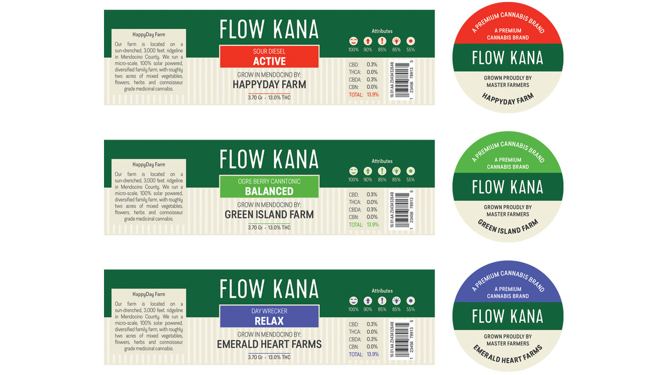

Option 6

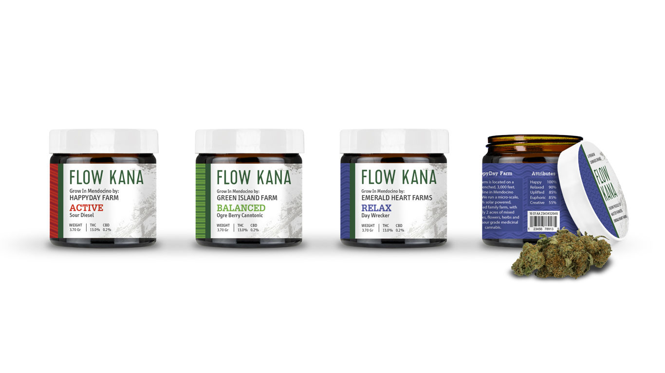
Second round of Design Explorations
Customer insights
The client had a clear preference for the fourth option. Here is some of the stakeholder feedback and guidance for the next iteration.
"I really like the new idea, the materials, and its designs, although I will t, to make it cleaner"
"Try to make the design more classic and less trendy"
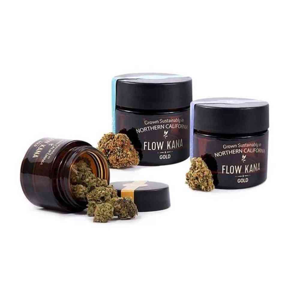
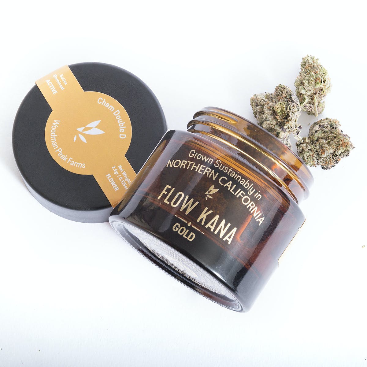
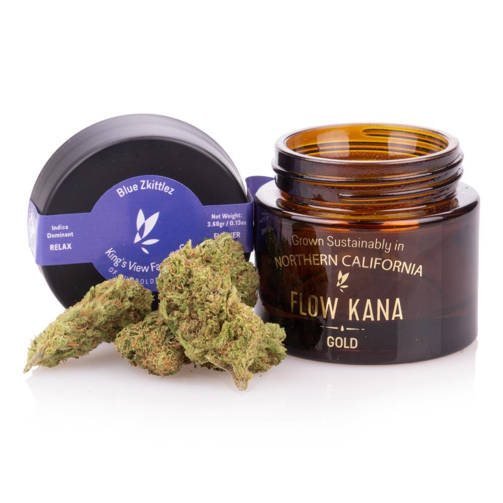
"The gold foil is exactly what the brand needed"
" I believe the strain tags solution is going to be a versatile way to personalize the jars"


Second round of Design Explorations


Selected Works
heraclio@designstgy.com